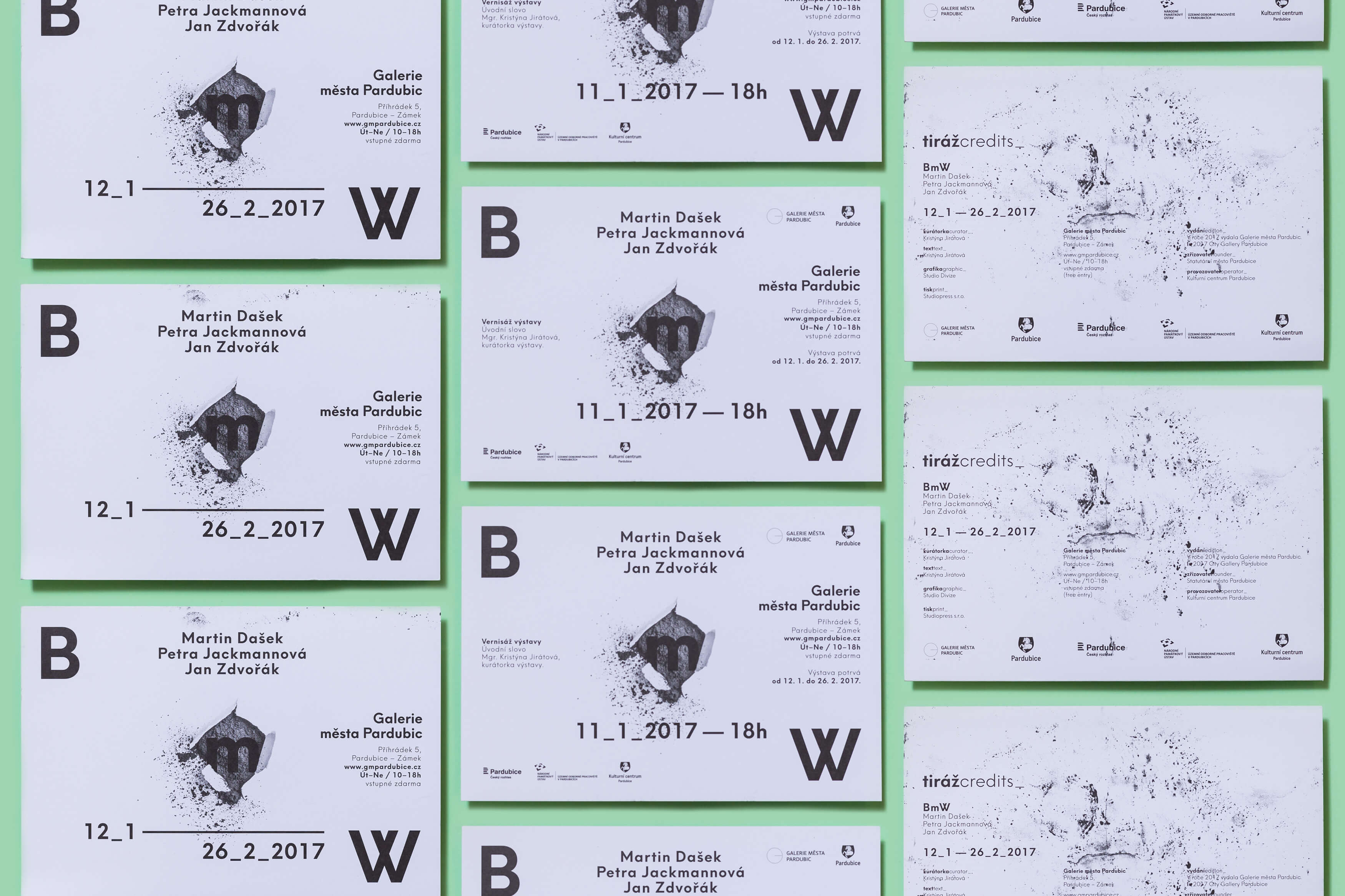
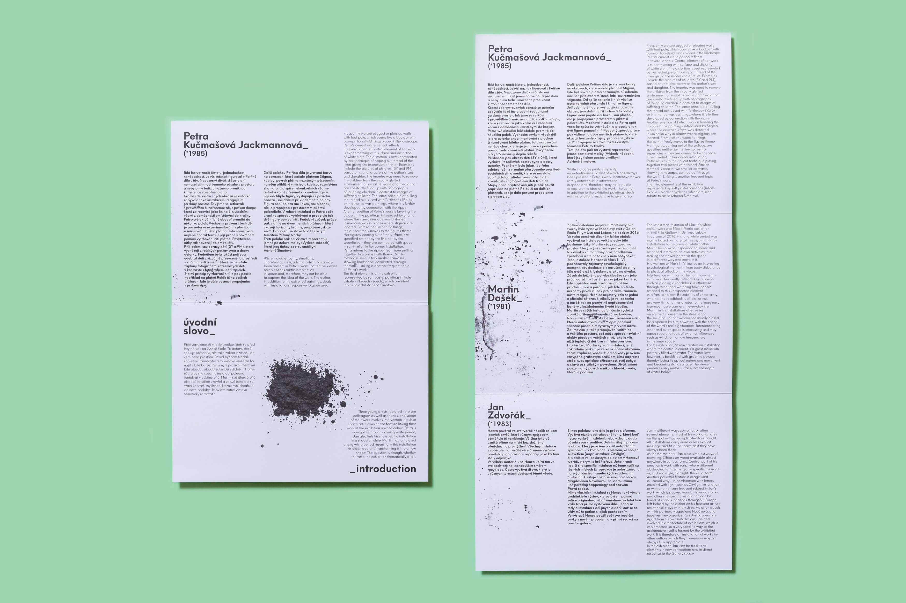
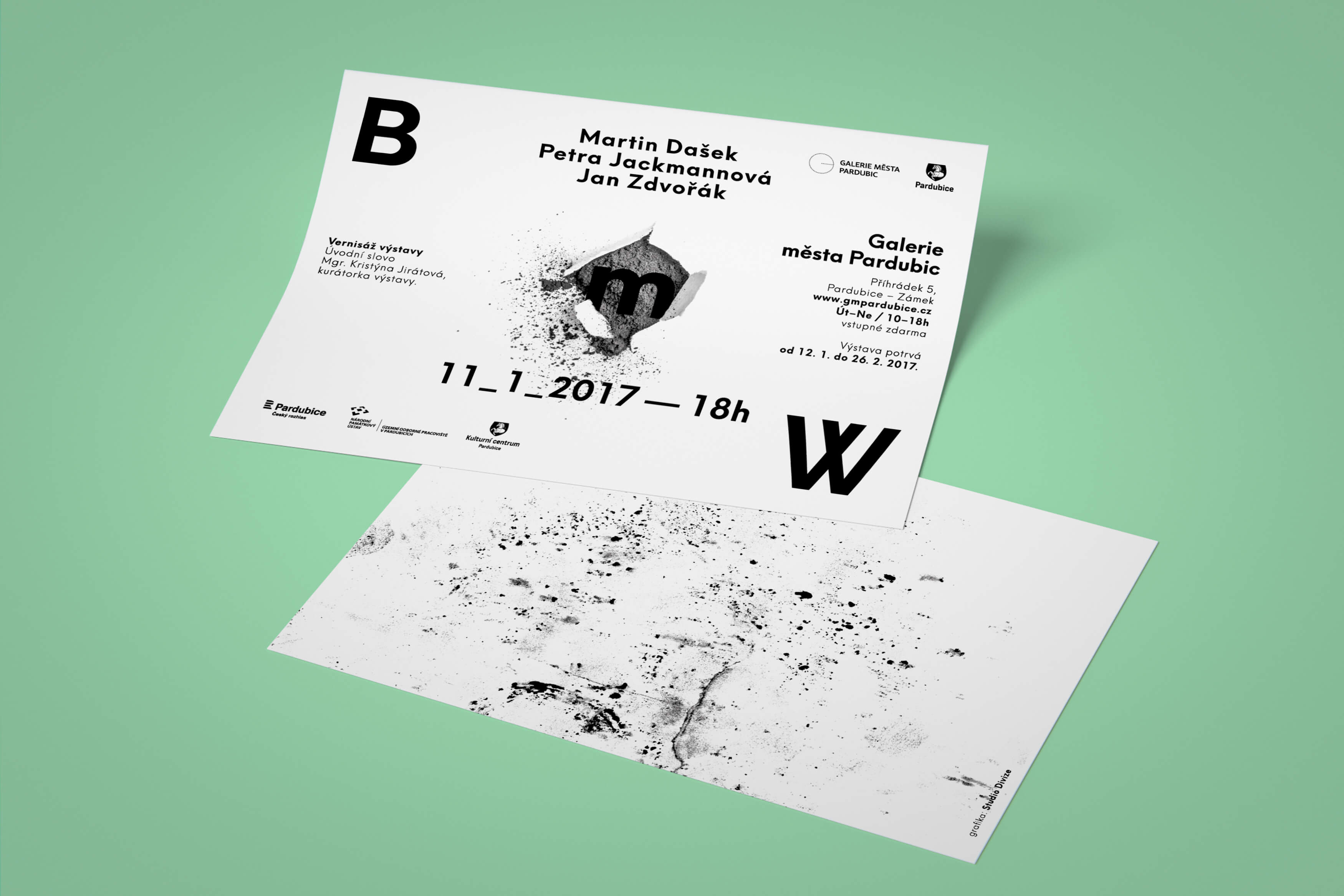
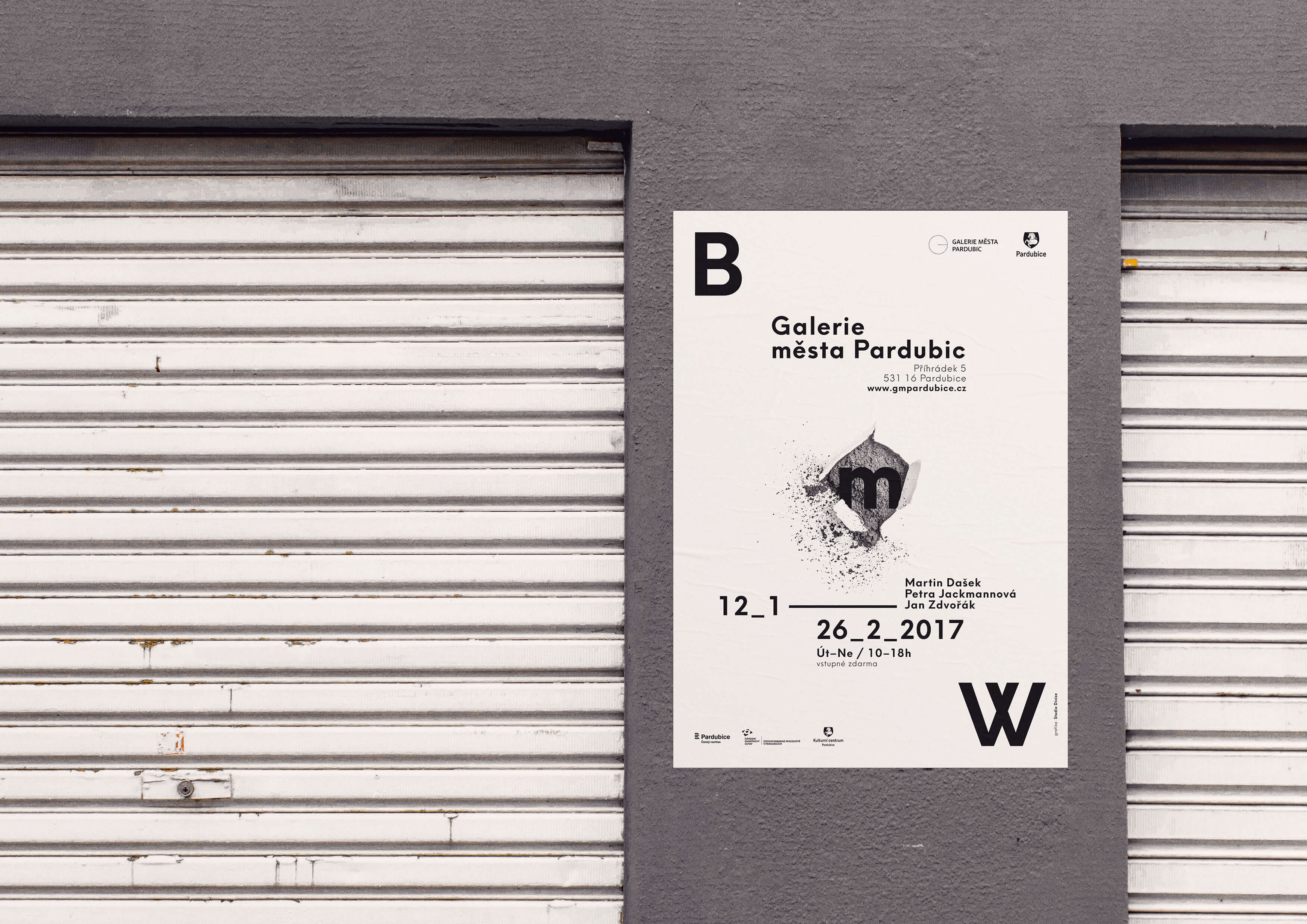
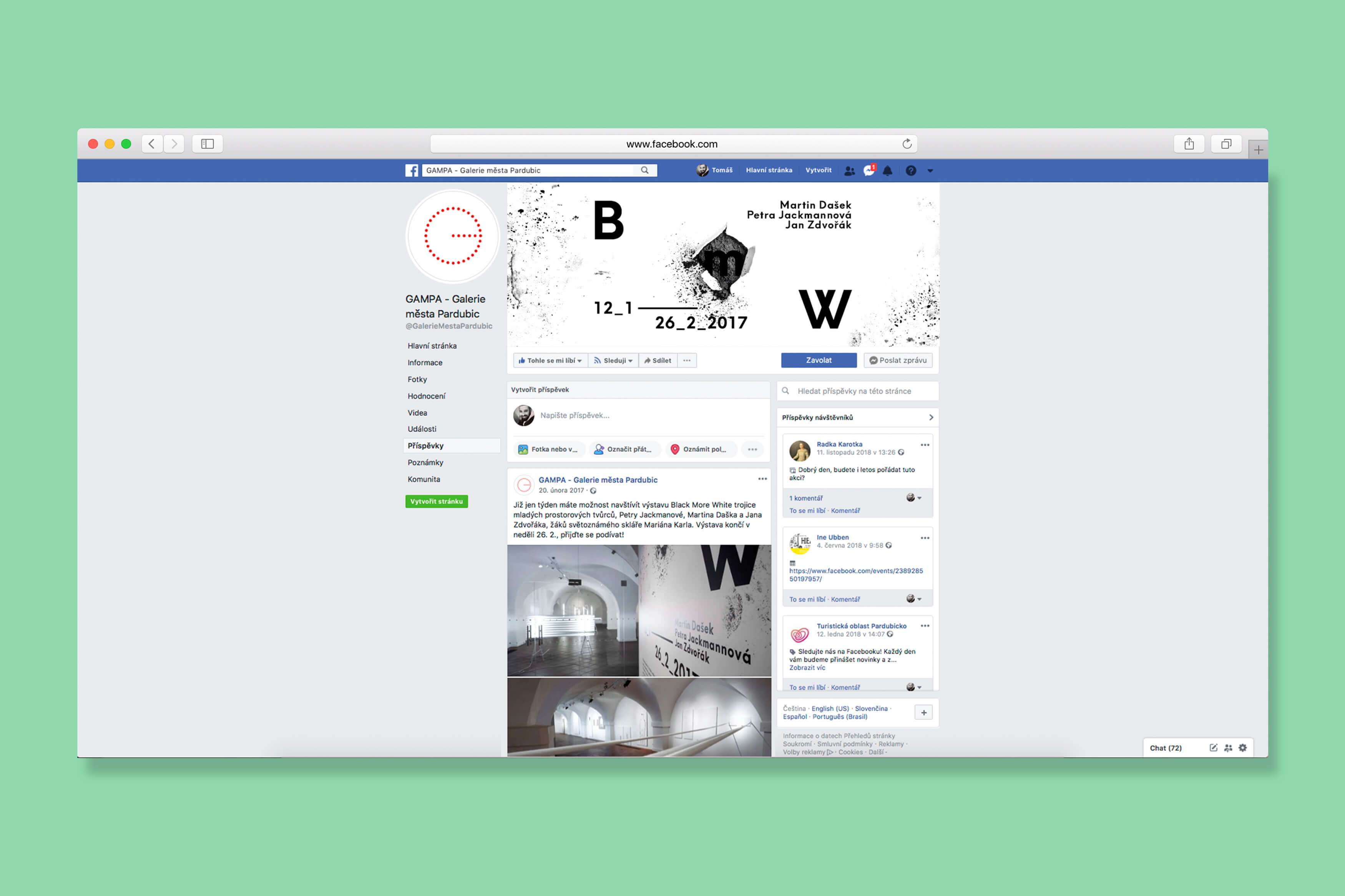
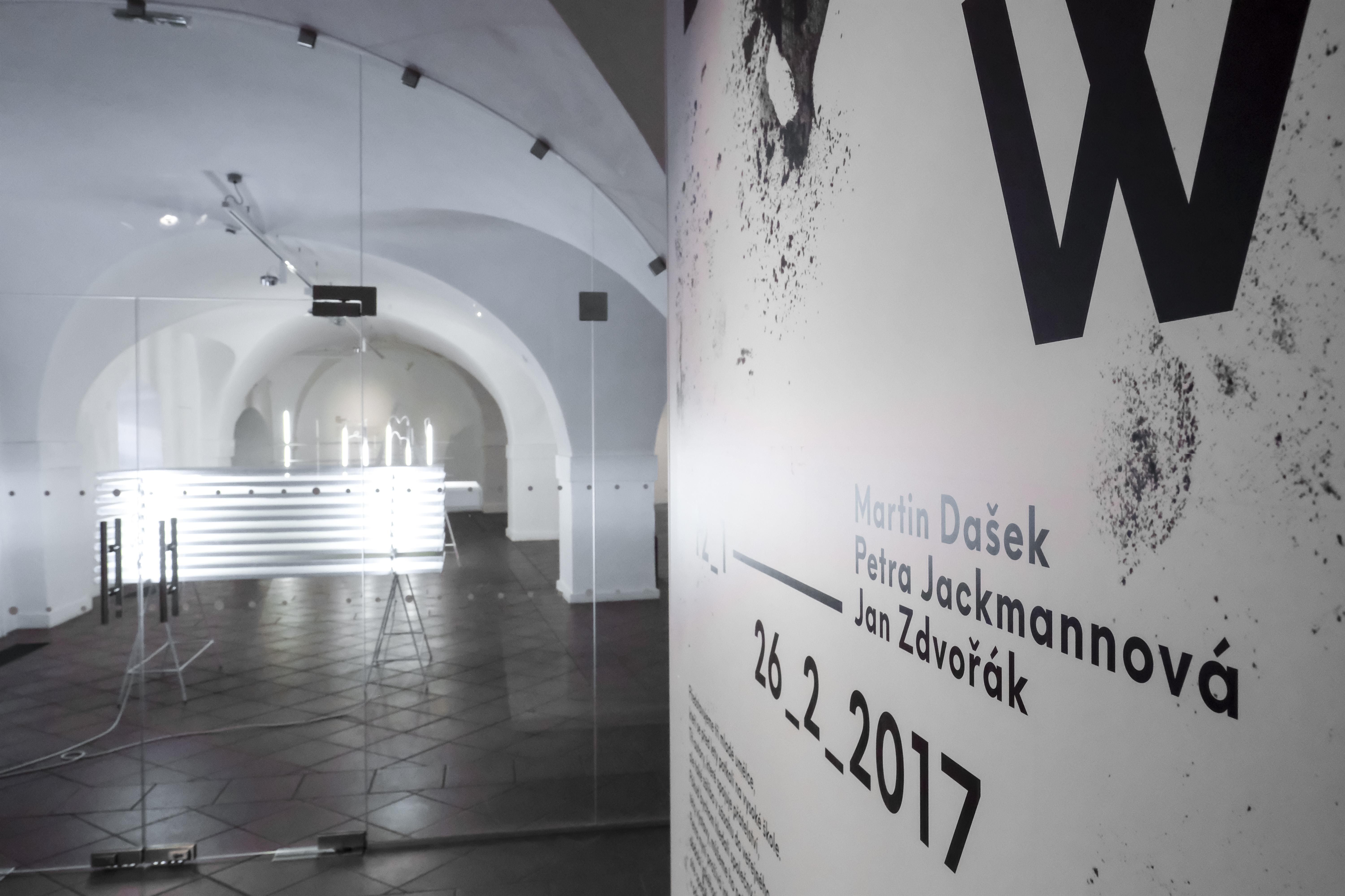
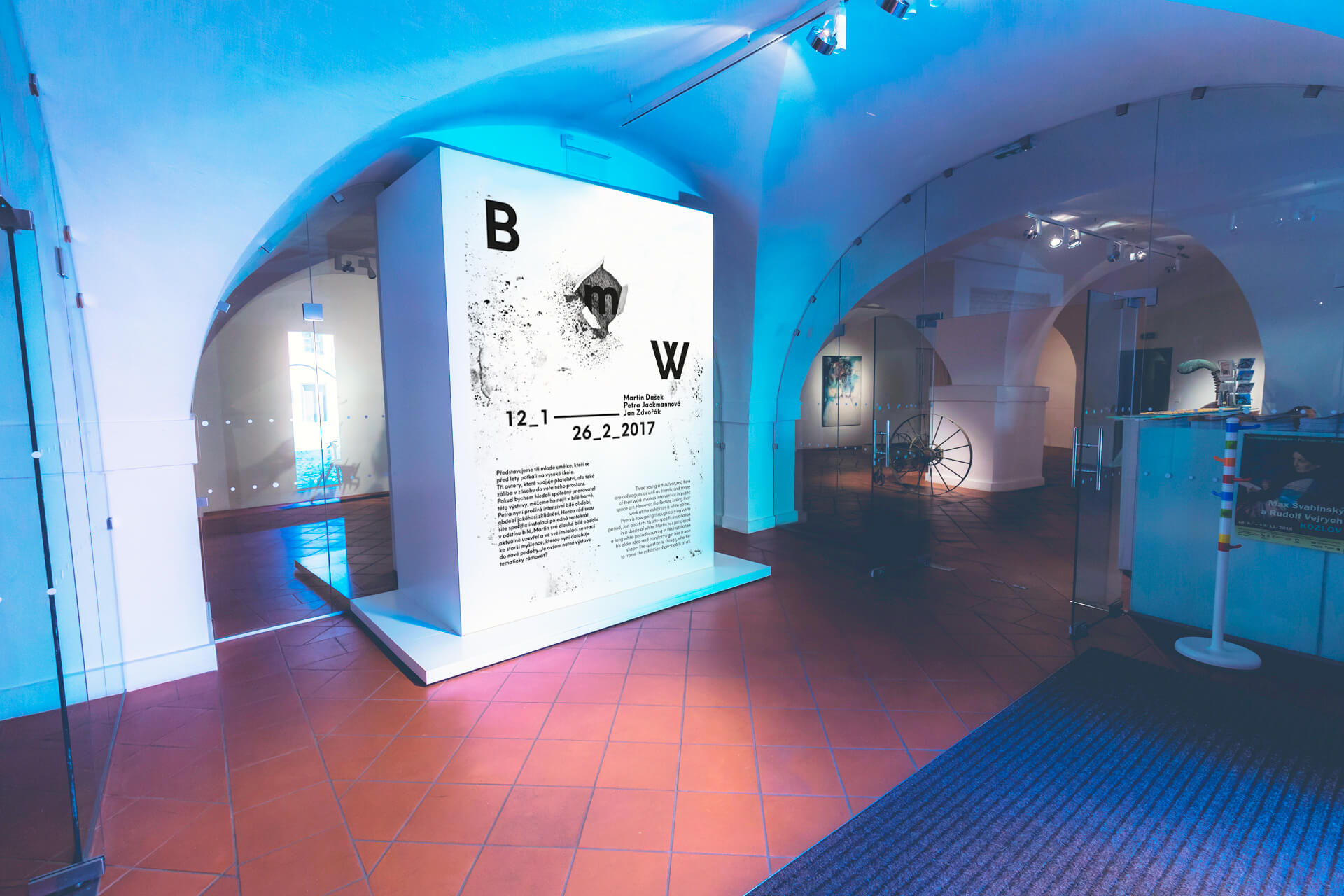
The visual identity of the exhibition presenting three young artists, who, besides being friends, also share an excitement for interfering in public space. The common trait of displayed works is the use of white color. However, this disturbs one of the authors, who just concludes his white period with the site-specific installation using graphite as the main material. It creates tension between white and black and between the artists themselves. This tension is expressed by the diagonal on which the letters from the exhibition’s title are placed. The visual identity is based on the contrast of white color and graphite penetrating the material. The task was to create all printed and online output: folded leaflet, poster, invitation, banner, descriptions etc.
IniTIATOR/Client:
Galerie města Pardubic
YEAR:
2017
Design:
Sára Bergmannová
Tomáš Brychta
The visual identity of the exhibition presenting three young artists, who, besides being friends, also share an excitement for interfering in public space. The common trait of displayed works is the use of white color. However, this disturbs one of the authors, who just concludes his white period with the site-specific installation using graphite as the main material. It creates tension between white and black and between the artists themselves. This tension is expressed by the diagonal on which the letters from the exhibition’s title are placed. The visual identity is based on the contrast of white color and graphite penetrating the material. The task was to create all printed and online output: folded leaflet, poster, invitation, banner, descriptions etc.
Initiator/client:
Galerie města Pardubic
Year:
2017
Design:
Sára Bergmannová
Tomáš Brychta
The visual identity of the exhibition presenting three young artists, who, besides being friends, also share an excitement for interfering in public space. The common trait of displayed works is the use of white color. However, this disturbs one of the authors, who just concludes his white period with the site-specific installation using graphite as the main material. It creates tension between white and black and between the artists themselves. This tension is expressed by the diagonal on which the letters from the exhibition’s title are placed. The visual identity is based on the contrast of white color and graphite penetrating the material. The task was to create all printed and online output: folded leaflet, poster, invitation, banner, descriptions etc.
Initiator/client::
Galerie města Pardubic
Year:
2017
Design:
Sára Bergmannová
Tomáš Brychta
The visual identity of the exhibition presenting three young artists, who, besides being friends, also share an excitement for interfering in public space. The common trait of displayed works is the use of white color. However, this disturbs one of the authors, who just concludes his white period with the site-specific installation using graphite as the main material. It creates tension between white and black and between the artists themselves. This tension is expressed by the diagonal on which the letters from the exhibition’s title are placed. The visual identity is based on the contrast of white color and graphite penetrating the material. The task was to create all printed and online output: folded leaflet, poster, invitation, banner, descriptions etc.
Initiator/client:
Galerie města Pardubic
Year:
2017
Design:
Sára Bergmannová
Tomáš Brychta
The visual identity of the exhibition presenting three young artists, who, besides being friends, also share an excitement for interfering in public space. The common trait of displayed works is the use of white color. However, this disturbs one of the authors, who just concludes his white period with the site-specific installation using graphite as the main material. It creates tension between white and black and between the artists themselves. This tension is expressed by the diagonal on which the letters from the exhibition’s title are placed. The visual identity is based on the contrast of white color and graphite penetrating the material. The task was to create all printed and online output: folded leaflet, poster, invitation, banner, descriptions etc.
Initiator/client:
Galerie města Pardubic
year:
2017
Design:
Sára Bergmannová
Tomáš Brychta