endors
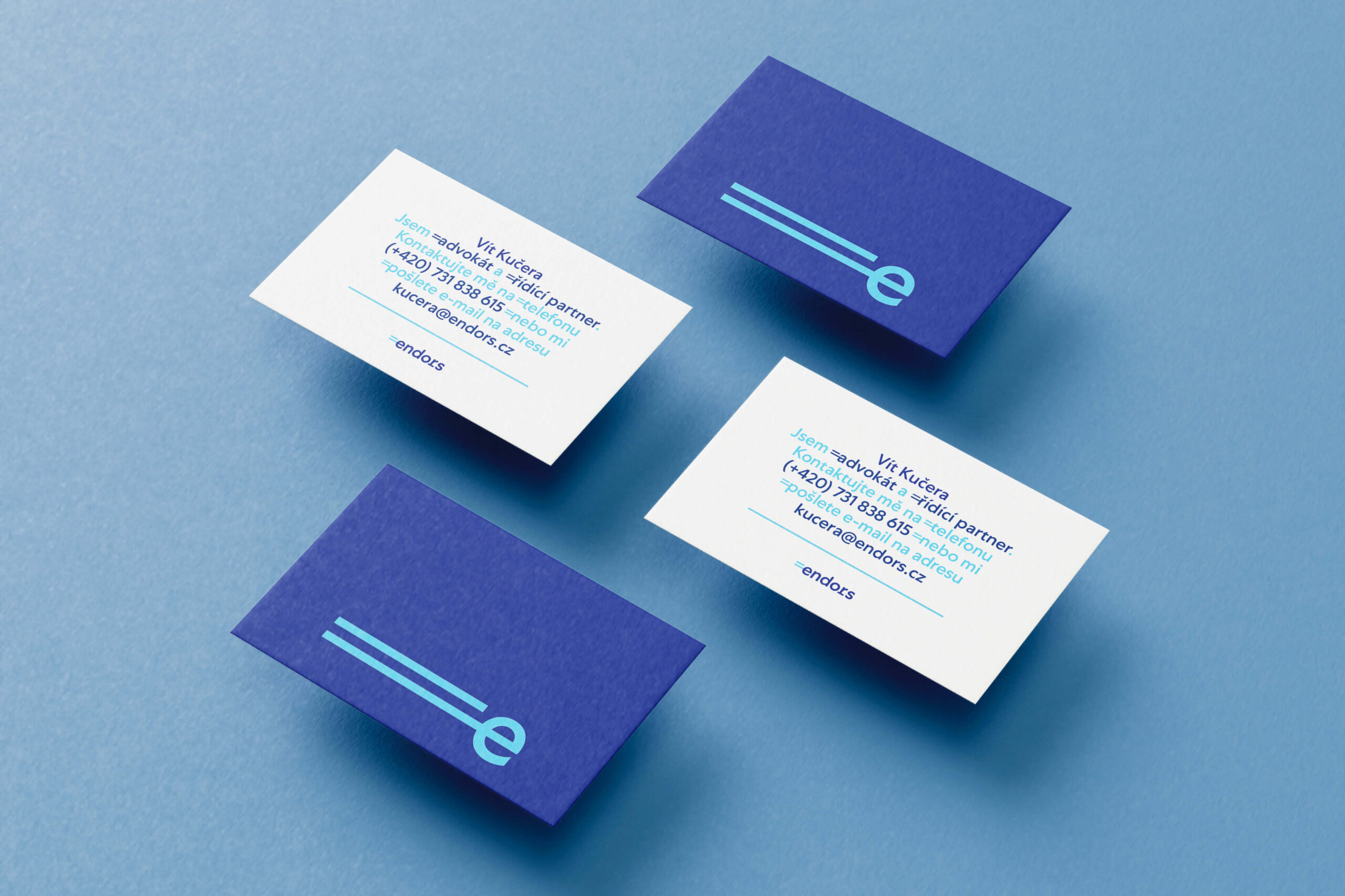
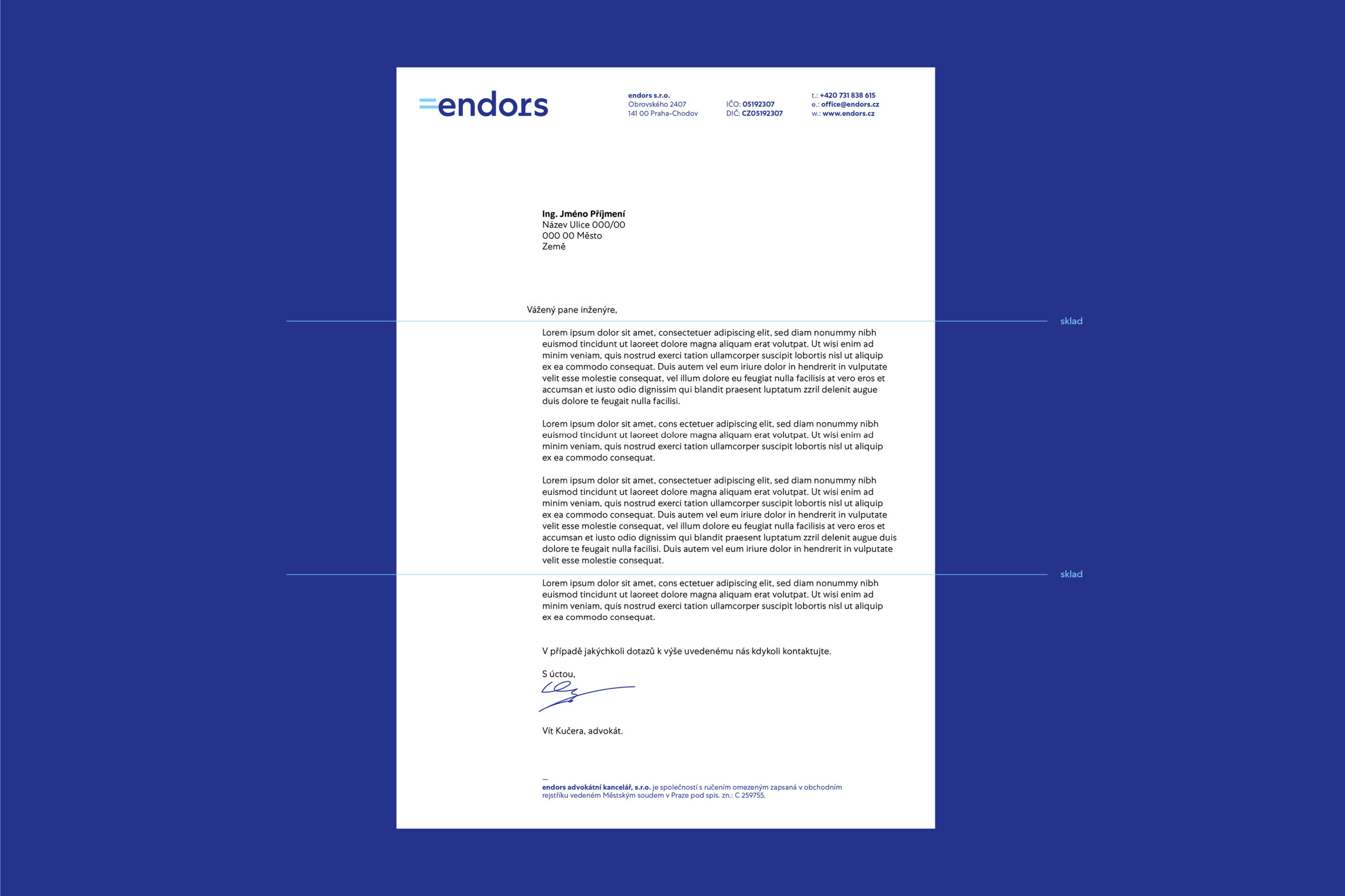
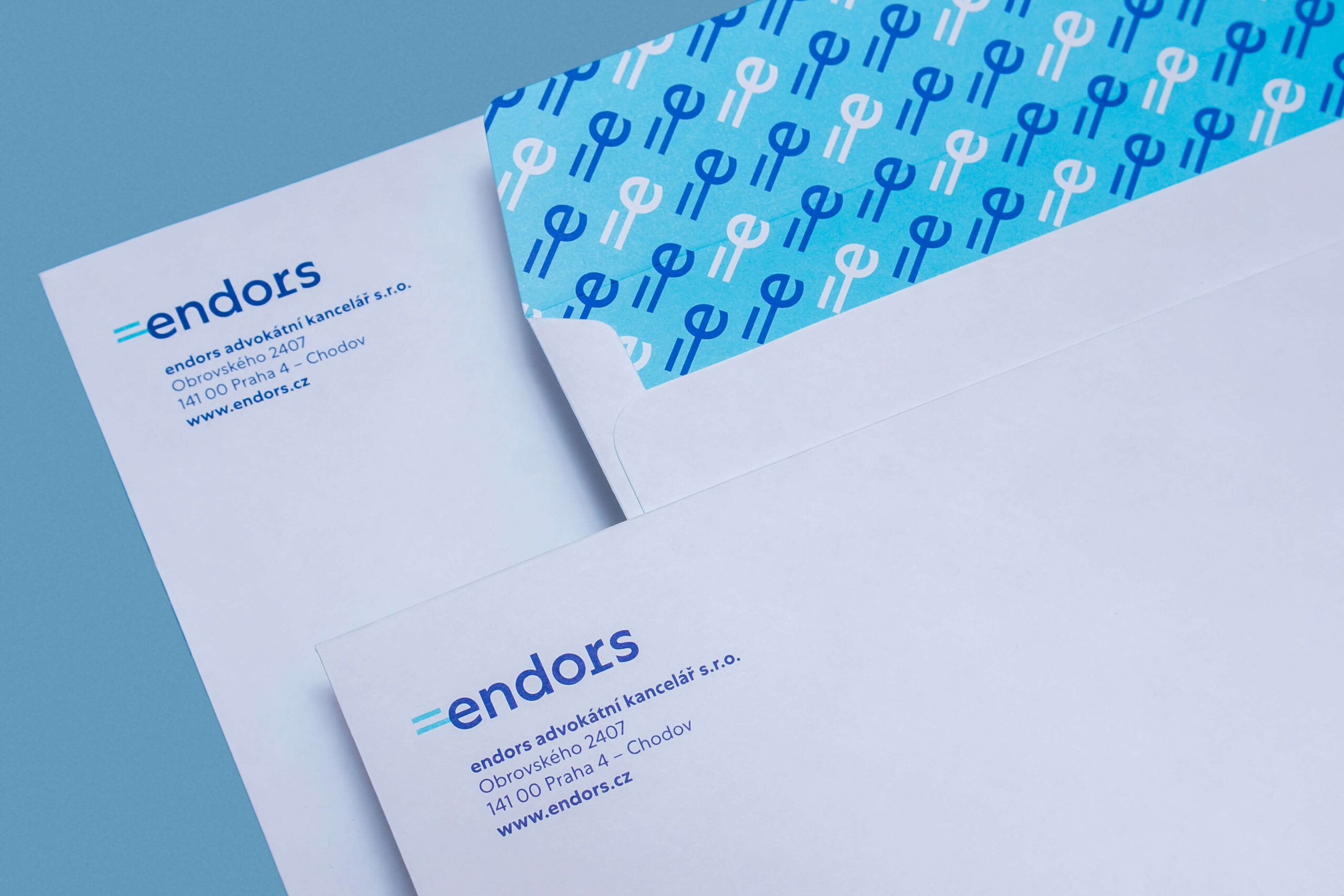
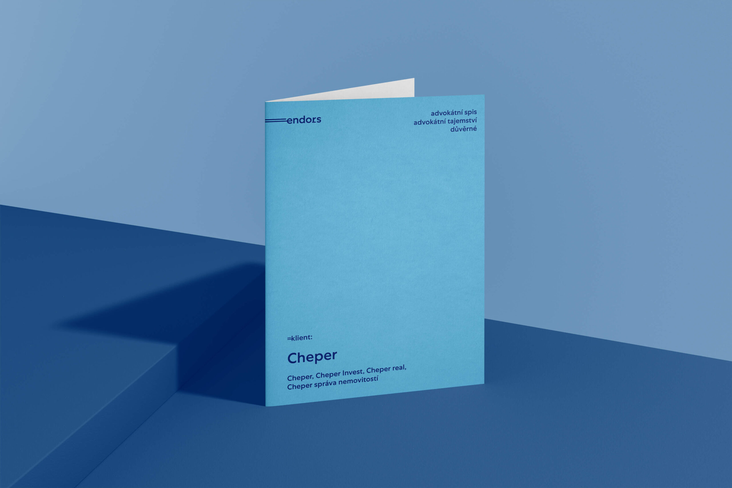
The law firm endors was originally called k.law, a name under which it operated successfully for several years. During the course of 2021, its founder, and at the same time the majority partner, decided to rename the firm, as the name was very much associated with his name alone and was no longer sufficient for a team of around 20 members. This change is also linked to the uniform visual style itself. The core pillars of the rebranding, the name and the vision of the new brand were defined by the CEO with the help of a brand coordinator who is part of the Kiduo brand. Subsequently, Studio Divize was involved in the transformation process, with its design responding to the brand’s defined associations: energy, results, business, law. This led to the creation of a unique symbol based on the character expressing “equal to (=)”, which is linked to the first letter of the name “e”. This connection gives the logotype a dynamic character of forward movement, suggesting competitiveness in a positive sense and the desired results. The combination of the blue colour palette was based purely on the client’s wishes, so this primarily concerned a harmonious selection of two different shades of the same colour. The identity uses several styles of the Centra No.1 font from the American typefoundry Sharp Type. This geometric, sans-serif font emphasises legibility - instead of adhering to a strict geometric structure, its clipped strokes transform a static form into a dynamic character. This cooperation has led to the creation of many printed materials which the law firm uses in its everyday work.
Initiator/Client:
endors
Years:
2021–2022
Design:
Karla Gondeková (design)
Tomáš Brychta (art-director)
Brand Strategy:
Filip Šimoník (KIDUO)