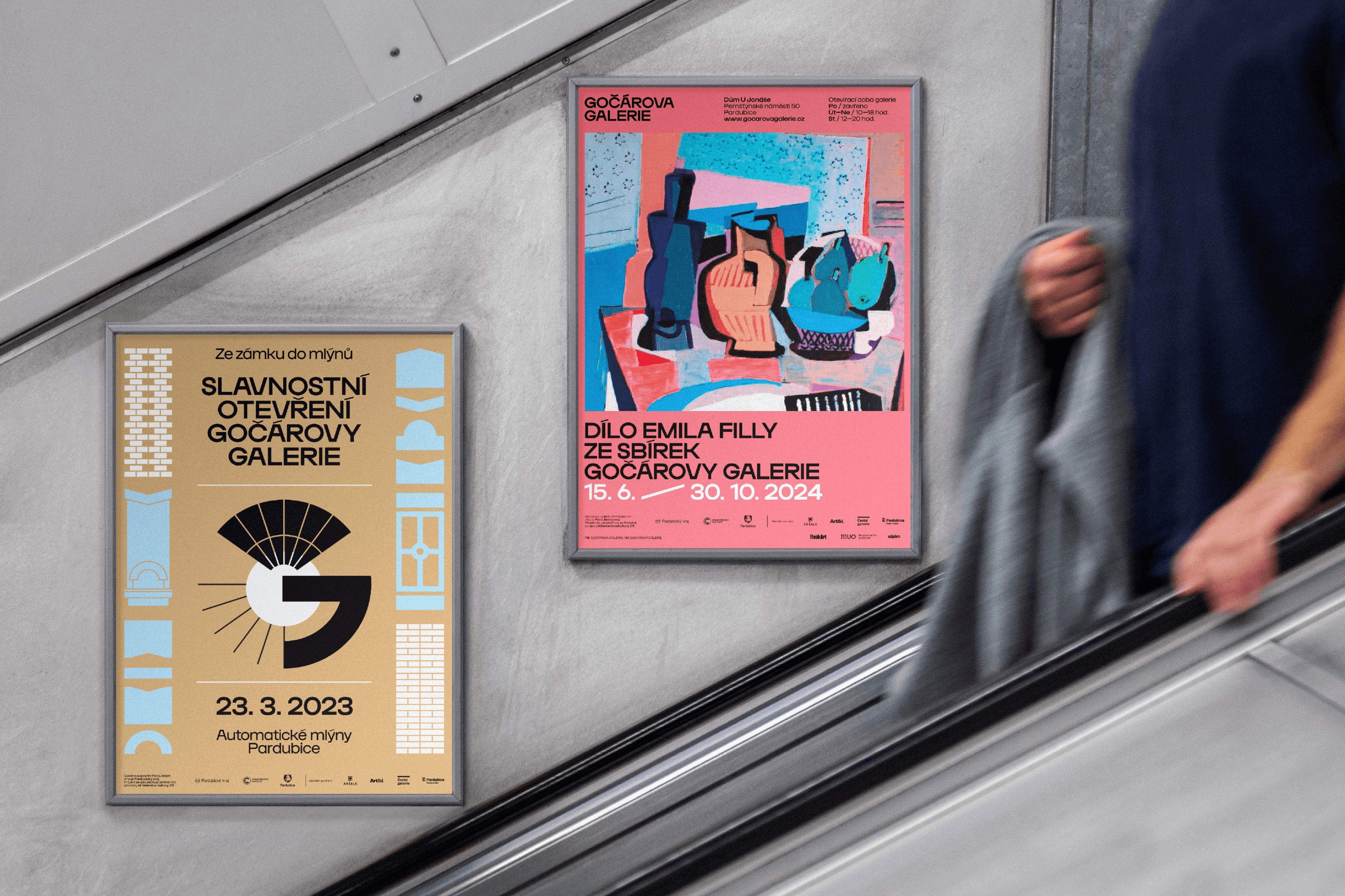
Gočár Gallery
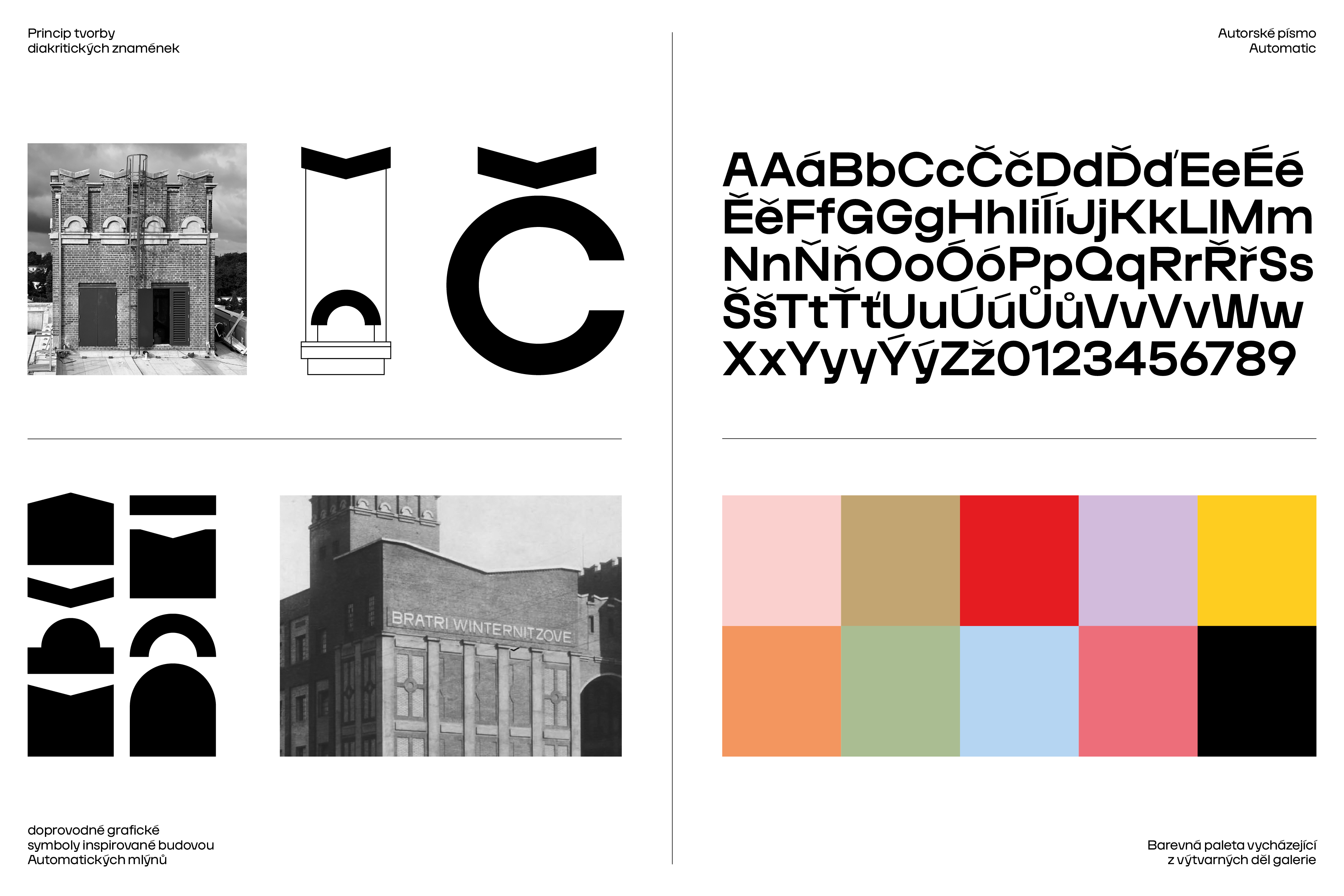
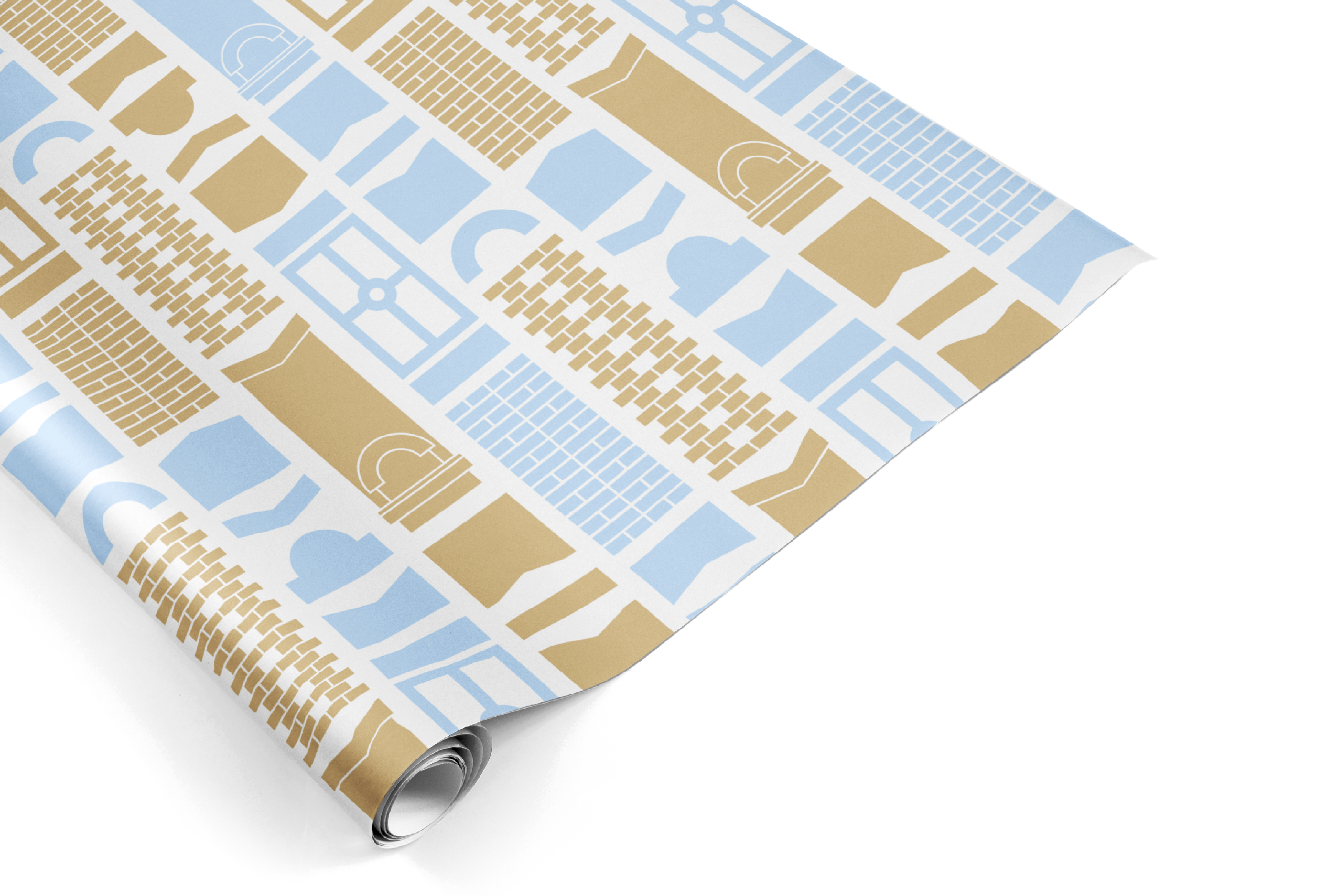
We drew inspiration for the competition design of the unified visual style and logo of the Gočár Gallery from the historical appearance of the building in which the new gallery is housed. Architectural features, called “swallow tails”, which are very significant for the building of the Automatic Mills in Pardubice, were transformed into diacritical marks, which are part of the name of the institution itself. The new logotype modifies the hook in the letter “Č” from the original logo of the East Bohemian Gallery. This accent changes its form precisely on the basis of the previously mentioned swallow tails - a feature which is located at the top of the building of the Mills itself. It follows the same slant and, as on the building itself, is placed at the top - i.e. above the logotype. This feature opens up further possibilities for modification and can be used as a functional element, e.g. on the website.
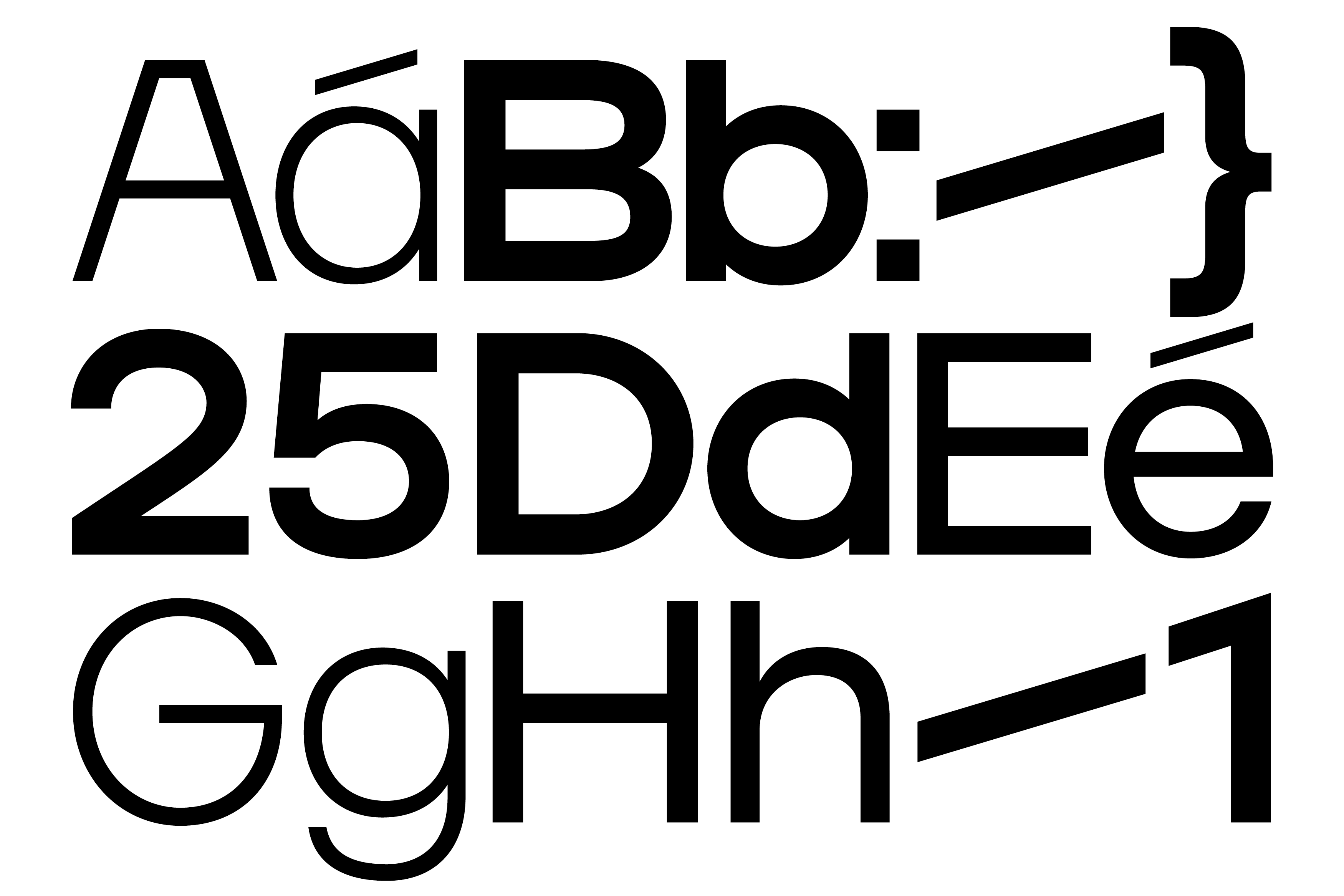
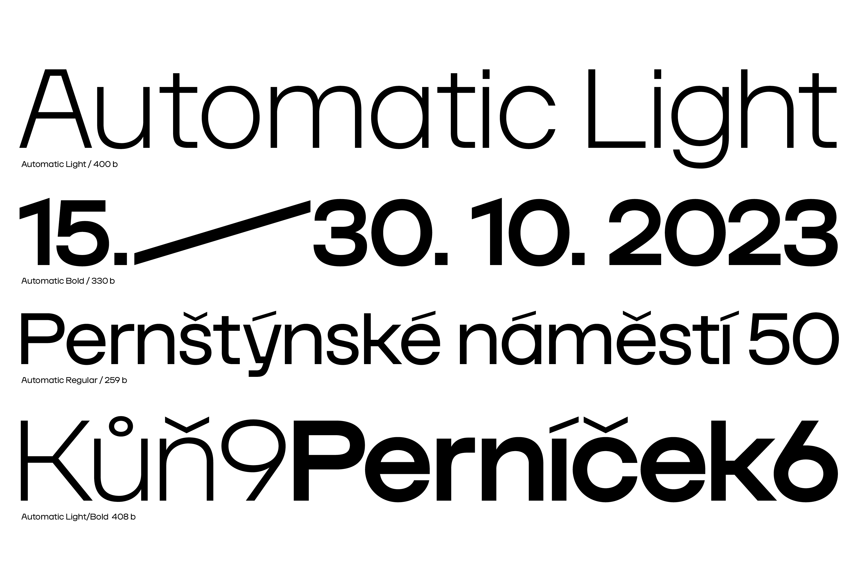
The main motif and connecting element of the design of the new unified visual identity of the Gočár Gallery is the original Automatic font. An important inspiration for drawing of the complete alphabet of the font was the original design of the inscription for the building of the Automatic Mills (formerly the Winternitz Brothers) by the building’s architect Josef Gočár. When creating the font, it was desirable to preserve the overall aesthetic impression and elements of the original letters. The Automatic font is based on basic geometric shapes which are based on the architectural character of the building, and which are then transcribed into the overall unified visual style of the Gočár Gallery.
The Automatic font, designed in 3 font styles, has been enriched with contextual alternatives of the letters “A”, “V”, “W” and “y” which have been simplified. We did so to ensure the timelessness of the long-term use of the font for materials created by the Gočár Gallery. This will ensure for the graphic designer more flexible options for use of the font, e.g. for different exhibition themes, etc. We would recommend use of the Light font style in particular for creation of larger headers or graphic designs, e.g. to reflect the typography in the context of the whole resulting material. For use in smaller sizes, the Regular and Bold font styles are mainly used.
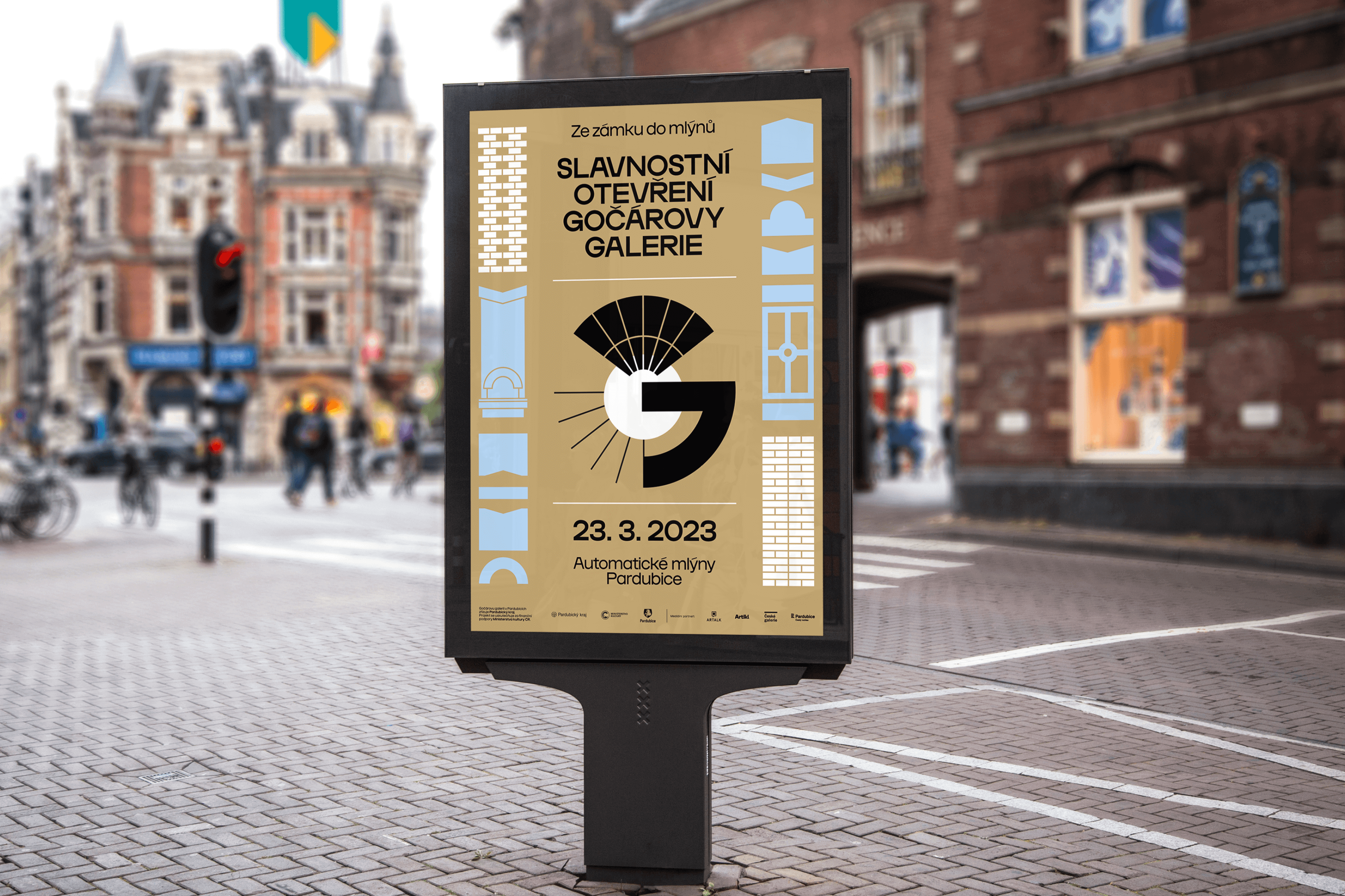
A definition of the use of the two alternatives of the letter “G” has also arisen. The alternative of the letter “G” with a vertical stroke is always used in the word “GOČÁR” and in words derived from it. Functionality is ensured by the prepared ligature of the letters “G”, “O” and “Č”, which is automatically activated when the same sequence of letters is typed. In other cases, a simpler, rounder variant of the letter “G” is used.
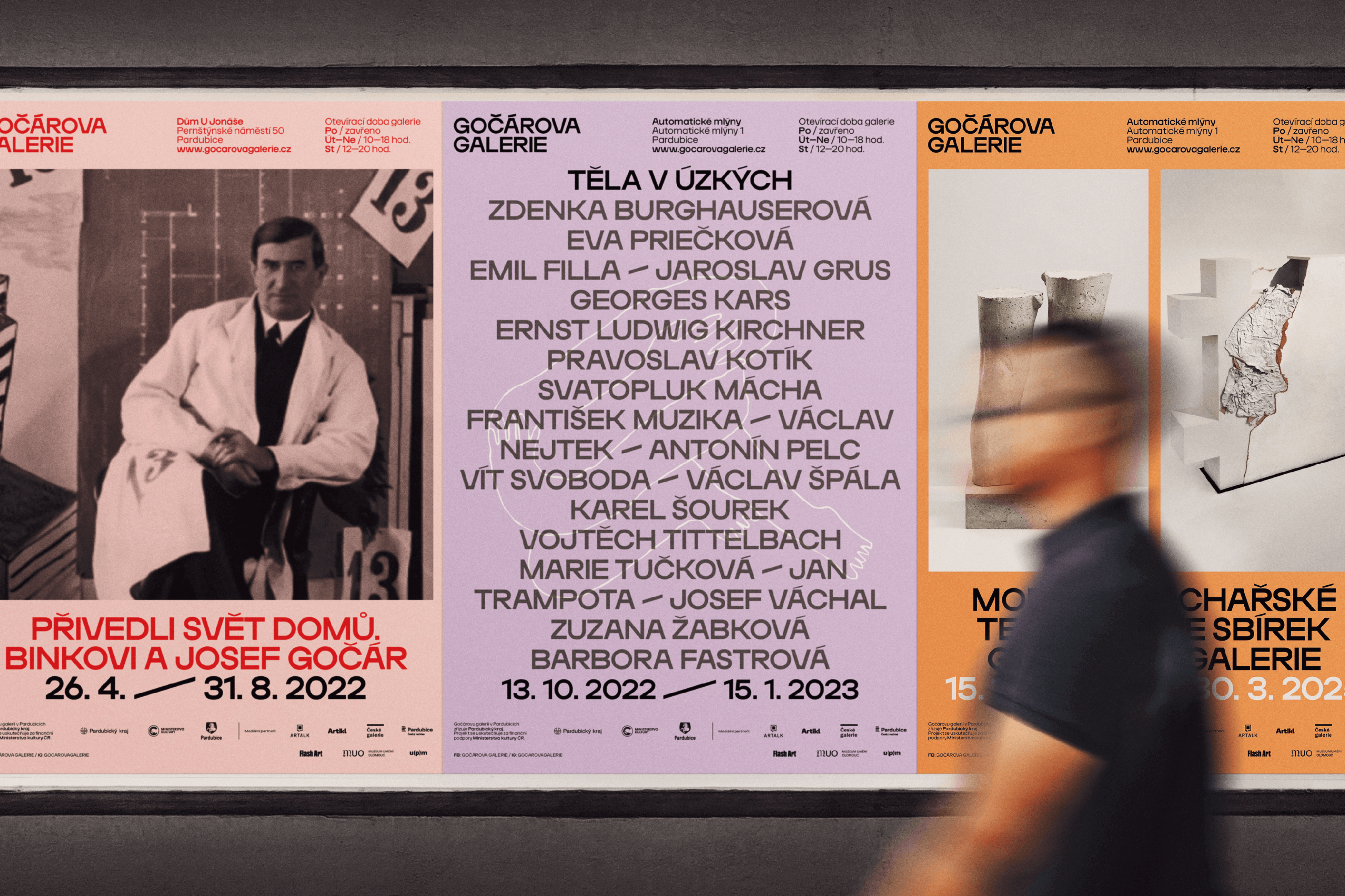
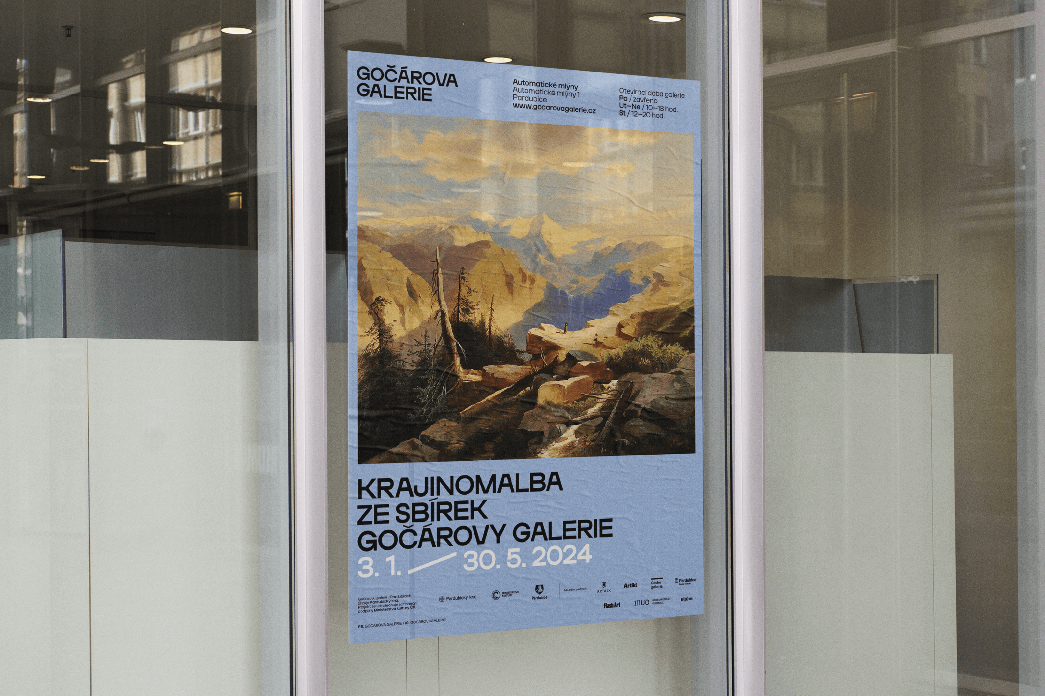
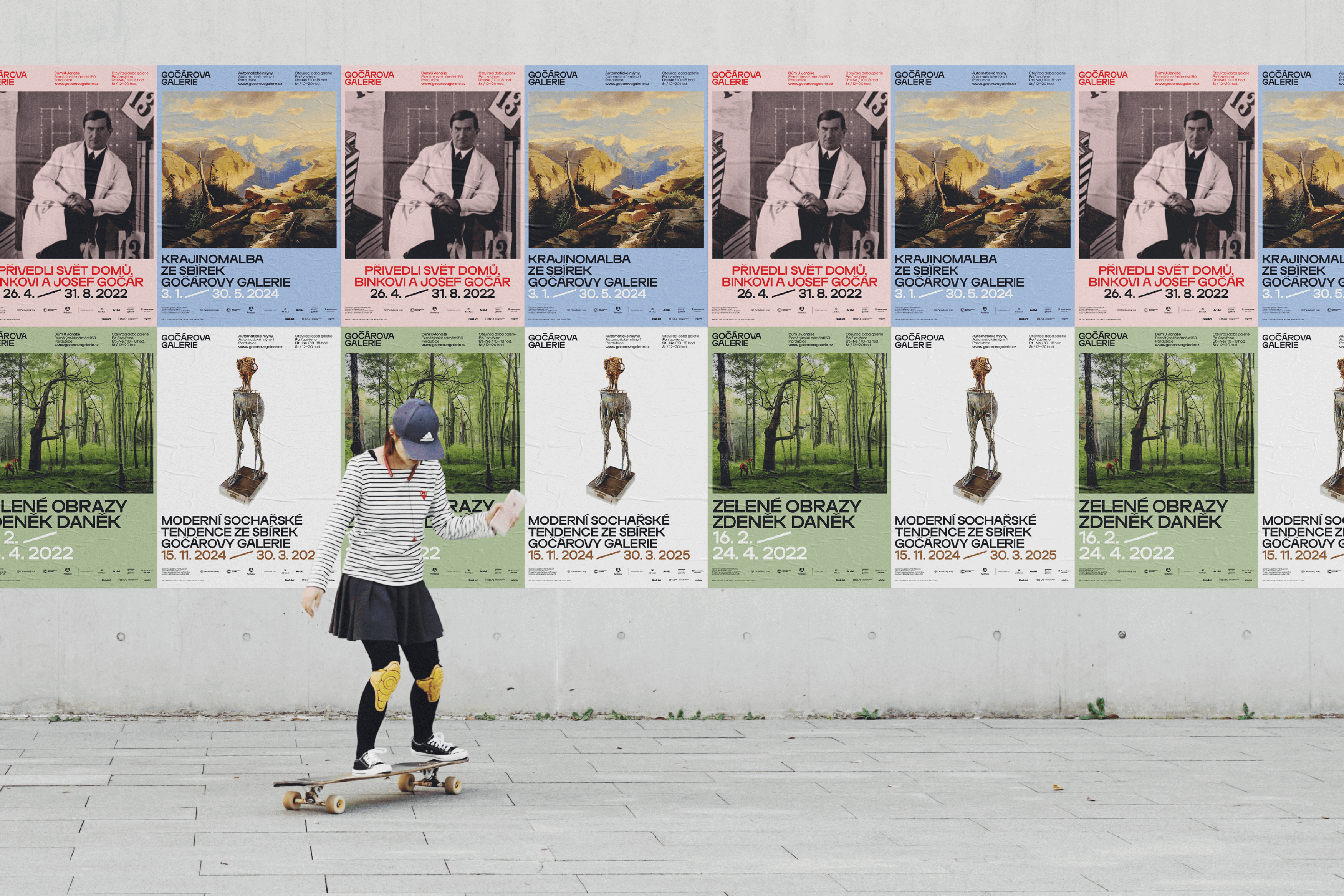
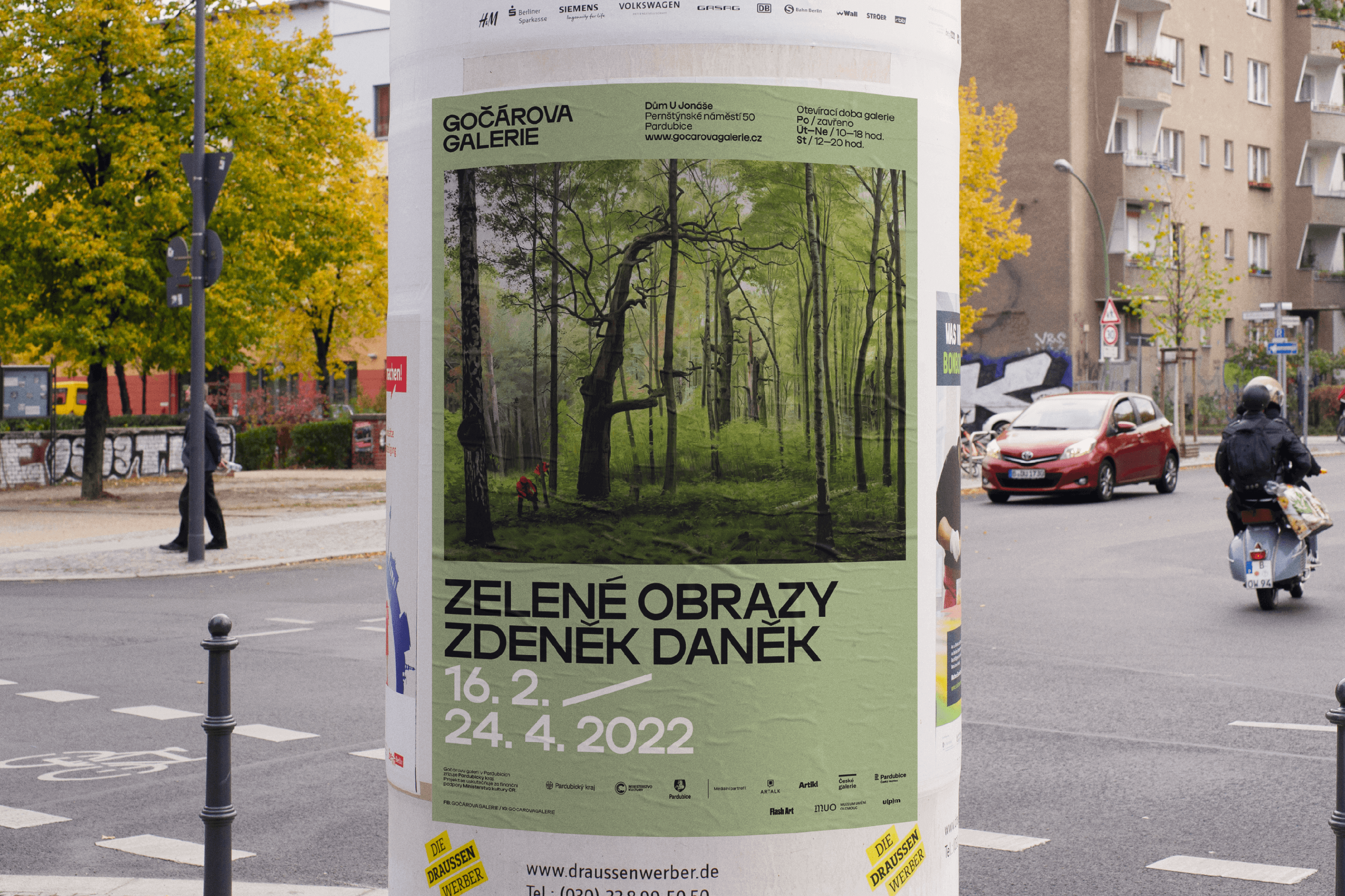
The communication campaign for the grand opening of the Gočár Gallery in linked to the design scheme of the Automatic font, as well as the decorative architectural elements of the new building and the countdown to the grand opening. The posters, and other materials, are based on graphic elements which draw on the motifs mentioned above. This gives rise to several forms of the letters “G”, “O” and “A” representing the abbreviation of the gallery GOGA. The celebratory colour scheme combines gold with light blue.
Initiator/Client:
Gočárova galerie
Czechdesign
Year:
2022
Design:
Tomáš Brychta
Sára Bergmanová
Karla Gondeková
Ilja Bazhanov