Hoax craft Brewery
HOAX Craft Brewery is a nomadic brewery that brews its beers in selected breweries run by experienced brewmasters. The recipes, however, are entirely their own – crafted just the way the founders themselves like to drink. In the context of the unified visual identity, the name HOAX is not meant as an alarming message or a reference to deception. Instead, it points to mystification and playful exaggeration.
The bold and distinctive name of the brewery also stems from the founders’ personal experience in the media world – they know firsthand how quickly a message can spread and how much it can change before it reaches its destination. That spirit of experimentation is reflected in their products.
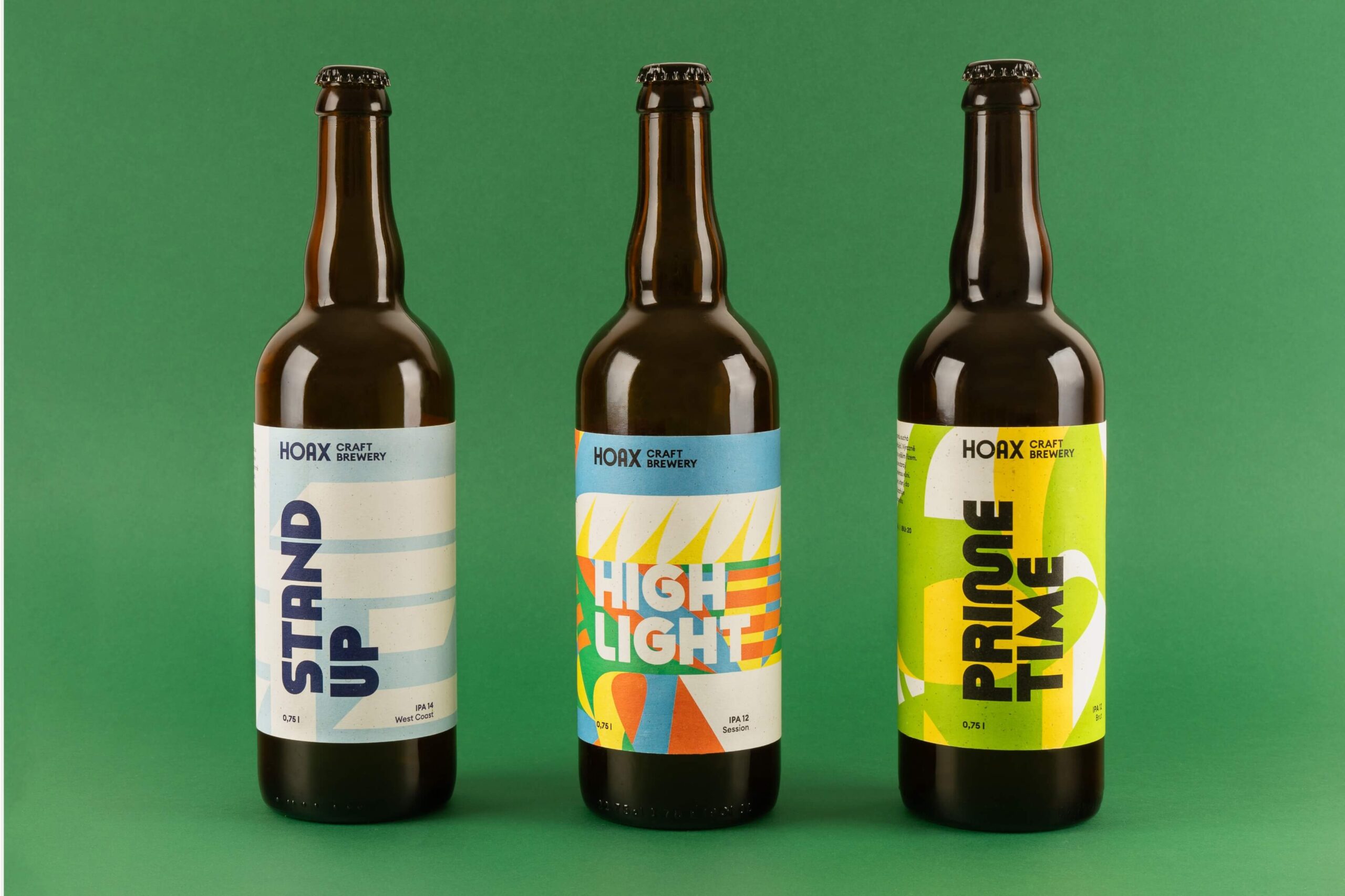
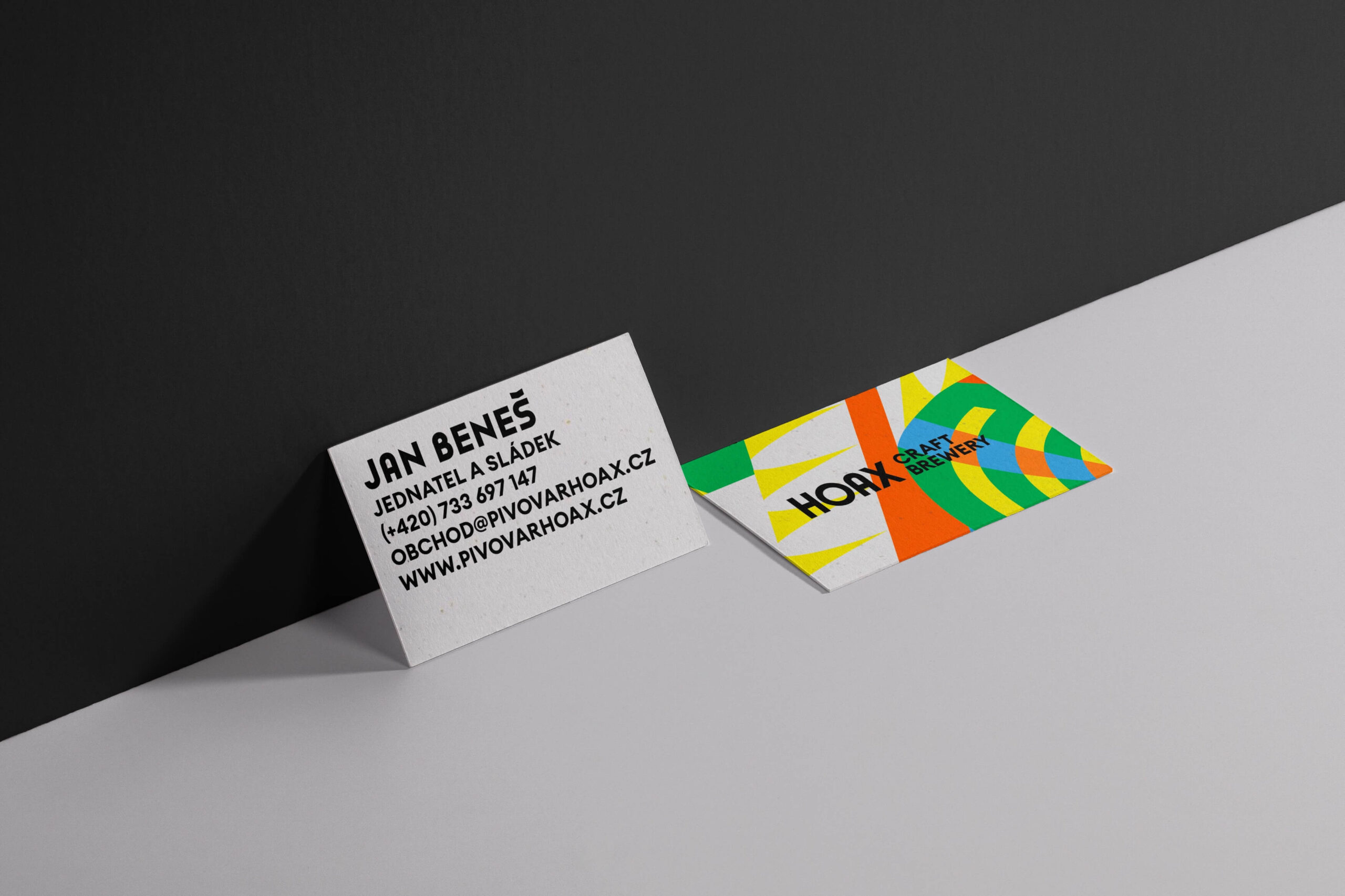
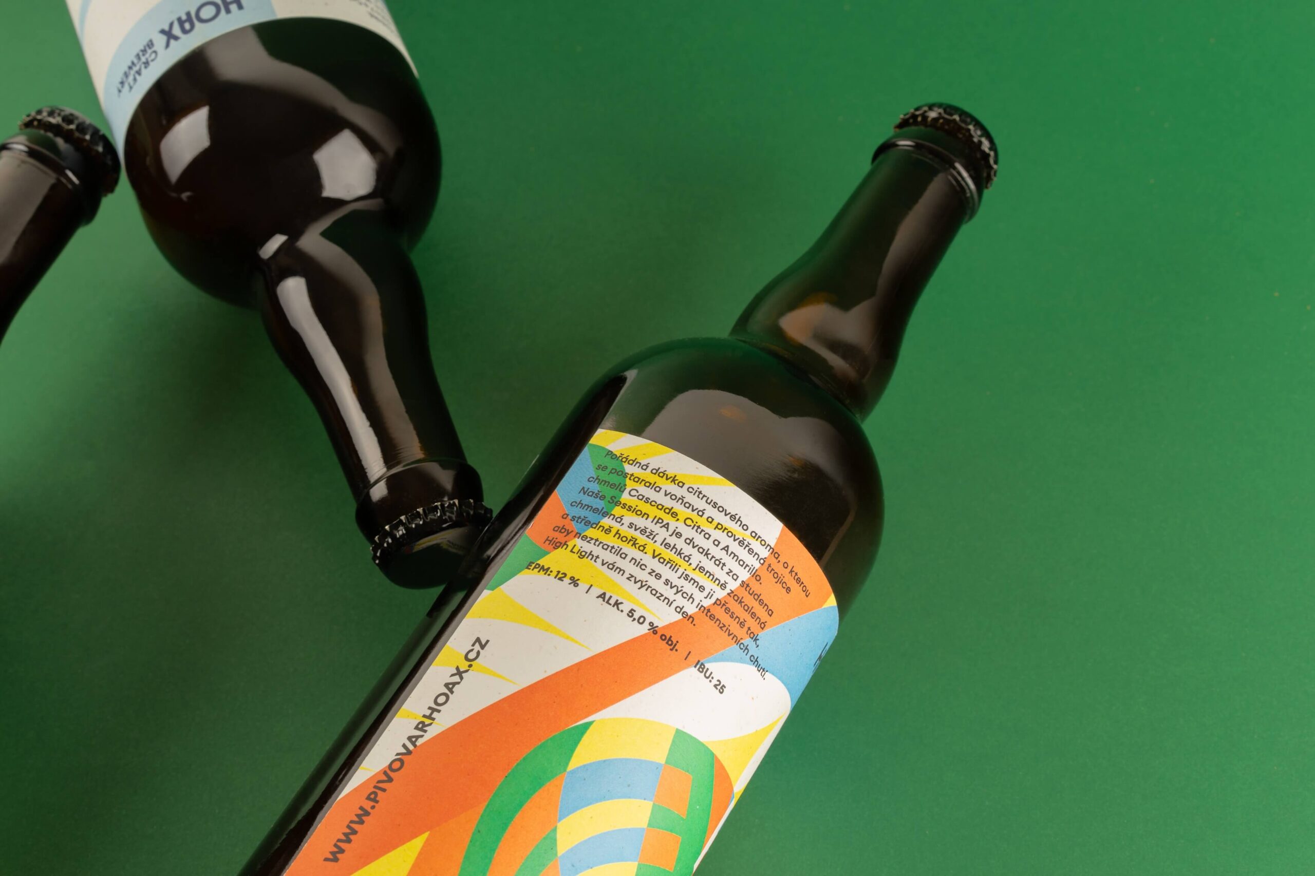
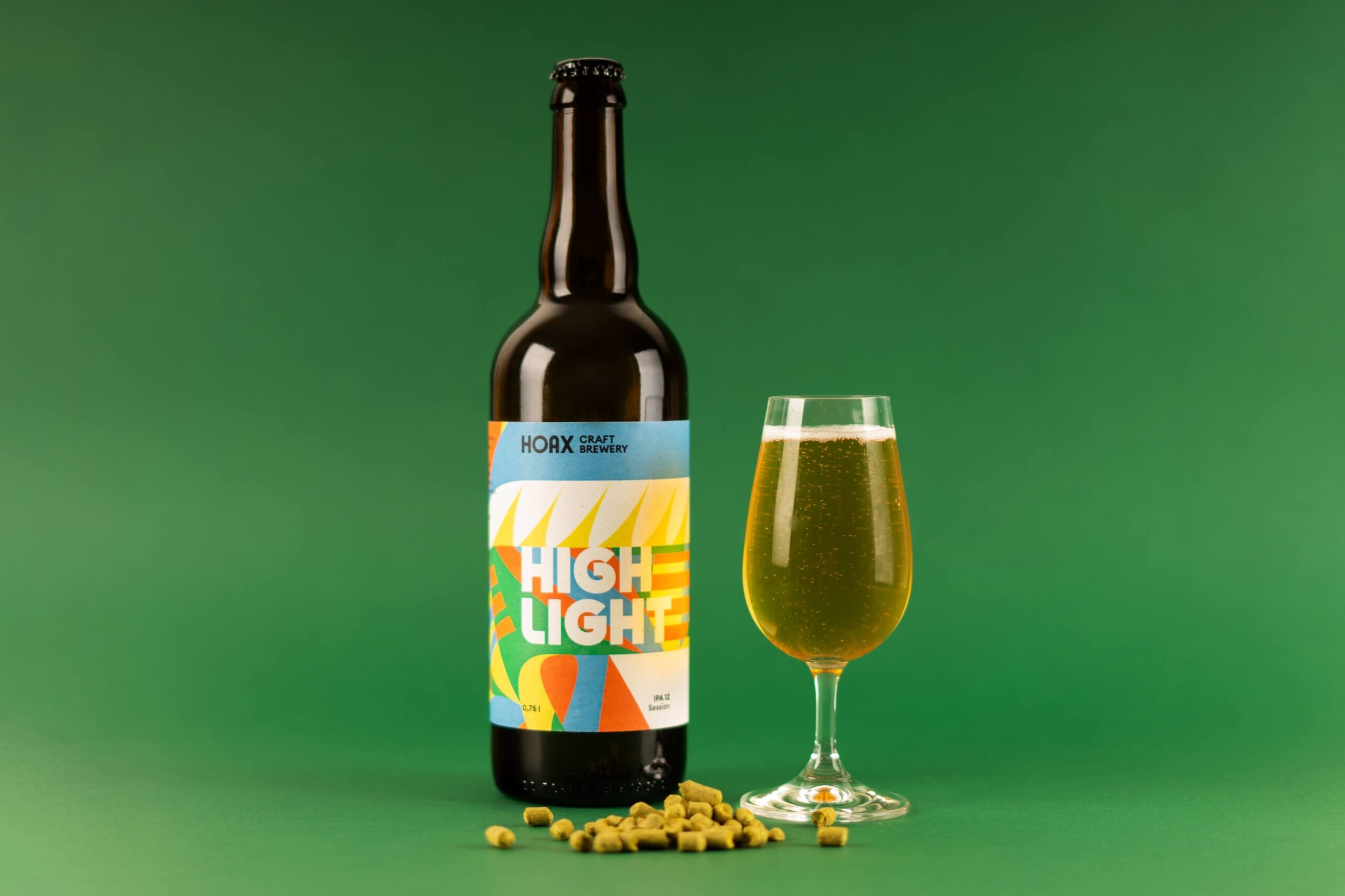
What is definitely not a hoax, though, is the use of a special ecological and recycled paper from the Gmund Bier range, used for the labels and accompanying printed materials (business cards, beer menus, etc.). This material contains a high proportion of waste from the brewing industry, such as spent grain, hops, and malt.
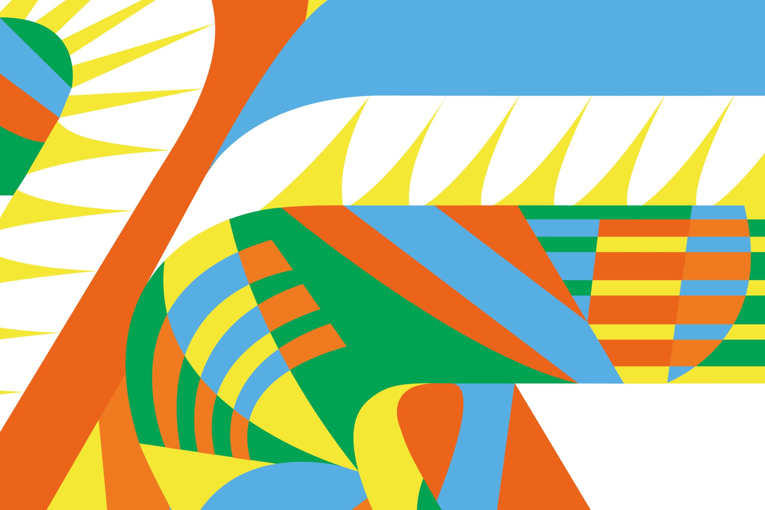
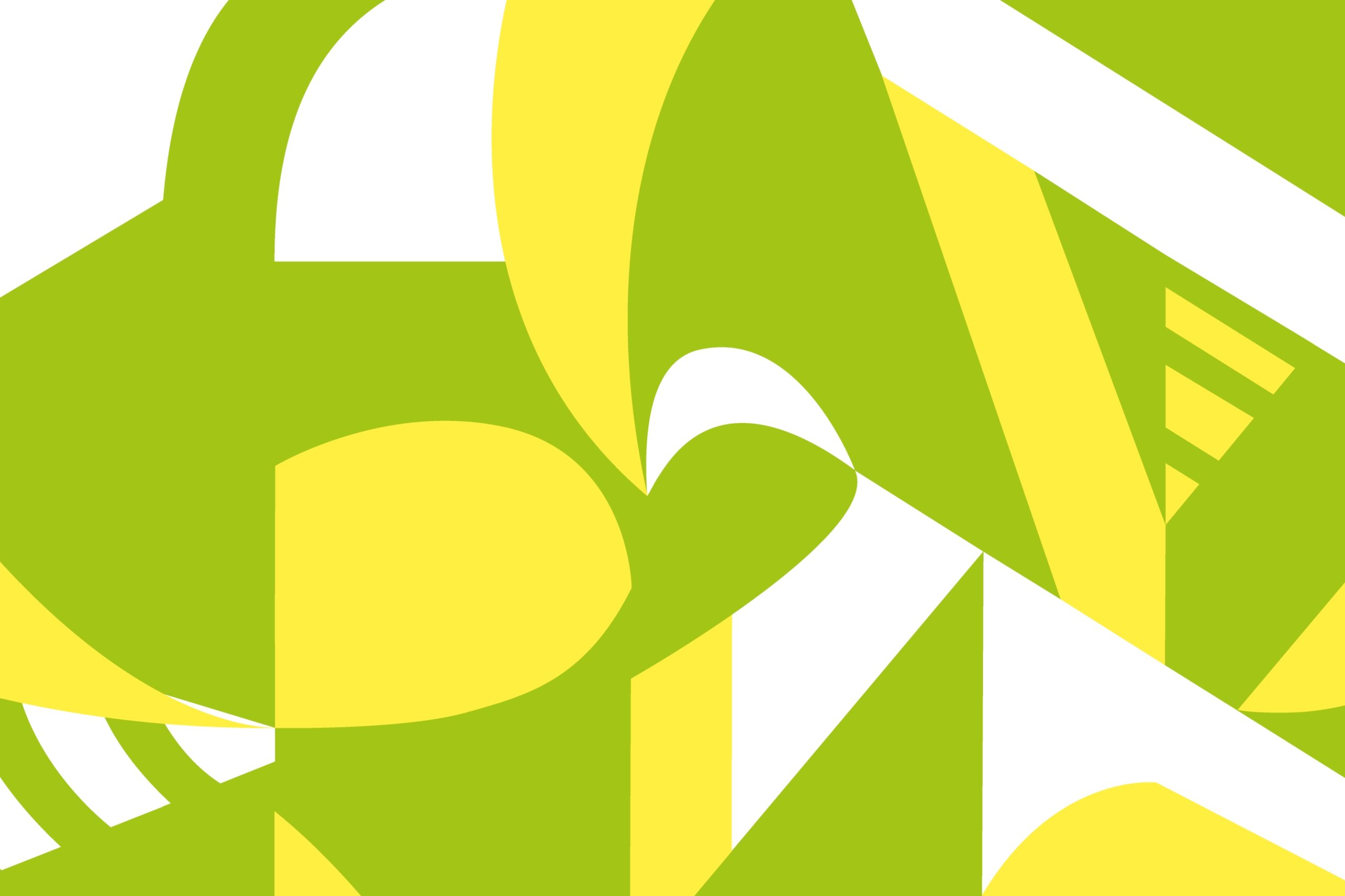
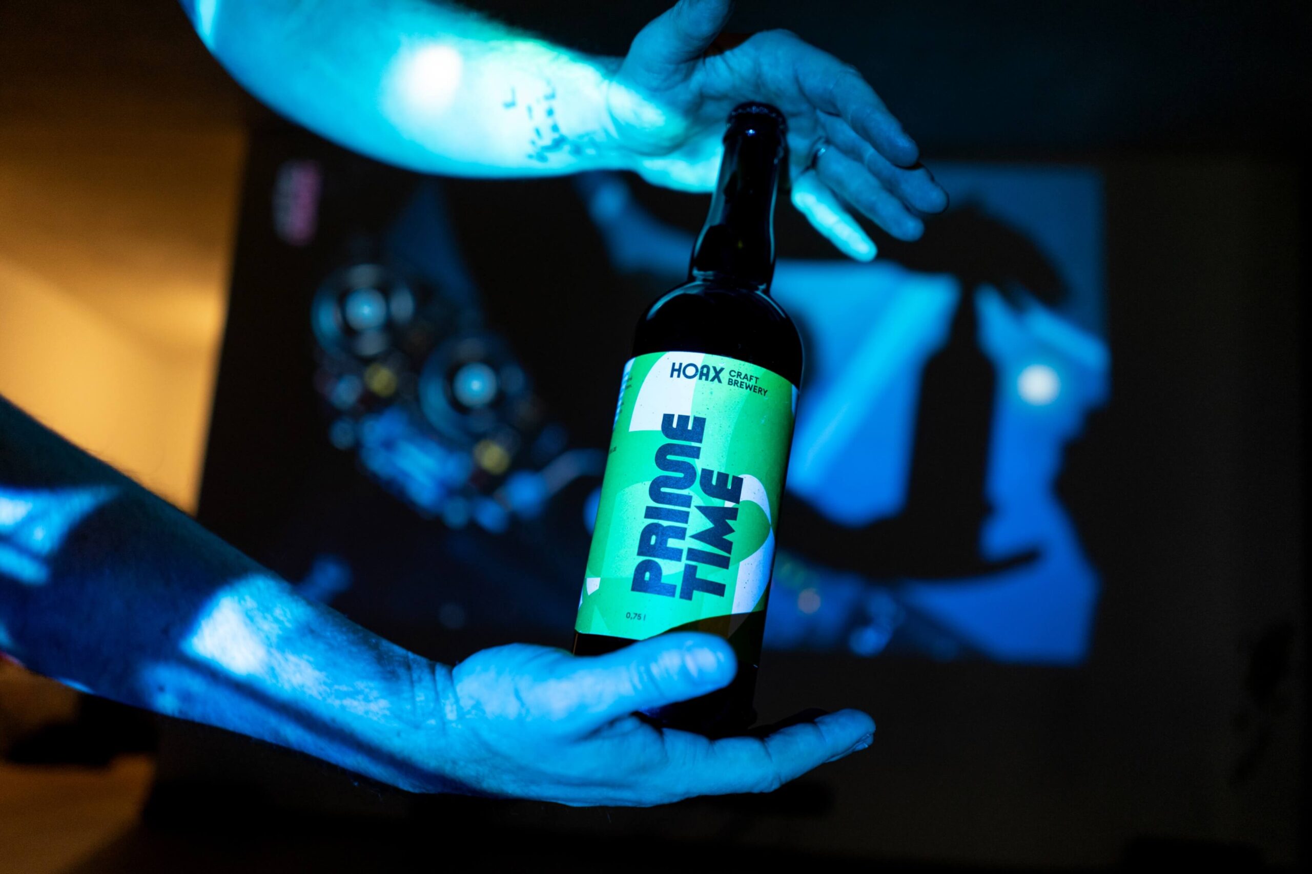
The visual style draws inspiration from illustrative detail and the logic of optical illusions, which adapt to the individual flavors and hop profiles of each product – as well as their color palettes.
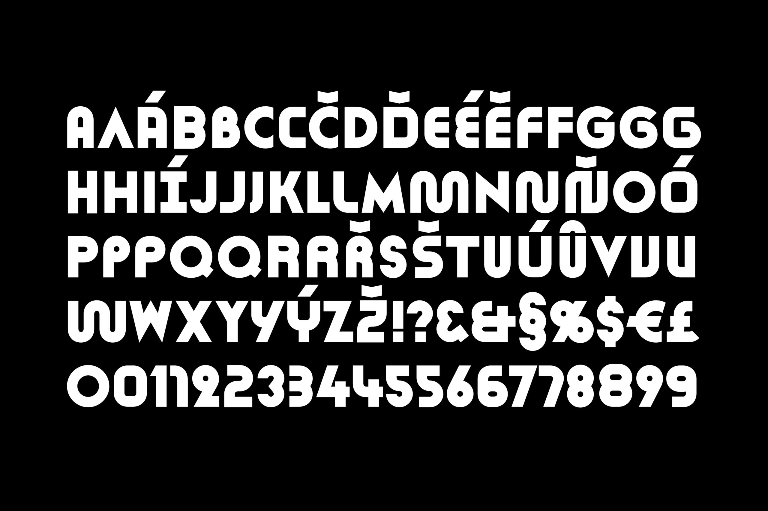
A standout feature of the visual identity is the Retroduktor SOLID typeface by Briefcase Type Foundry. Many of its letters come with contextual alternates, which allow for subtle customization and help enhance the visual expression of each beer’s name.
Initiator/client:
Hoax Craft Brewery
Year:
2022–2024
Design:
Ilja Bazhanov
Tomáš Brychta
Karla Gondeková