Metronome festival Prague 2019
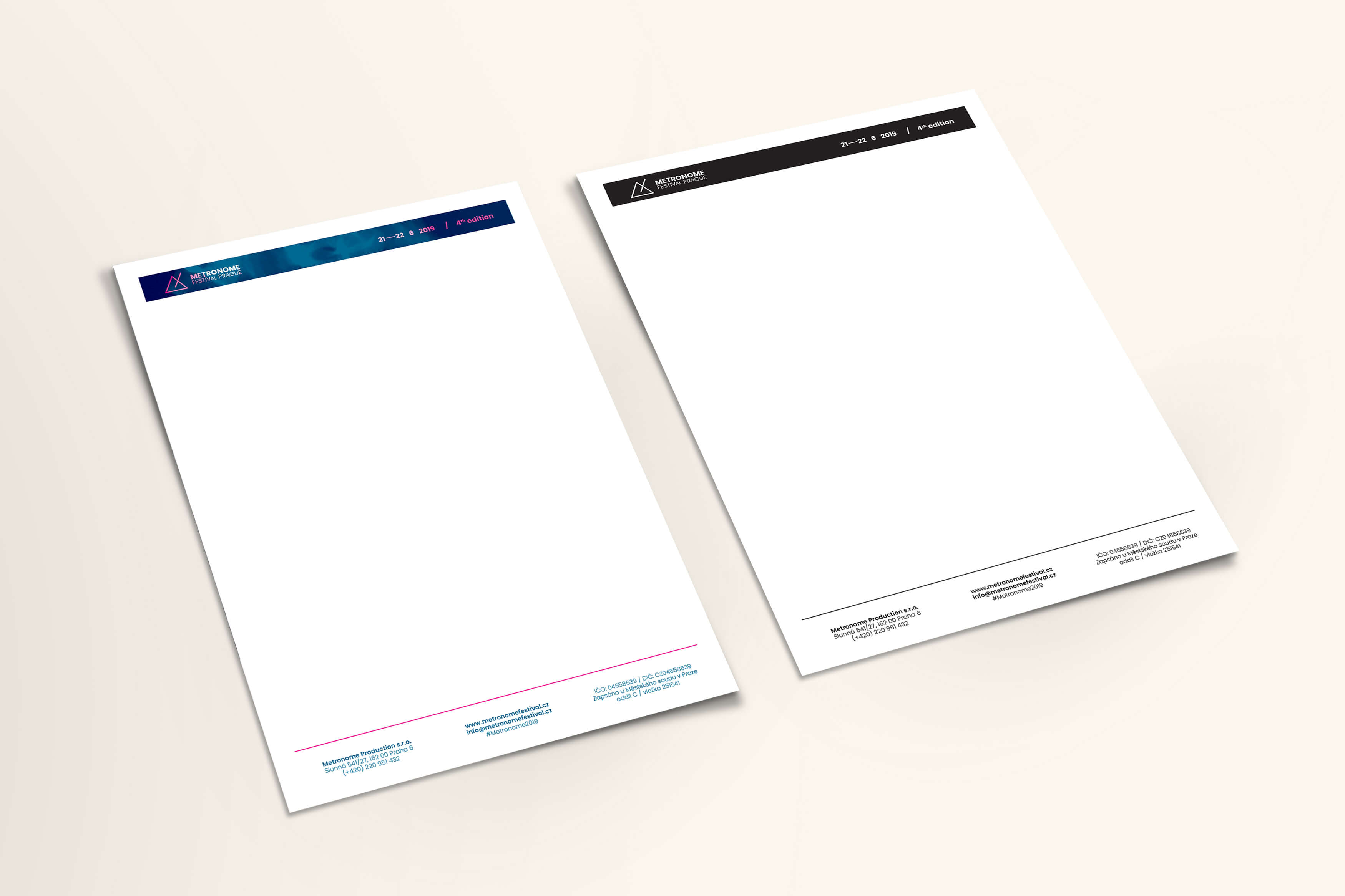
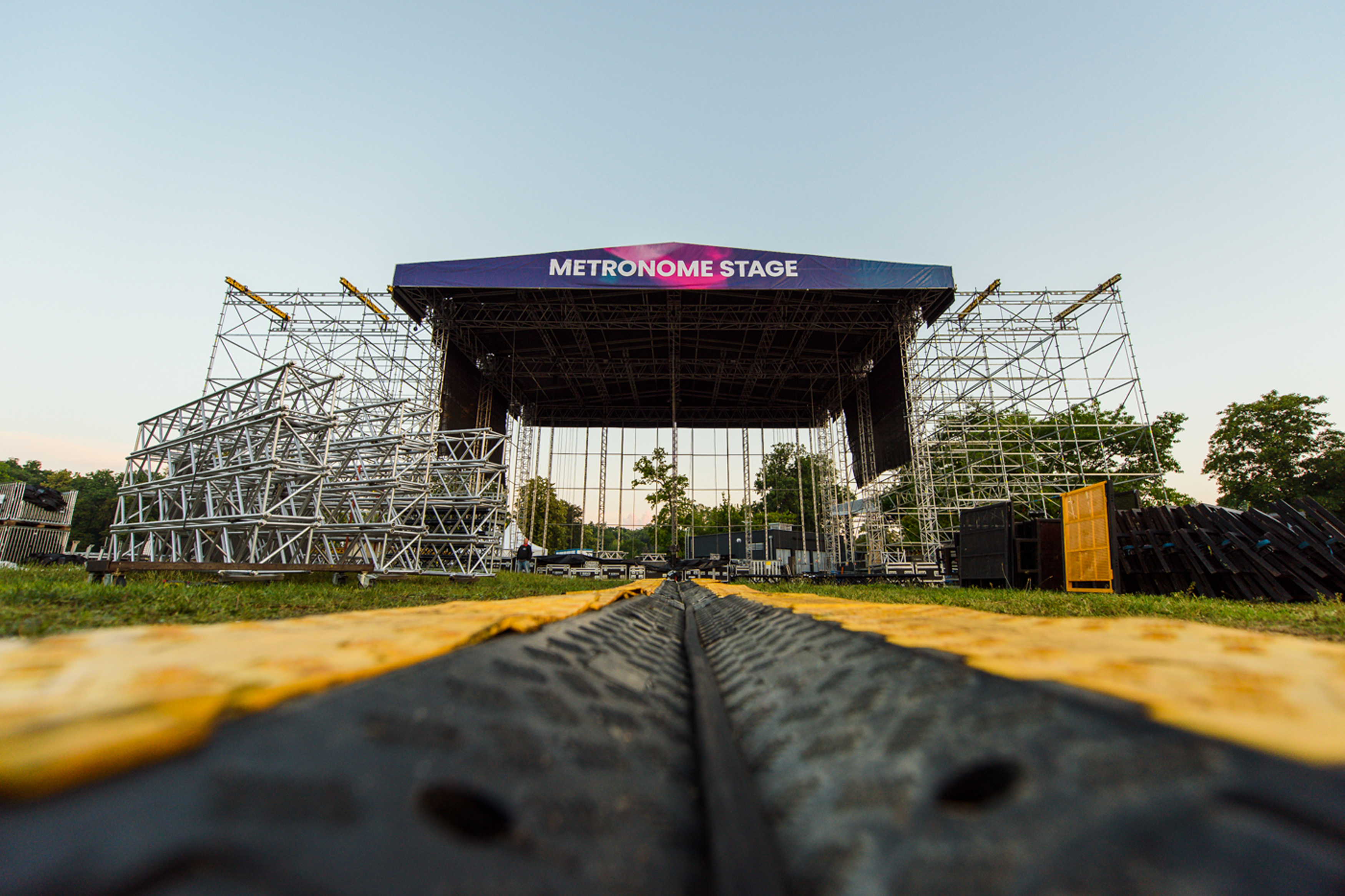
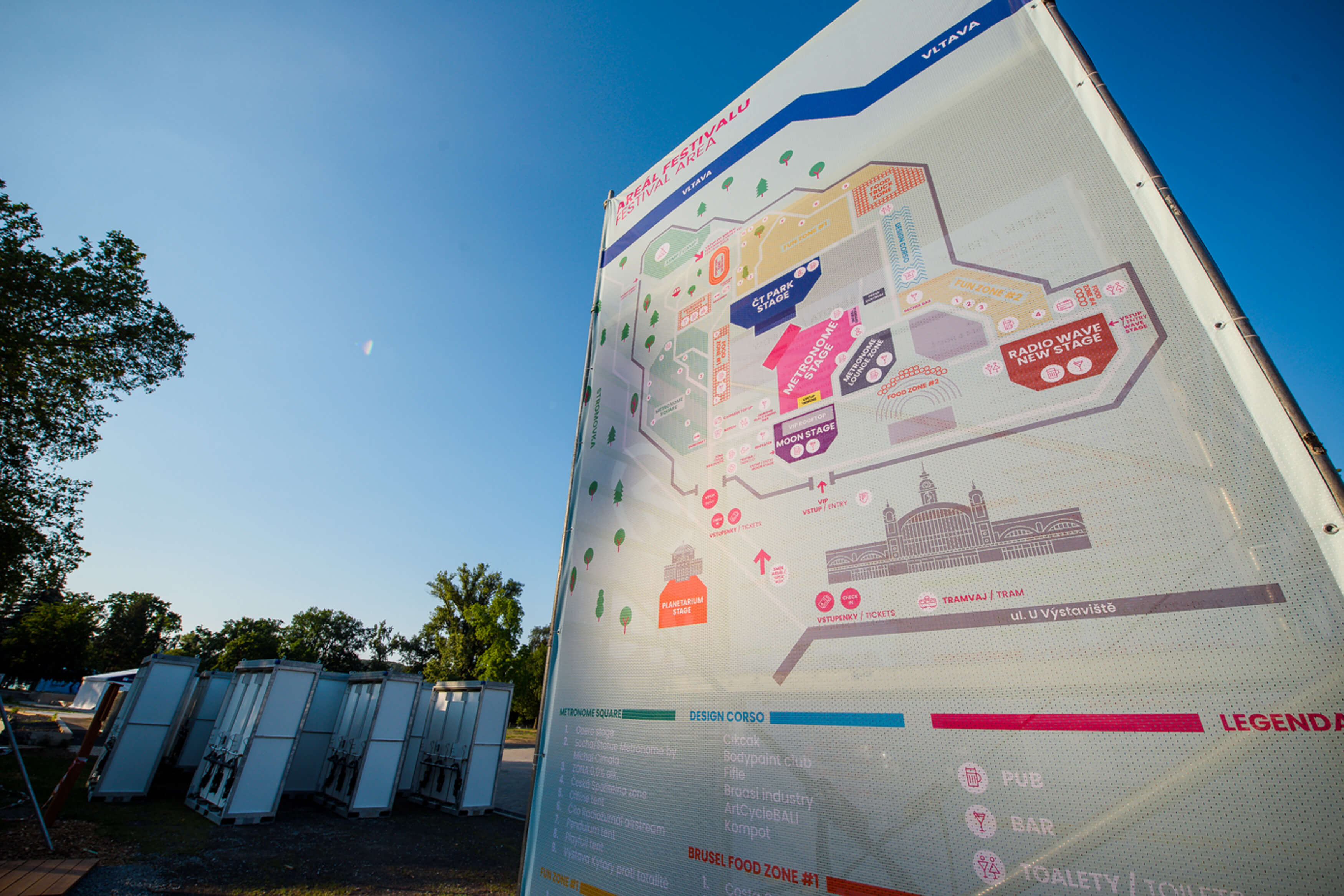
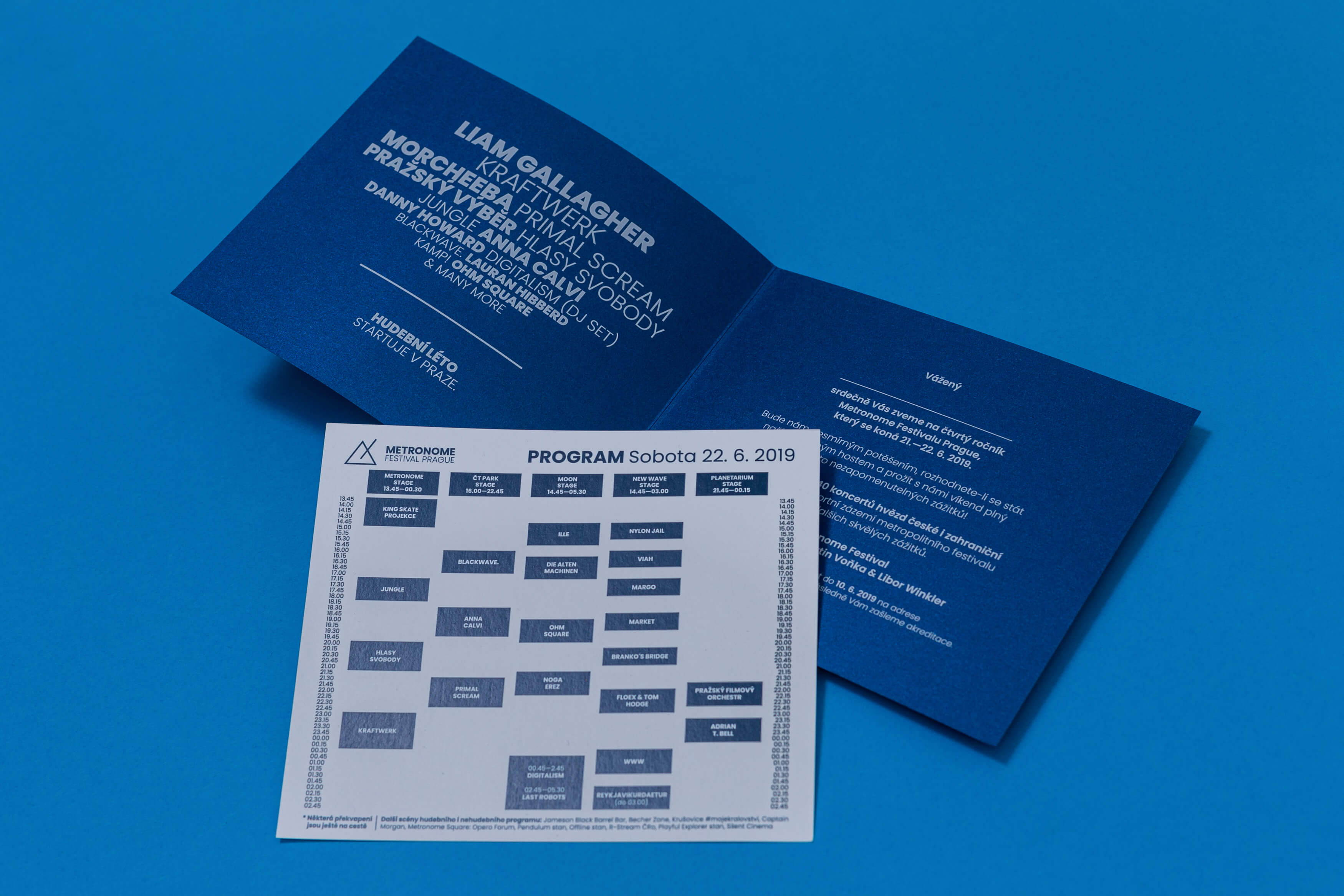
A comprehensive visual identity was developed for the 4th year of the Metronome Festival Prague music event, based on the use of a two-color, pink-blue filter. This is an abstract photography that combines the shape of a triangle, adapting the festival logo, the structure of water surface, symbolizing the Vltava river, and light evoking the summer mood, which is an integral part of the festival. The filter was applied to create most of the output, integrating the visual identity. To design the festival guidance system was part of the task: festival map and a set of pictograms, used in the festival area, on its website and in online communication.
The festival logo was redesigned. There was a change in the typeface, which showed in all other outputs, and a slight reshaping of the graphic symbol of the Prague Metronome.
IniTIATOR/Client:
Metronome festival Prague
Year:
2018–2019
Design:
Sára Bergmannová
Karla Gondeková
Tomáš Brychta
Jan Buchtela