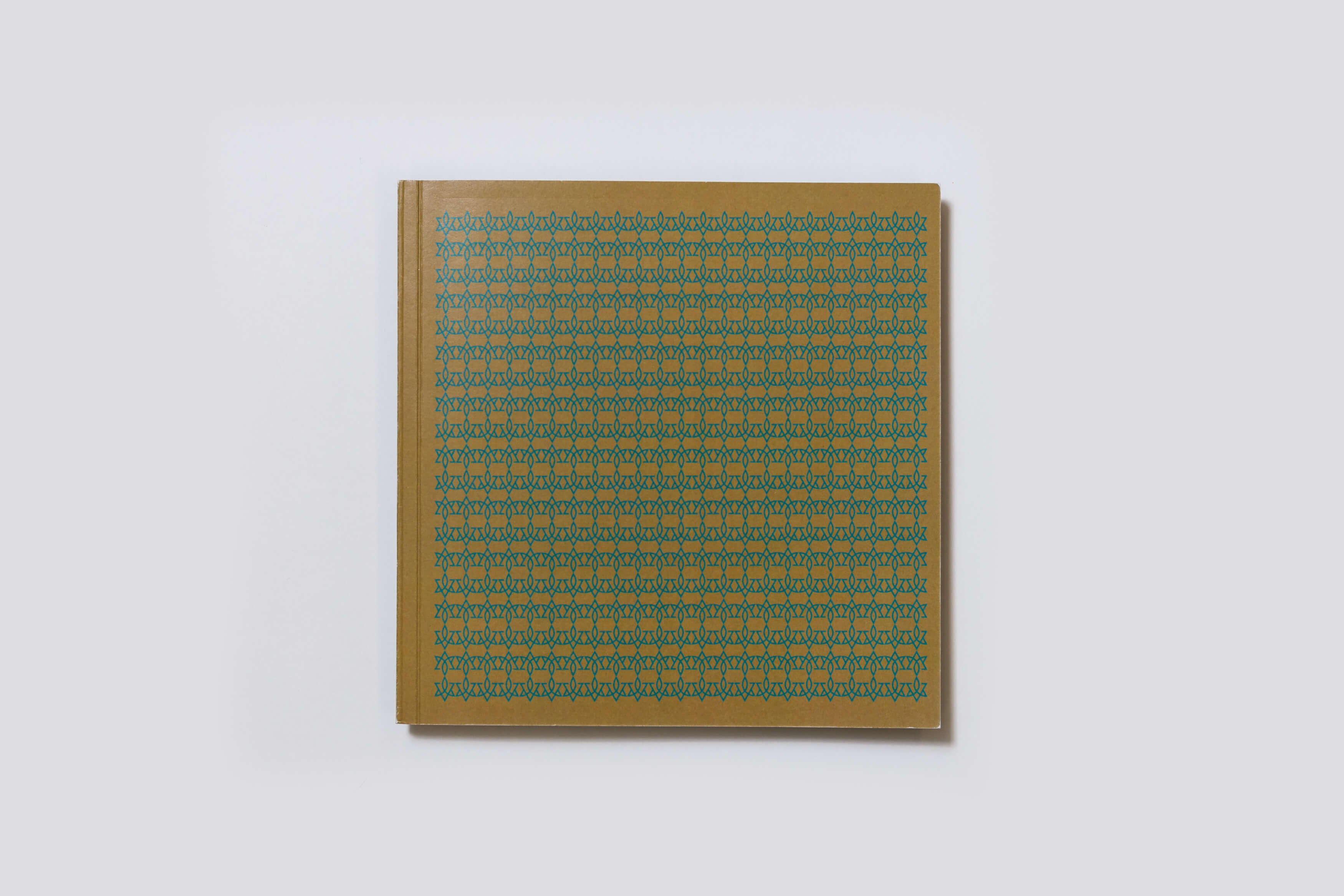
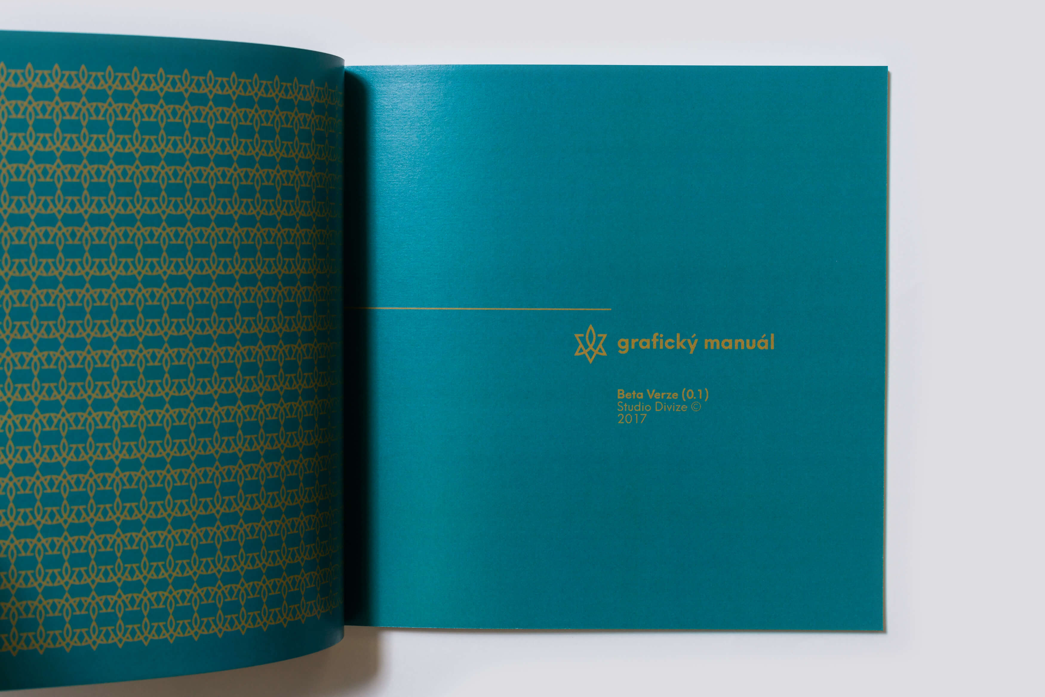
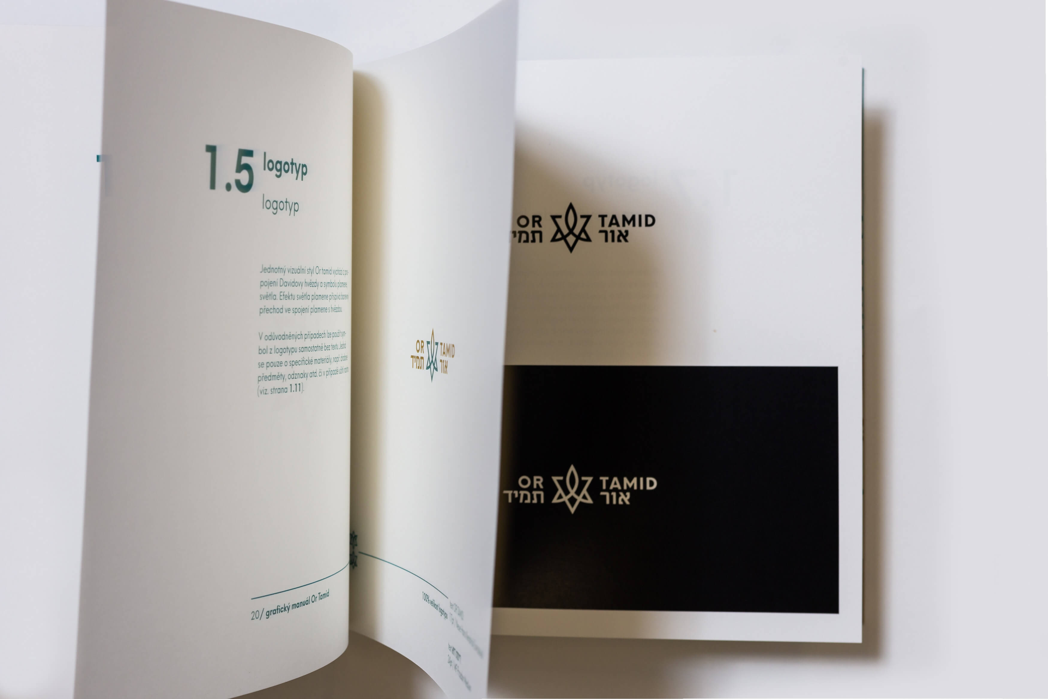
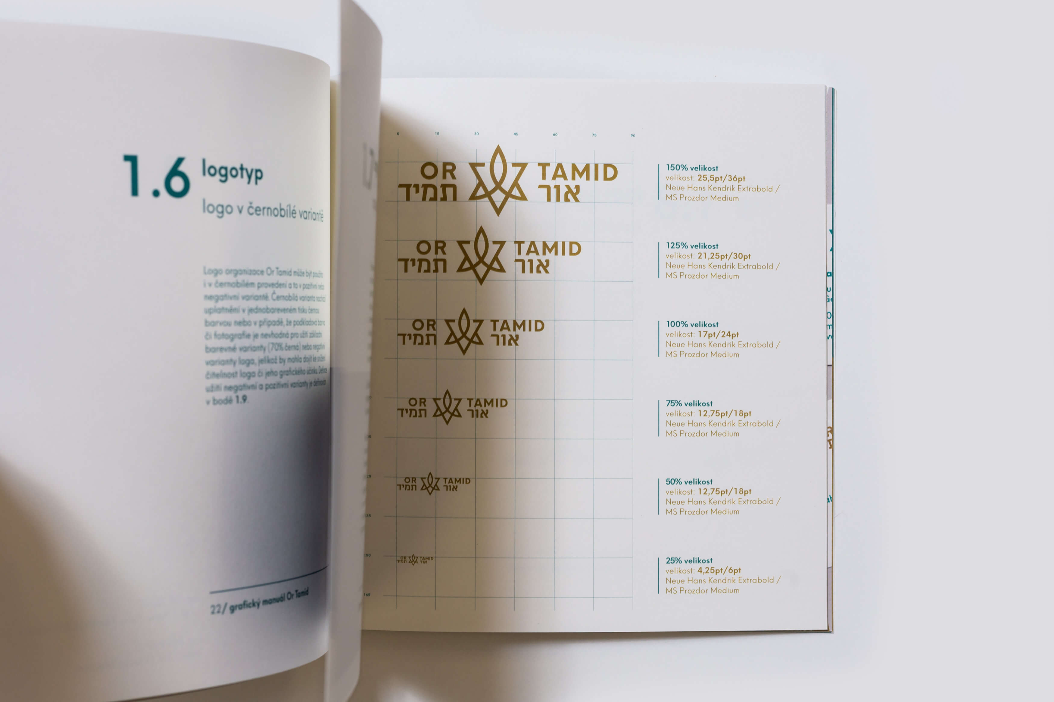
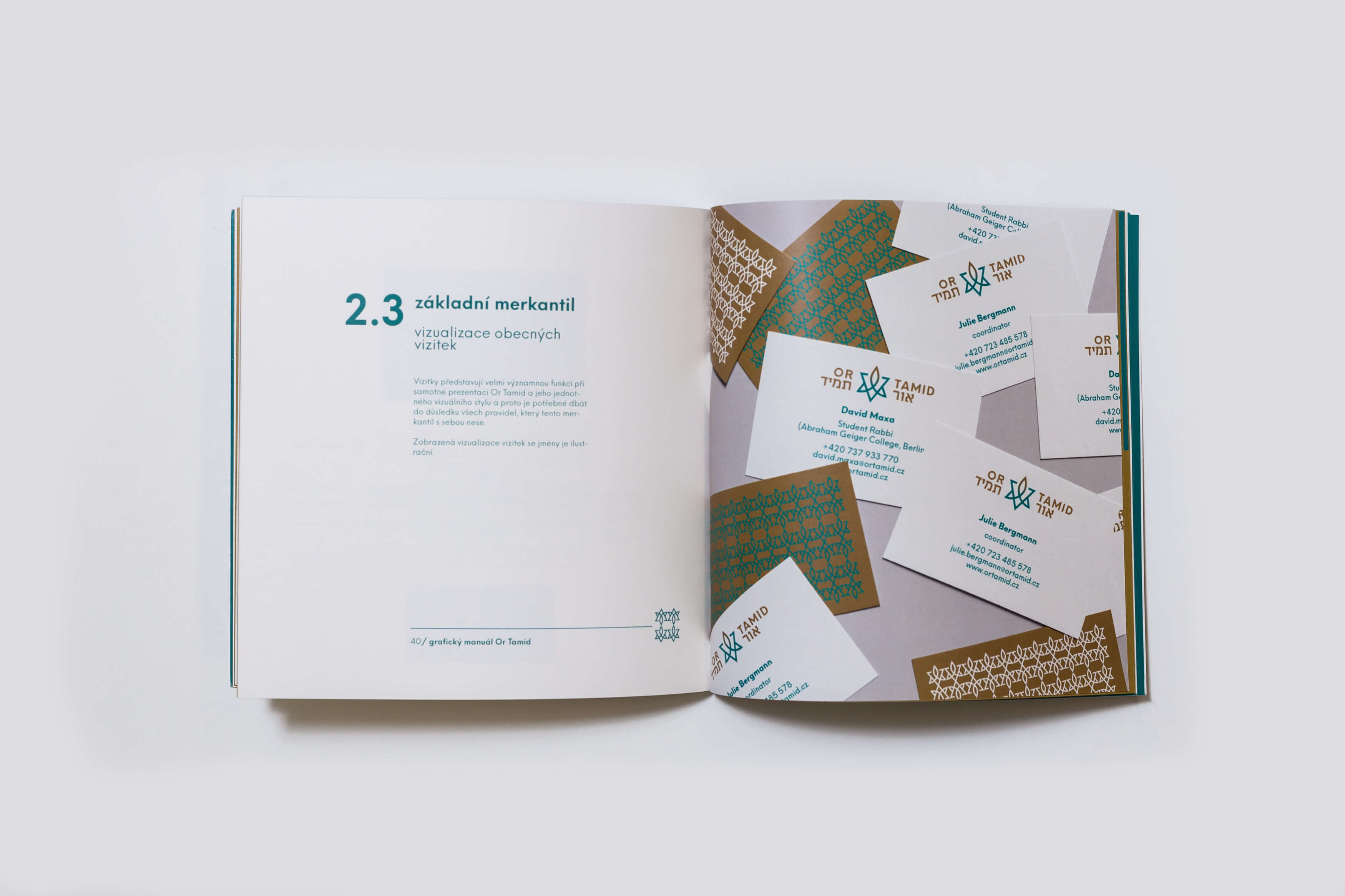
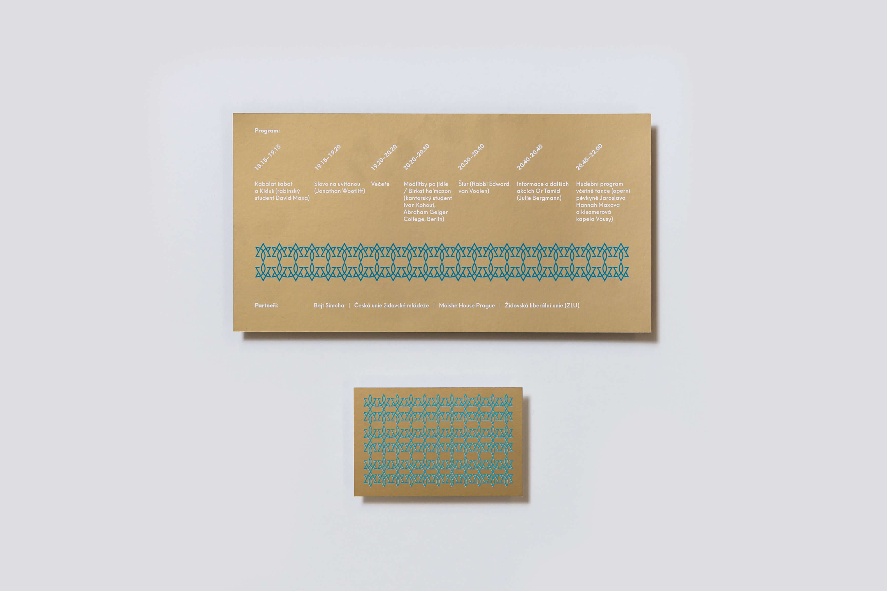
The visual identity made for citizens’ initiative Or Tamid uses the symbols of Star of David and a flame in which transforms its upper point. The name of the initiative refers to tradition of Jewish worship in Czech, held at the end of the 19th century by the Or Tomid Society in Prague. The visual style combines gold and petrol blue color. Repeating and linking together the logo creates a pattern which is applied to most outputs. The task was to design a graphic manual of visual identity, stationery pack, banners, posters, invitations and other accompanying prints.
Initiator/Client:
Julie Bergmann
Year:
2017
Design:
Karla Gondeková
Sára Bergmannová
Tomáš Brychta