Raventic
Shopping in Home & Decor is a visual experience. Customers primarily make decisions based on the appearance of a product, and the tech start-up Raventic enables them to search for solutions based on what they like, without wasting time endlessly scrolling through categories or other e-shops. Raventic's goal is to improve the overall user experience and help its partners achieve their business objectives.
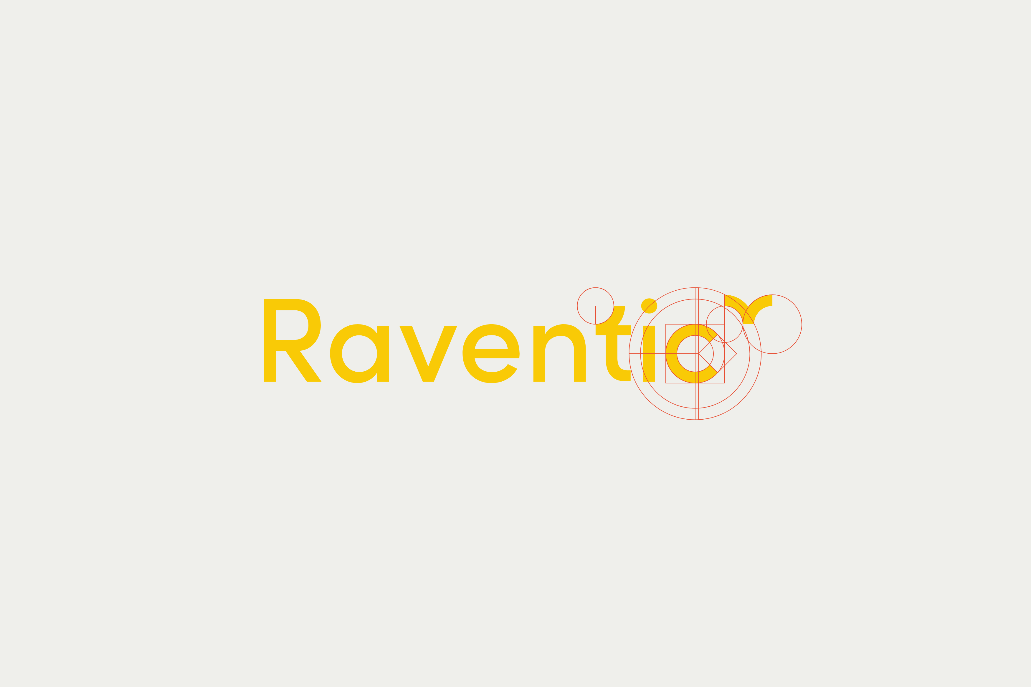
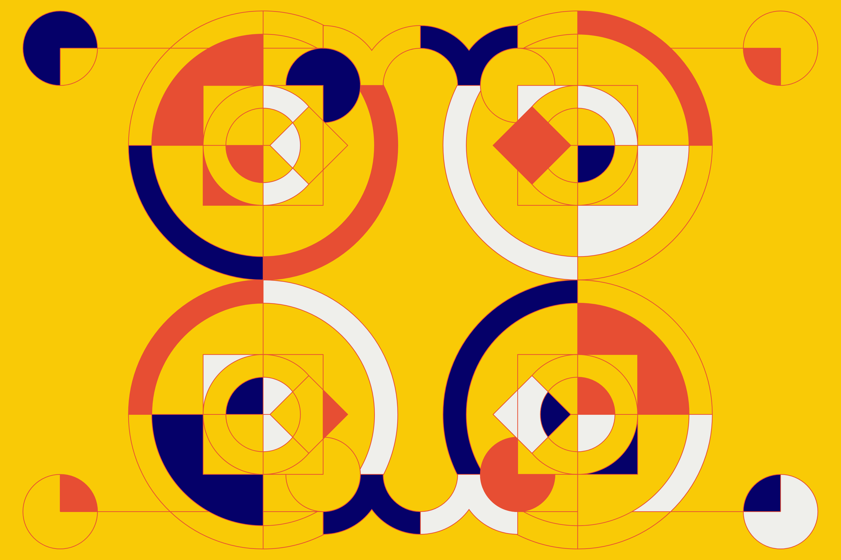
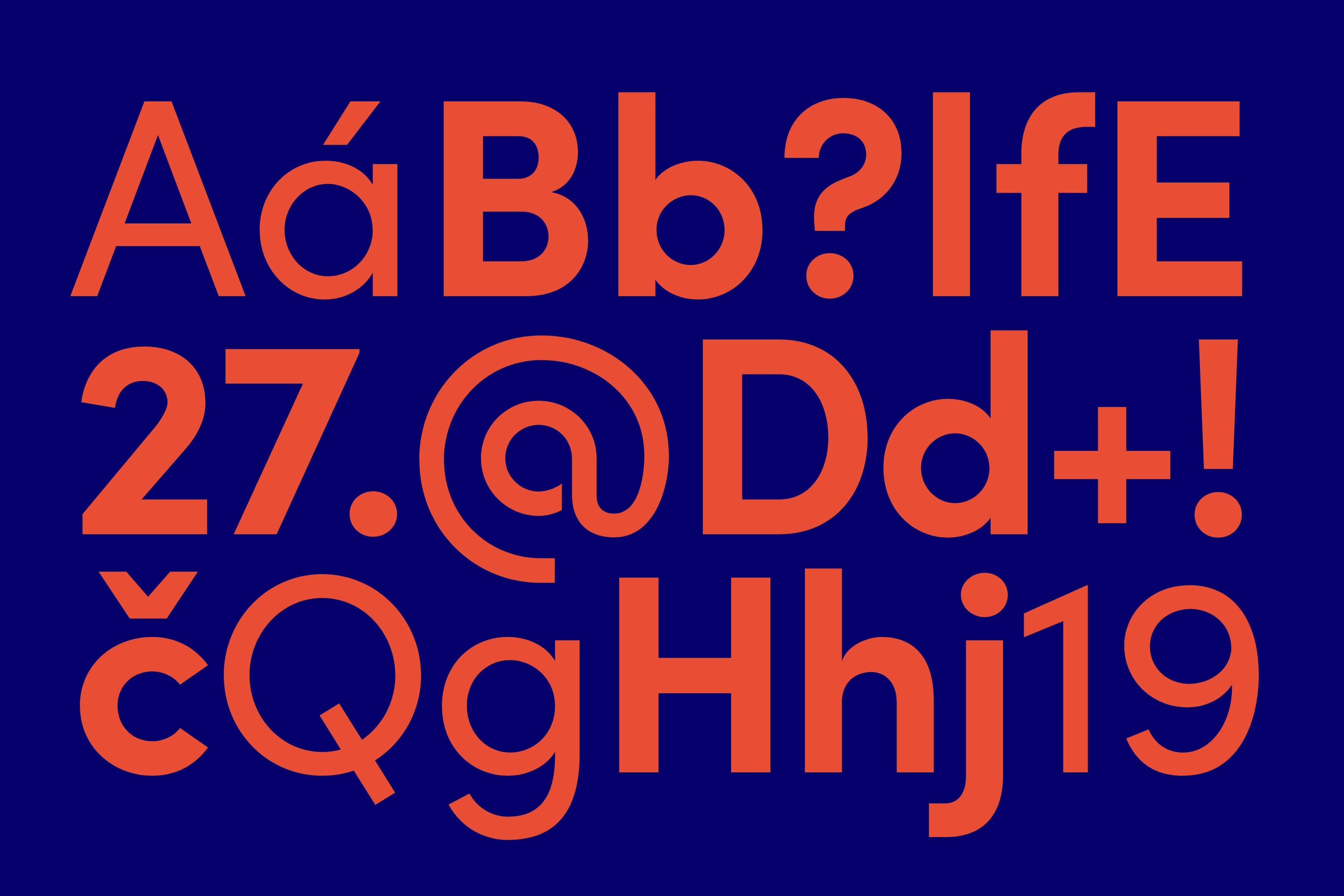
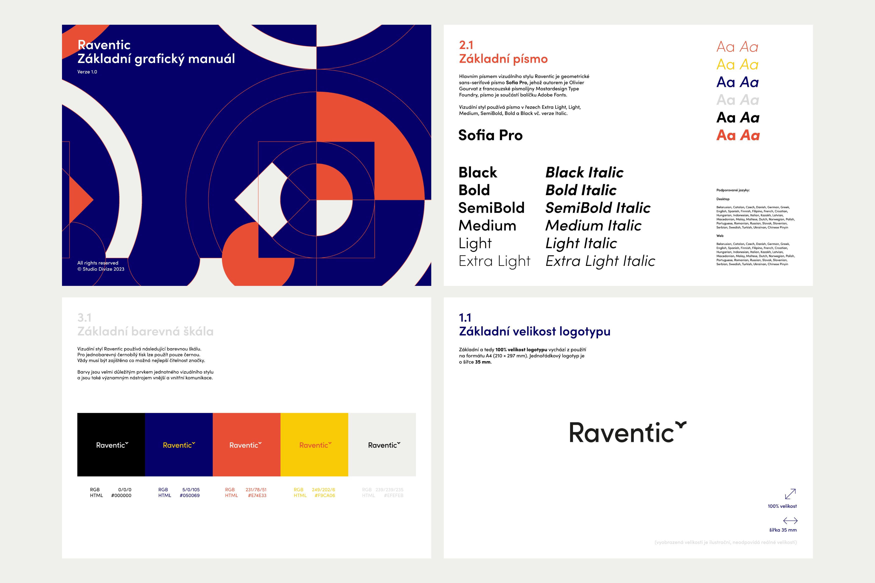
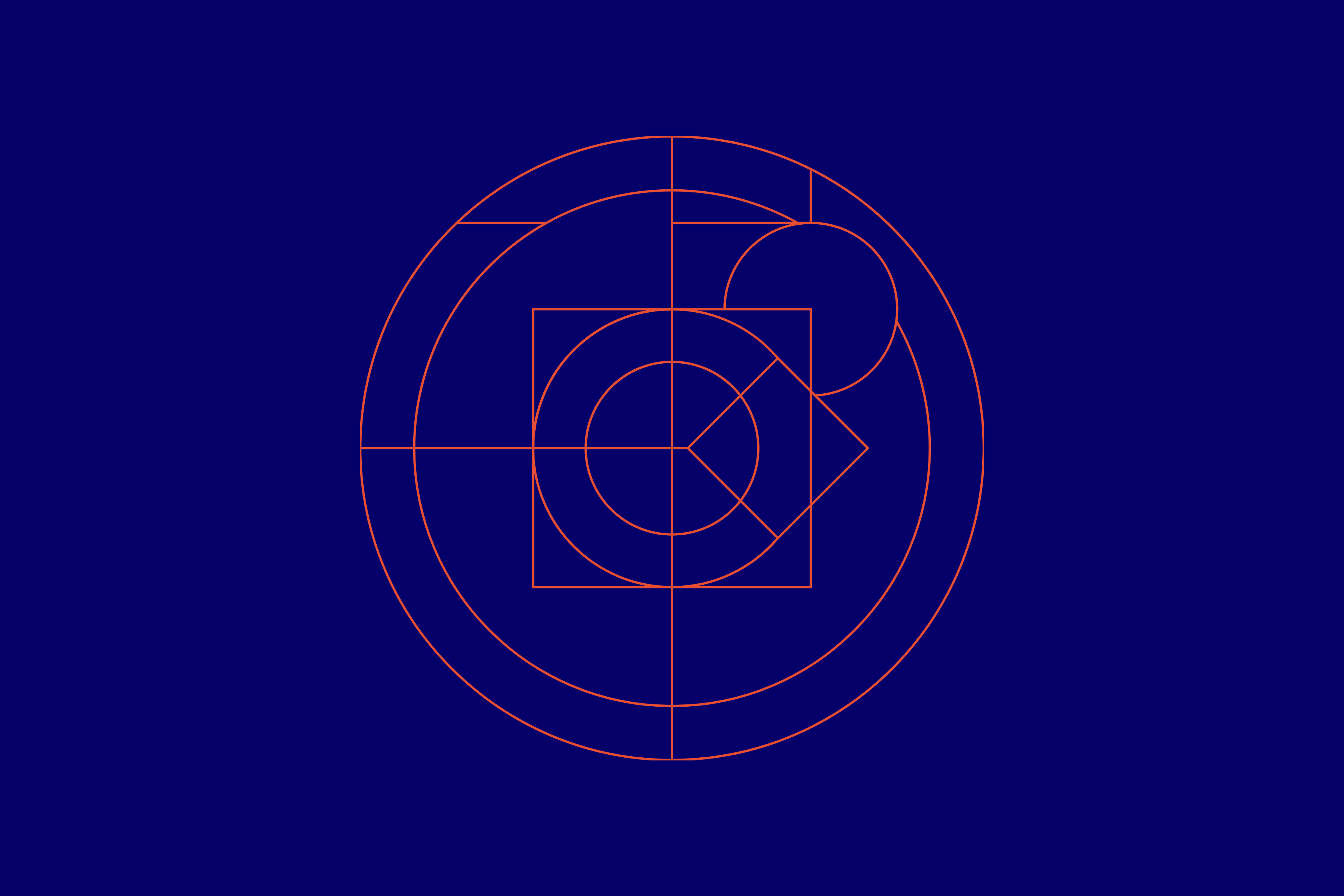
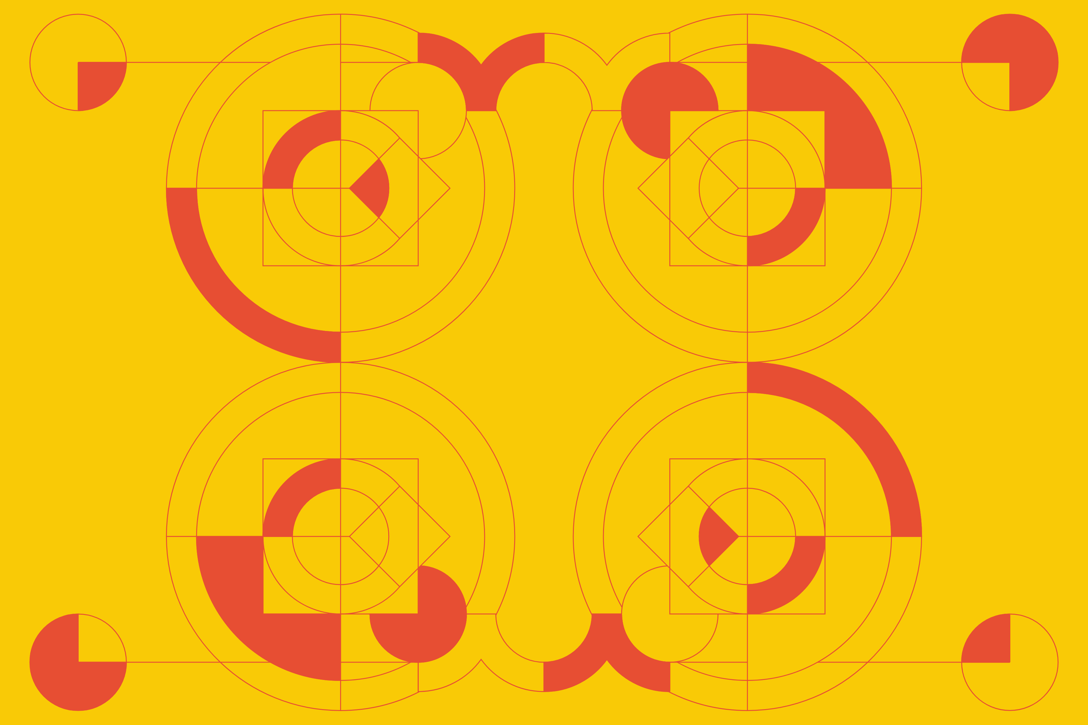
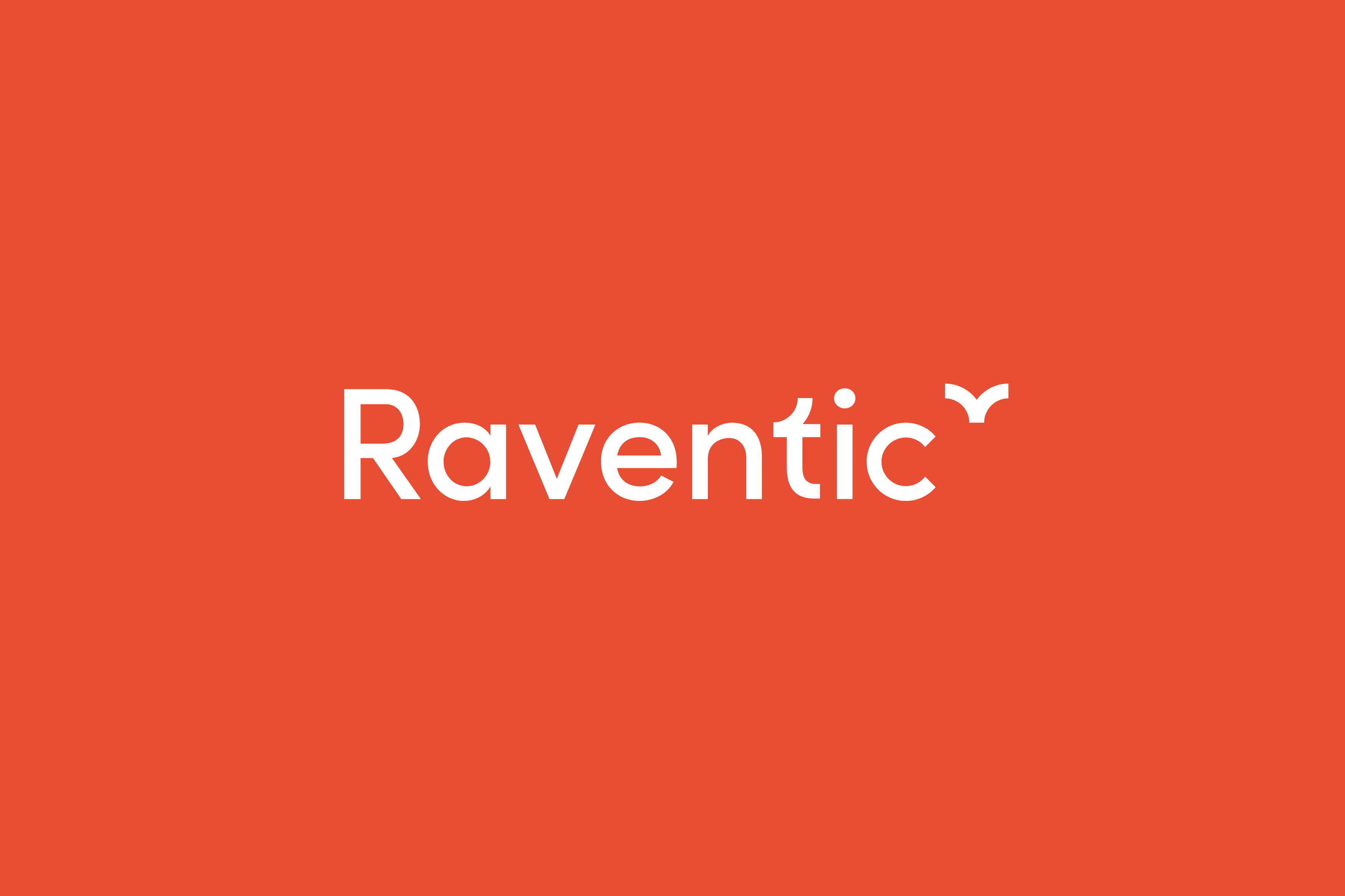
The name "Raventic" itself contains not only the word raven, which has become one of the brand's identity elements, but also references the attributes of one of the houses from J. K. Rowling’s fantasy saga – intelligence, wisdom, wit, intellectual ability, and creativity. The core design element is a simple geometric shape: the circle. The letter “c” is constructed from a circle, as is the terminal of the letter “t.” The accompanying graphic symbol, positioned as a superscript, mirrors the imaginary lines of the circle, creating a compact and confident brand that transcends its boundaries. The client’s requirement was to use an open-source typeface, which ultimately became the geometric sans-serif Sofia Pro, used both in the logotype and for setting other texts.
Initiator/client:
Raventic
Year:
2023
Design:
Karla Gondeková
Tomáš Brychta