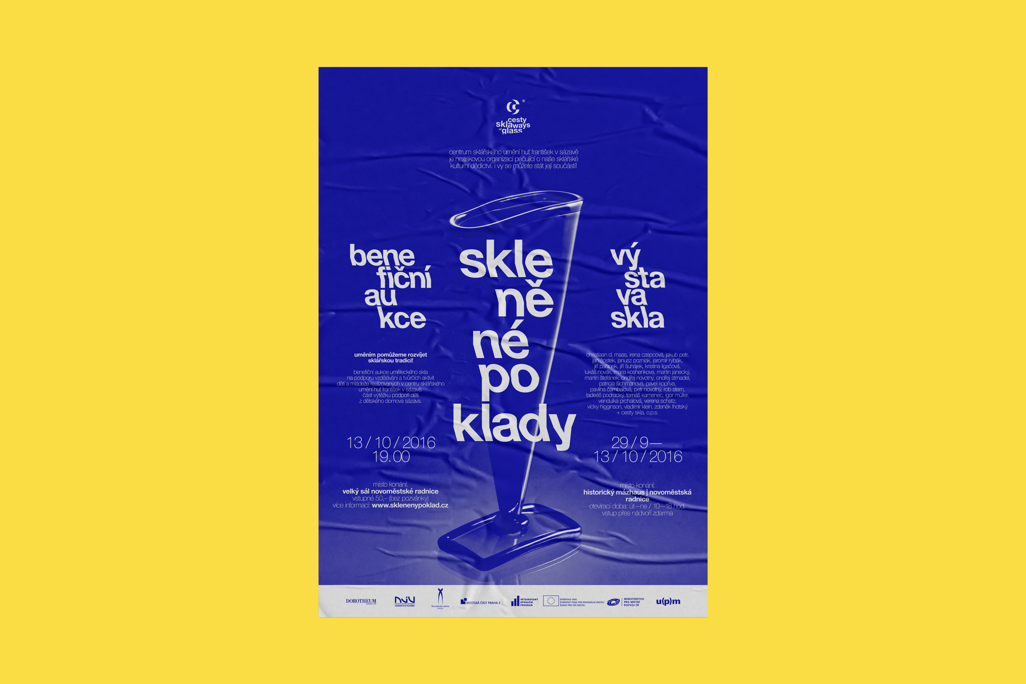
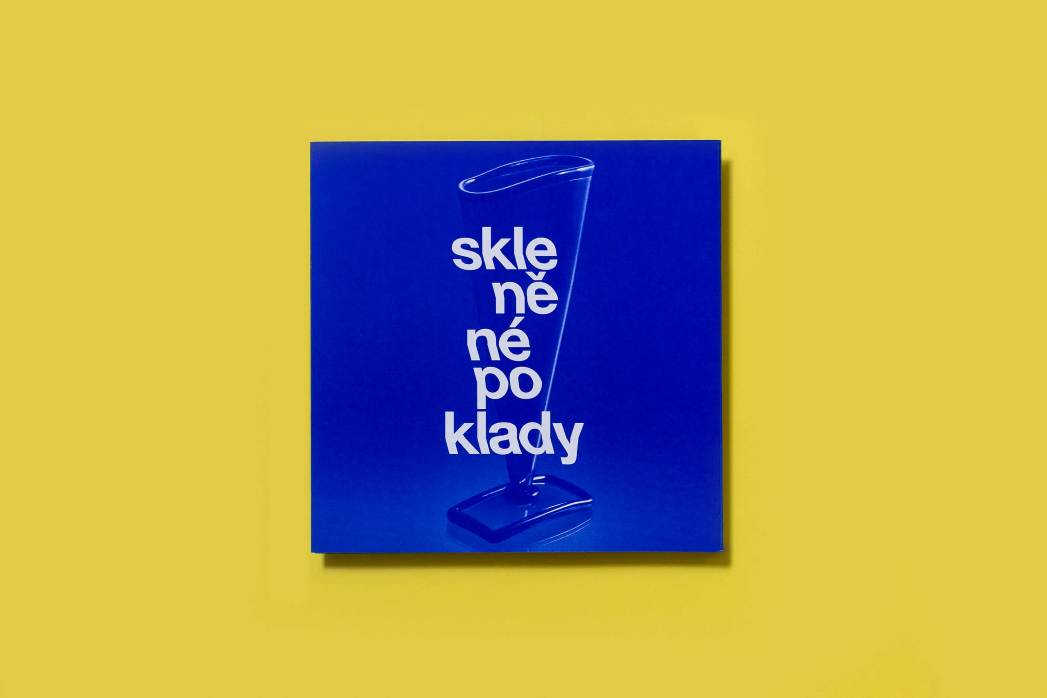
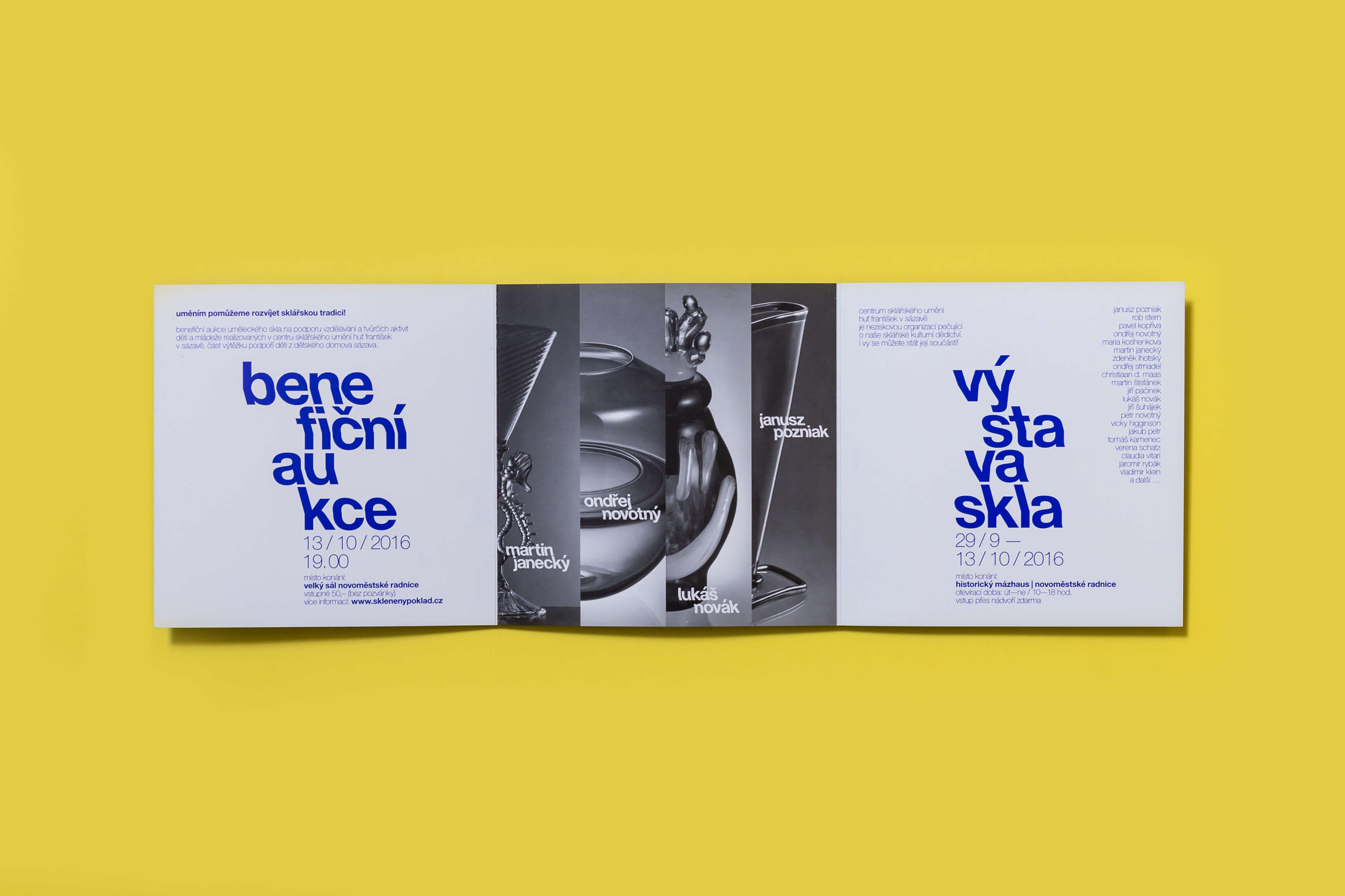
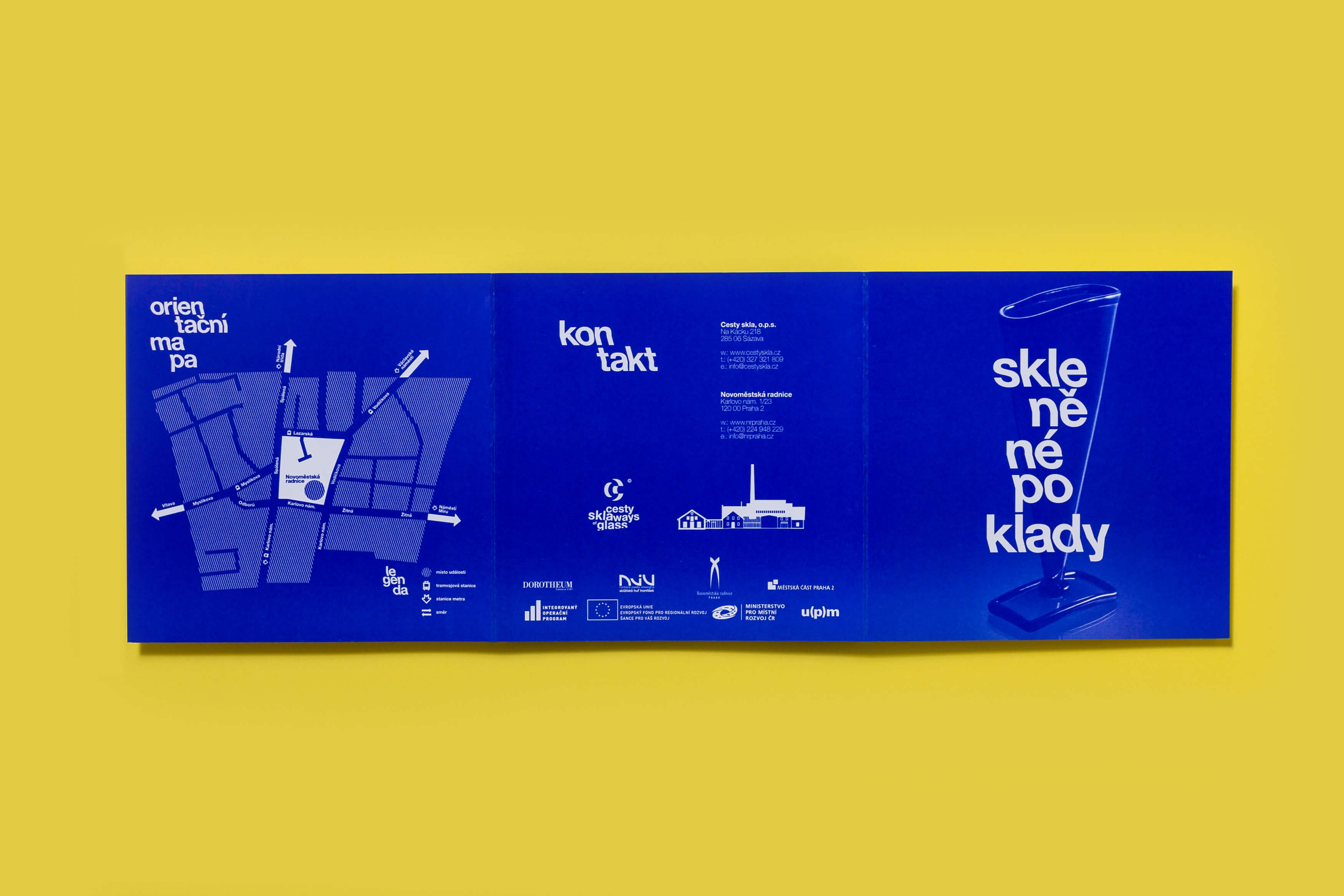
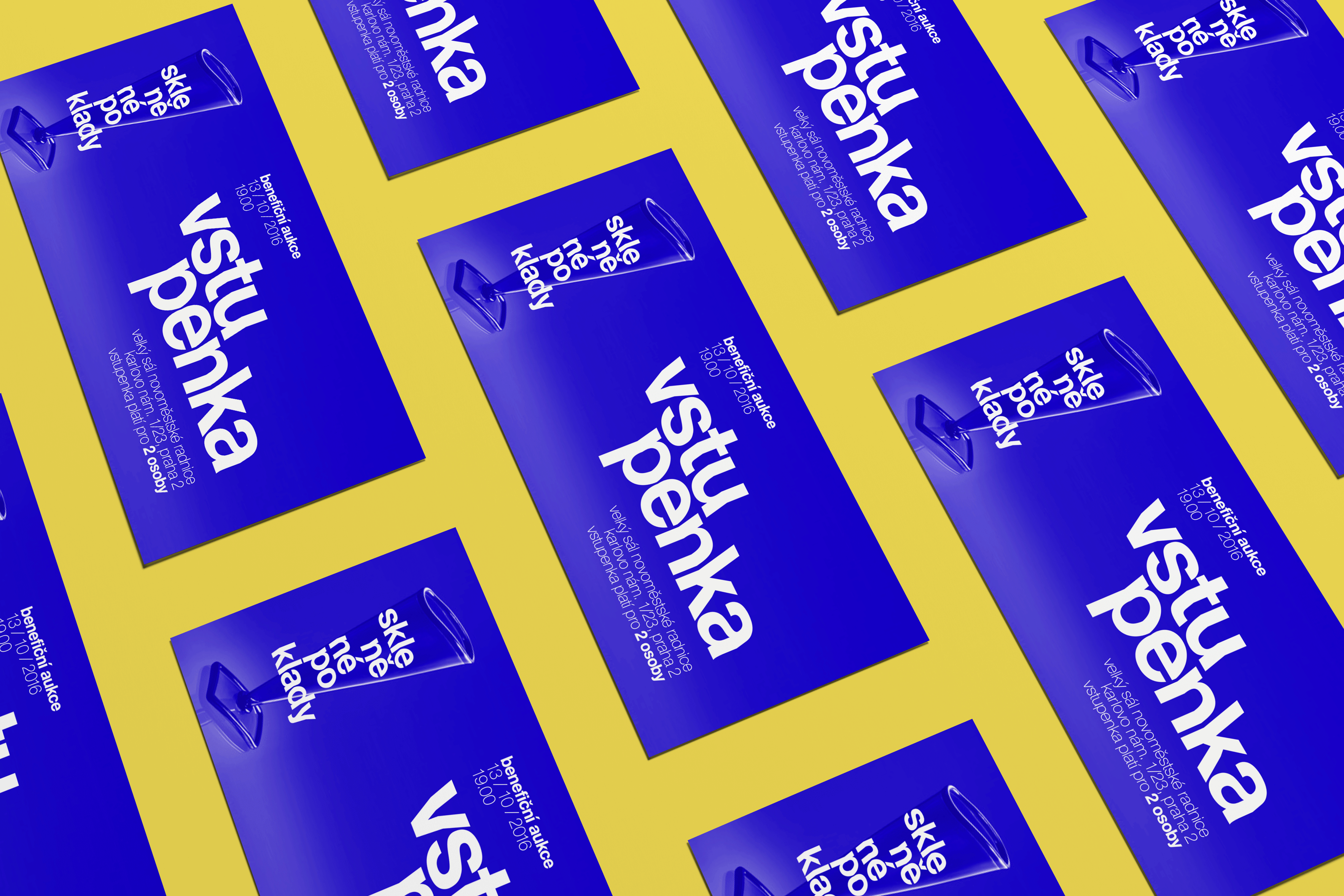
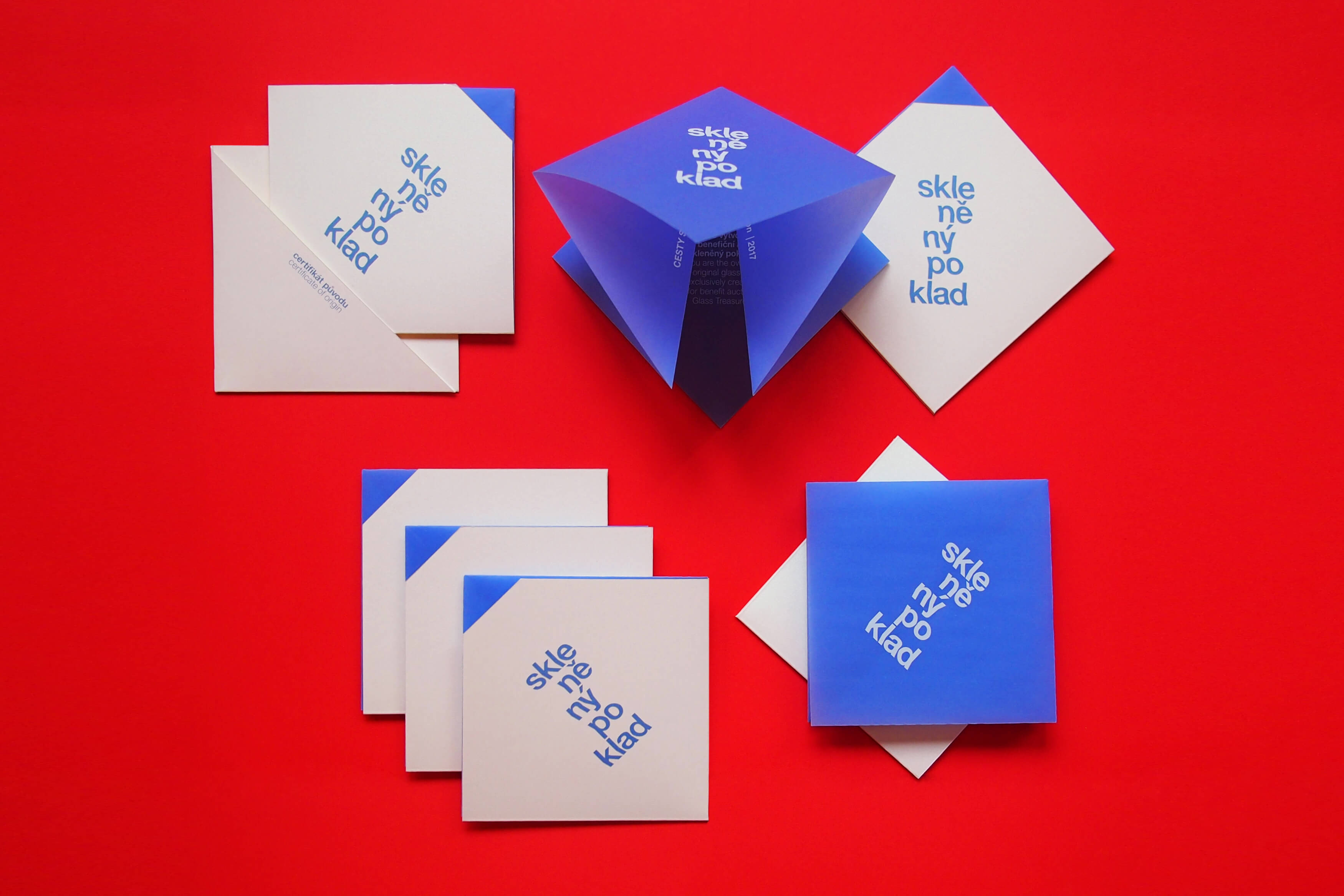
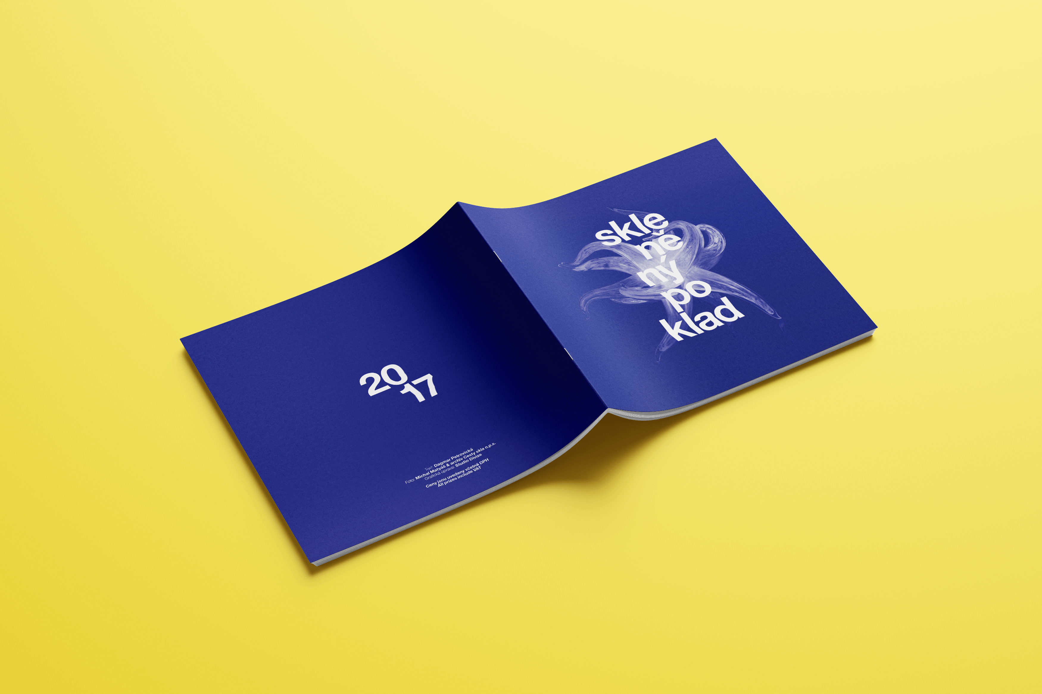
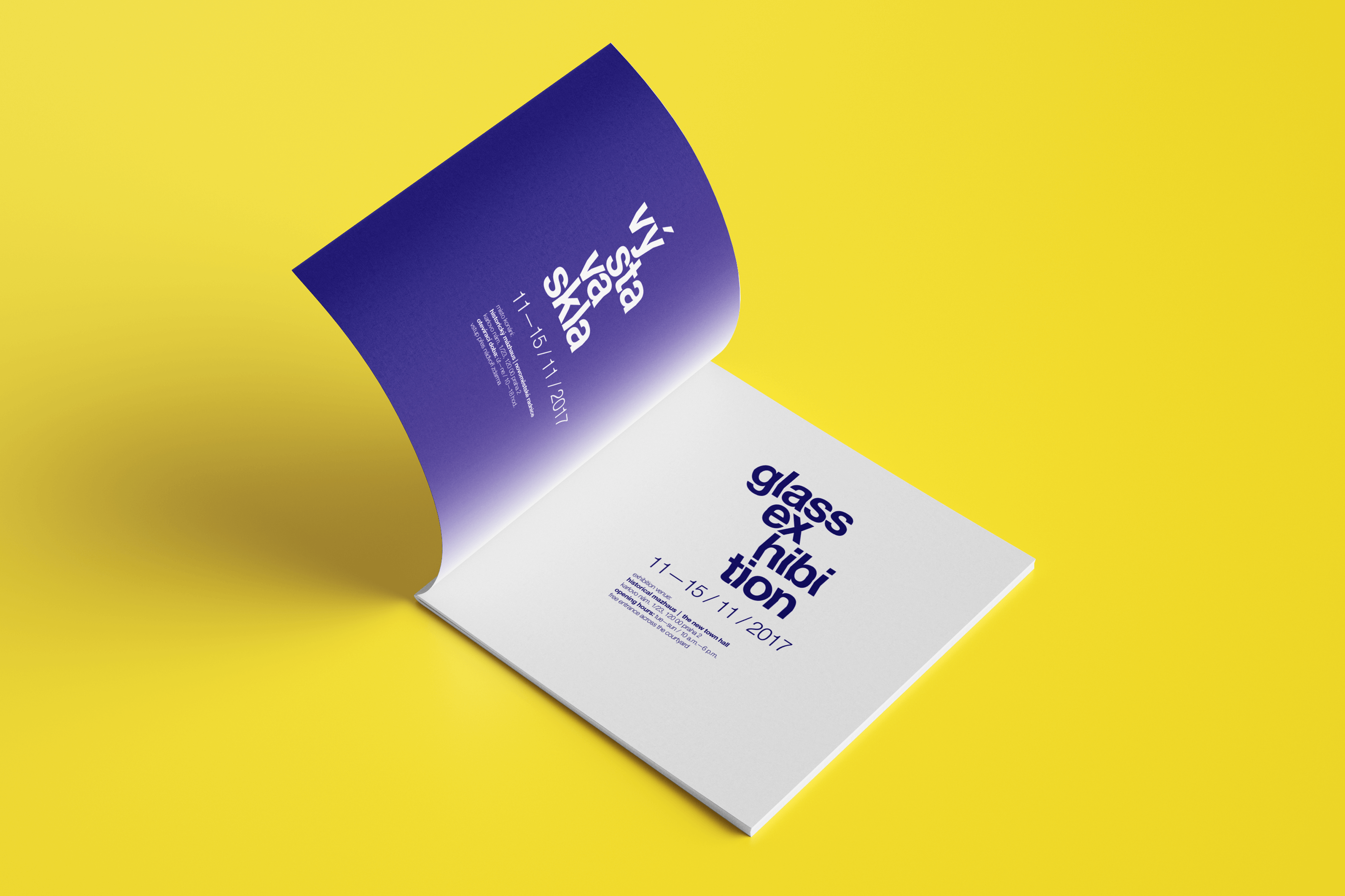
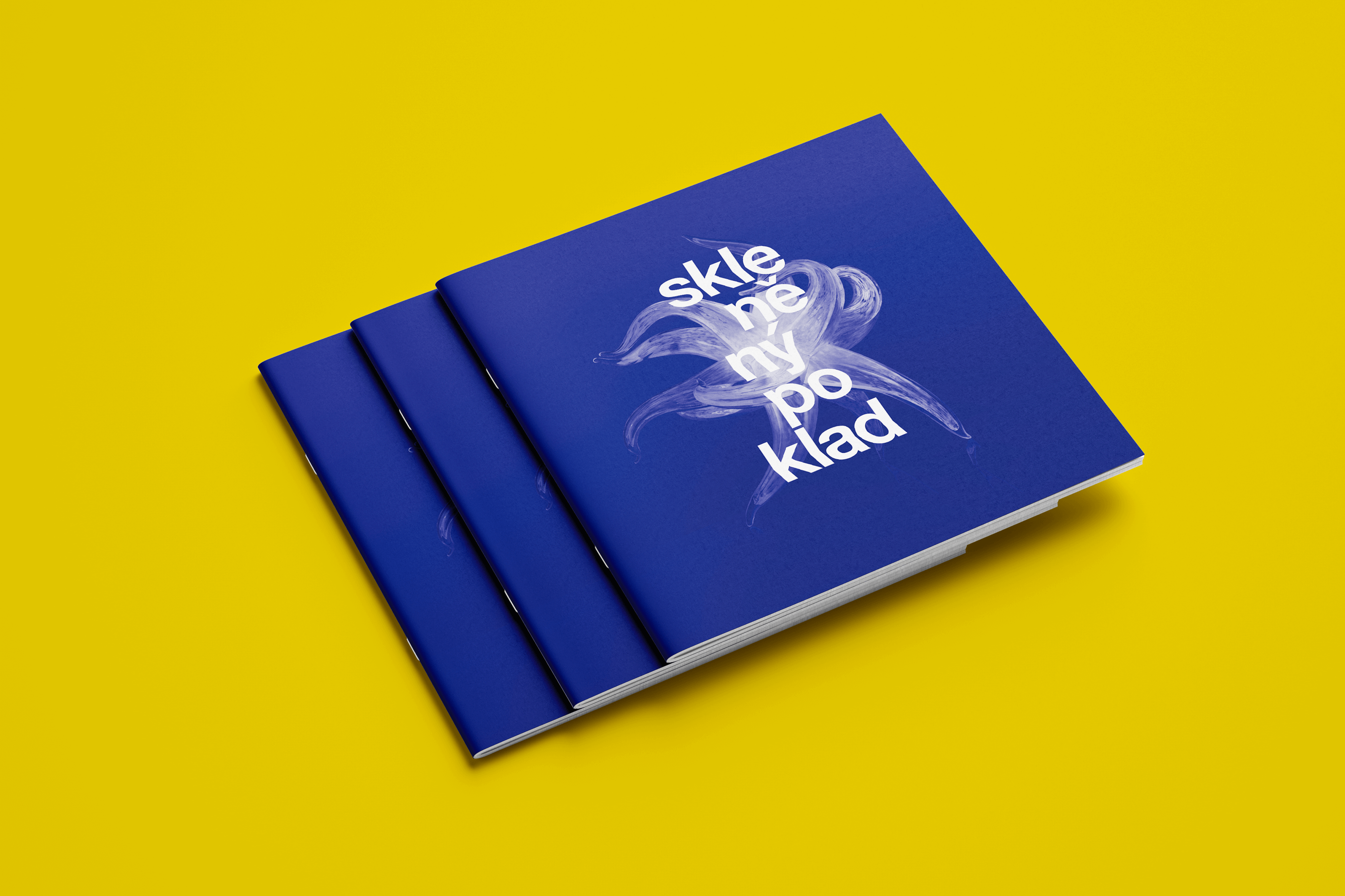
Glassworks František in Sázava, a glass art centre, annually organizes an exhibition of glass objects created by Czech and foreign artists. The visual identity of the display named ‘Glass Treasure’ employs the Helvetica Neue typeface and a break of its single letters at an angle of 5°. This evokes the refraction of light passing through the glass. This effect is used not only in the exhibition logotype, but also in the accompanying text and especially in the titles. The task was to design different promotional material: catalog, folded leaflet, poster, invitation, banner, descriptions or online outputs for the exhibition.
Initiator/Client:
Centrum sklářského umění Huť František v Sázavě
Cesty skla, o.p.s.
Year:
2016–2017
Design:
Sára bergmannová
Tomáš Brychta
Karla Gondeková
Glassworks František in Sázava, a glass art centre, annually organizes an exhibition of glass objects created by Czech and foreign artists. The visual identity of the display named ‘Glass Treasure’ employs the Helvetica Neue typeface and a break of its single letters at an angle of 5°. This evokes the refraction of light passing through the glass. This effect is used not only in the exhibition logotype, but also in the accompanying text and especially in the titles. The task was to design different promotional material: catalog, folded leaflet, poster, invitation, banner, descriptions or online outputs for the exhibition.
Initiator/client:
Centrum sklářského umění Huť František v Sázavě
Cesty skla, o.p.s.
Year:
2016–2017
Design:
Sára bergmannová
Tomáš Brychta
karla gondeková
Glassworks František in Sázava, a glass art centre, annually organizes an exhibition of glass objects created by Czech and foreign artists. The visual identity of the display named ‘Glass Treasure’ employs the Helvetica Neue typeface and a break of its single letters at an angle of 5°. This evokes the refraction of light passing through the glass. This effect is used not only in the exhibition logotype, but also in the accompanying text and especially in the titles. The task was to design different promotional material: catalog, folded leaflet, poster, invitation, banner, descriptions or online outputs for the exhibition.
Initiator/client:
Centrum sklářského umění Huť František v Sázavě
Cesty skla, o.p.s.
year:
2016–2017
Design:
Sára bergmannová
Tomáš Brychta
karla Gondeková
Glassworks František in Sázava, a glass art centre, annually organizes an exhibition of glass objects created by Czech and foreign artists. The visual identity of the display named ‘Glass Treasure’ employs the Helvetica Neue typeface and a break of its single letters at an angle of 5°. This evokes the refraction of light passing through the glass. This effect is used not only in the exhibition logotype, but also in the accompanying text and especially in the titles. The task was to design different promotional material: catalog, folded leaflet, poster, invitation, banner, descriptions or online outputs for the exhibition.
Initiator/Client:
Centrum sklářského umění Huť František
v Sázavě
Cesty skla, o.p.s.
Year:
2016–2017
Design:
Sára bergmannová
Tomáš Brychta
Karla gondeková

