Vršovické divadlo MANA
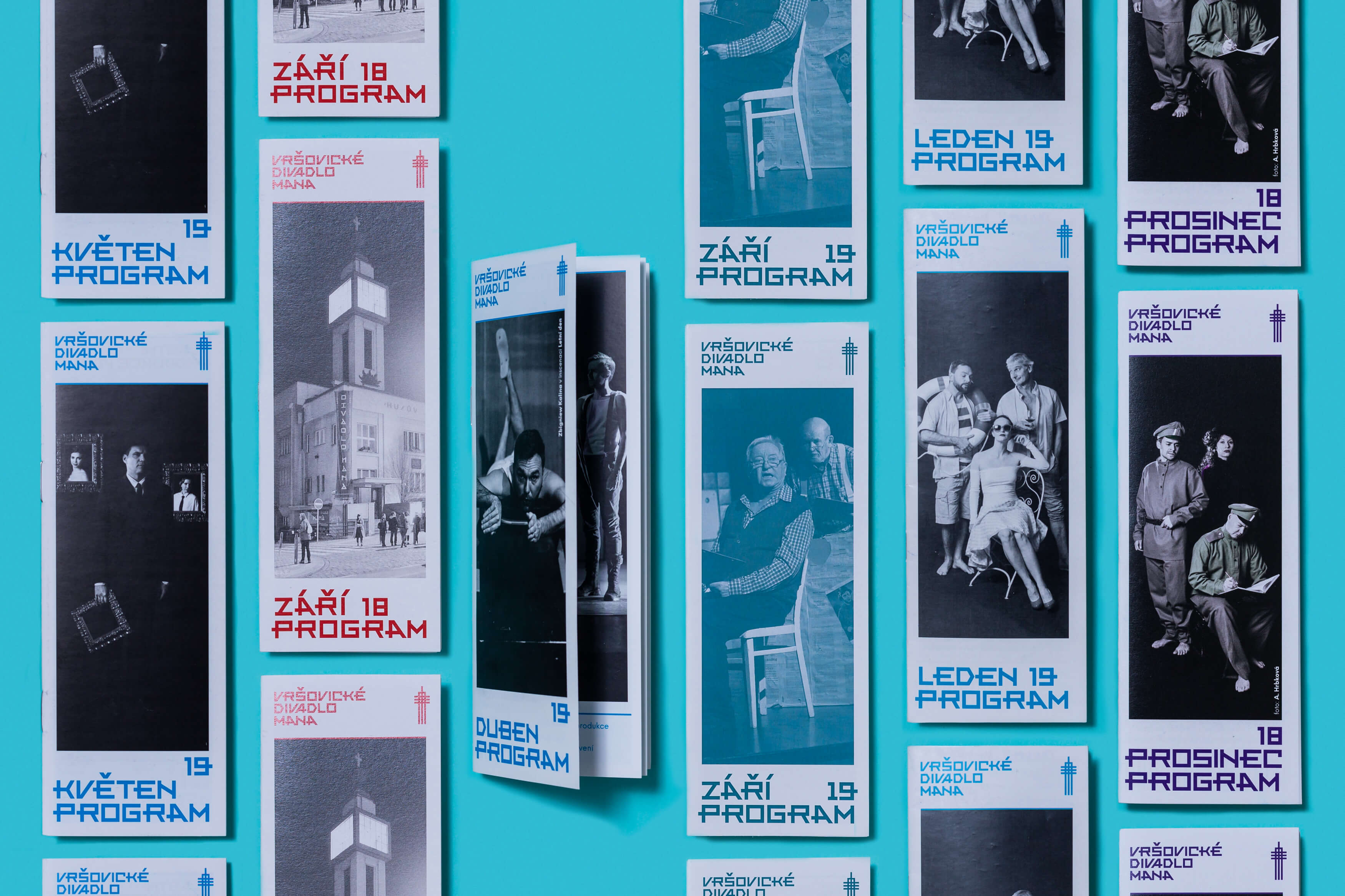
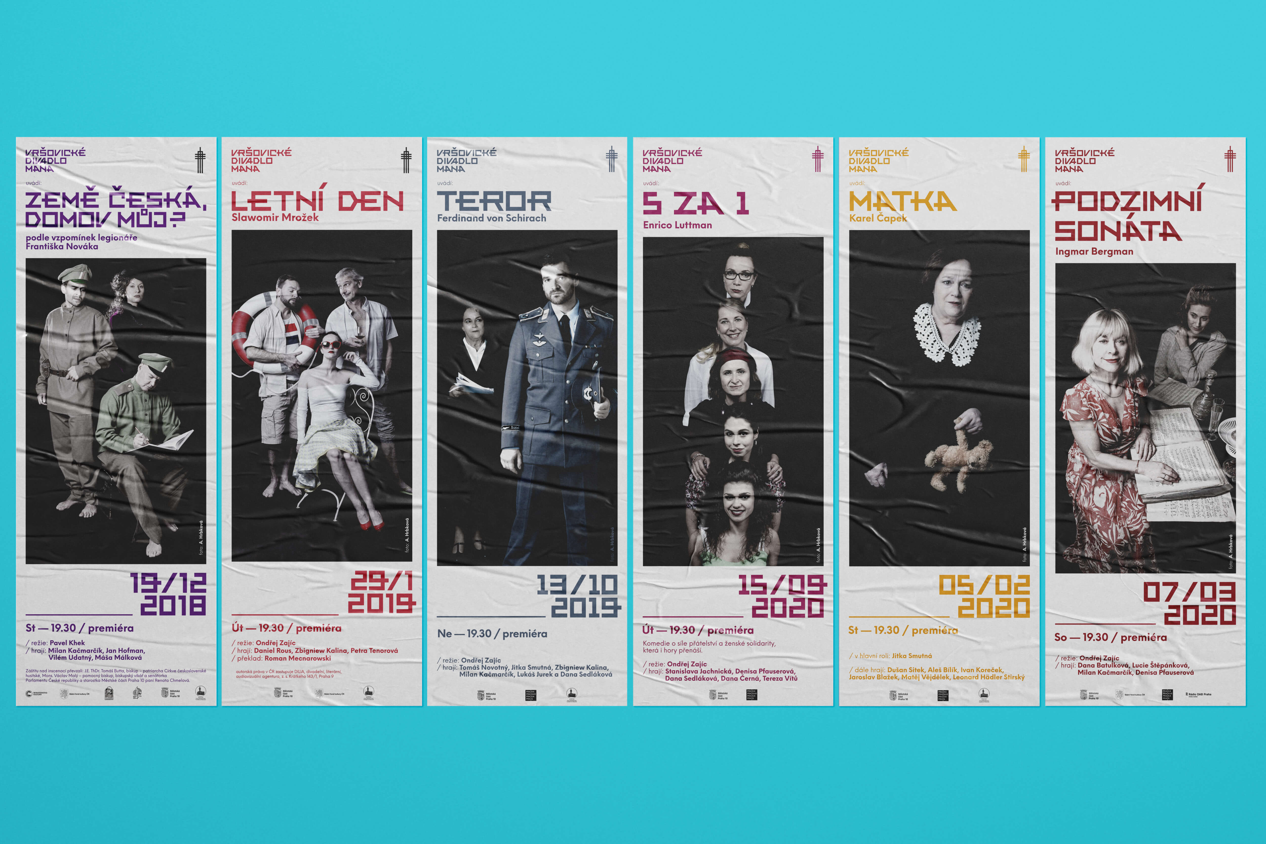
The logo created for the MANA Theater in Prague’s district Vršovice is inspired by details of the Truxa typeface, designed by Karel Truksa, the architect of the functionalist theater building. Redesigning the typeface reduces the thickness of its stroke, for better readableness if using a smaller size, removes circular shapes from its letters and unifies their style. The symbol of the theater house tower complements the logo. The verticality of the tower, together with the simple geometry, is reflected in the whole of the visual identity: in the formatting and formats of the printed output as well as in the design of the theater's website.
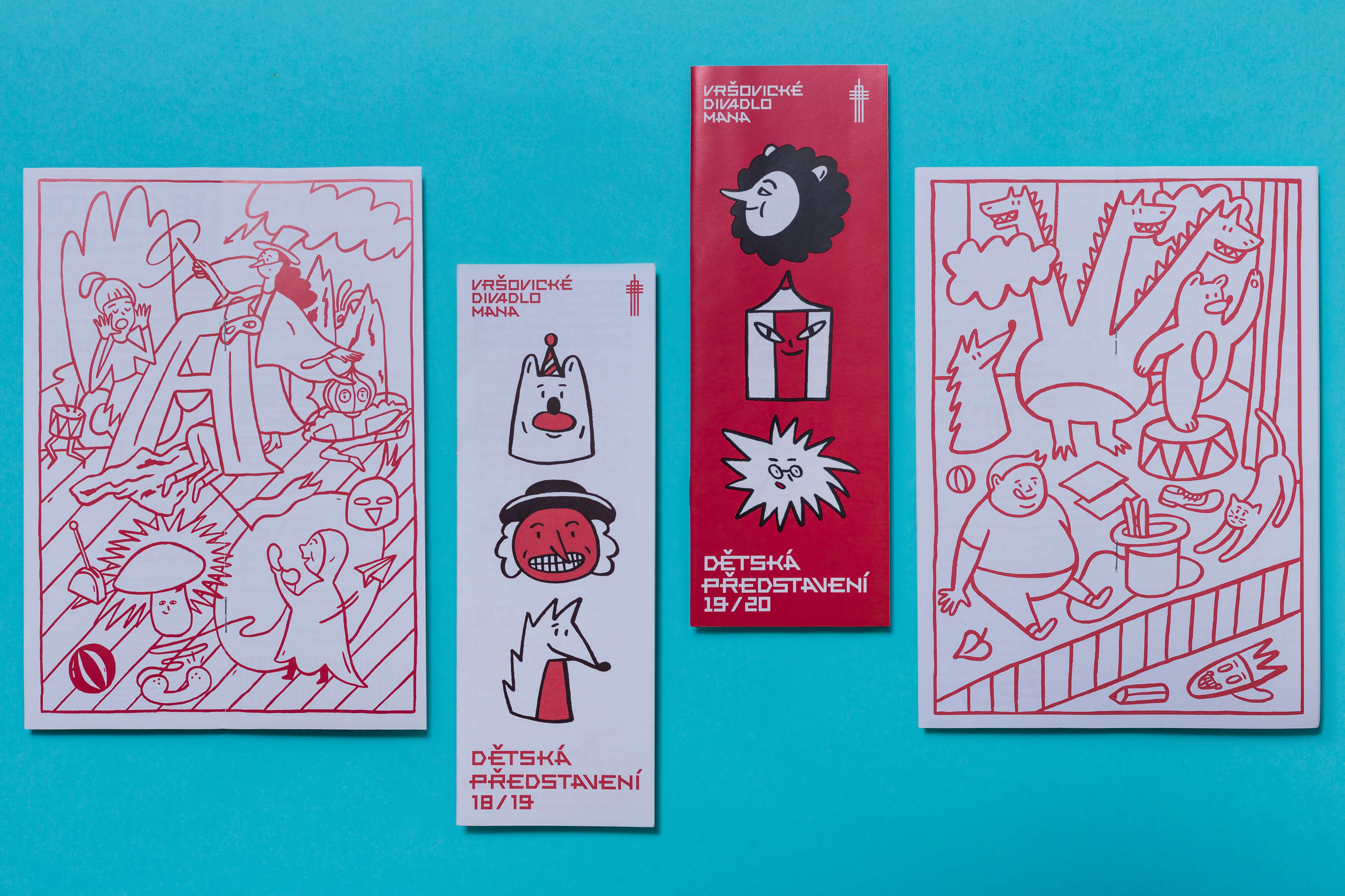
The program of children's performances, which includes illustrations a coloring page, is subject to an uniform visual identity. This also applies to all new output as the theater's activities and services expand.
Initiator/Client:
Vršovické divadlo MANA
Year:
2018–2019
illustration:
Karla Gondeková
Design:
Tomáš Brychta
Karla Gondeková