Waipawa Food
Waipawa vegan restaurant has had to deal with the advent of the covid era, and the associated anti-epidemic measures, evolving over the years from a food truck, to a bistro, to a restaurant. However, the restrictions associated with the government measures were not compatible with the restaurant's continued normal operation, so its founders found a way to keep their fans fed with their delicious dishes – thus the Waipawa Food brand was born.
The original logo of the restaurant has been redesigned – but it retains the features of the original morphology (Waipawa is a New Zealand town where the founders lived for a time and from where the Waipawa surf ease of living and respect for nature originates). The typography was changed and the graphic part of the logotype was completed.
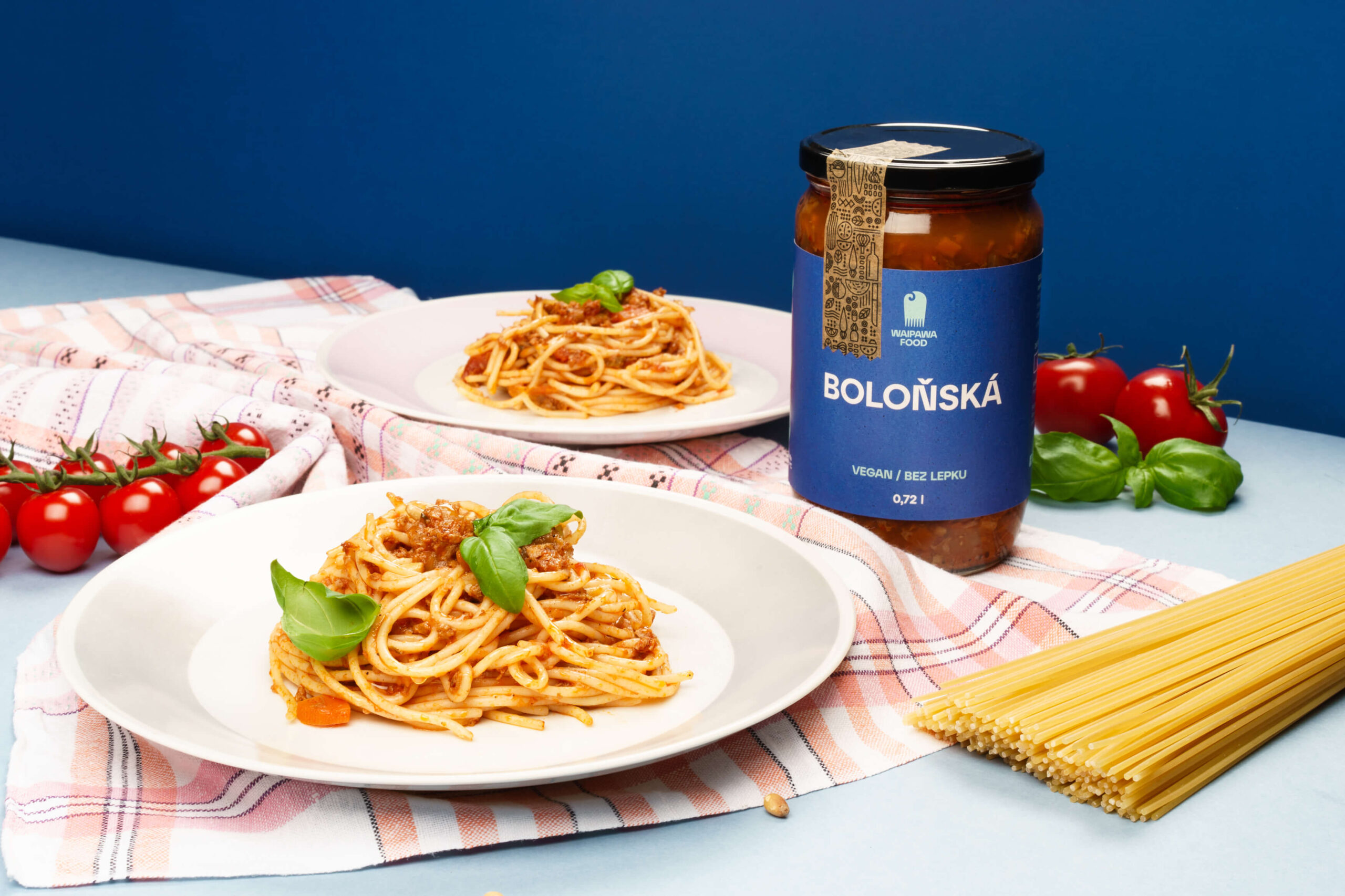
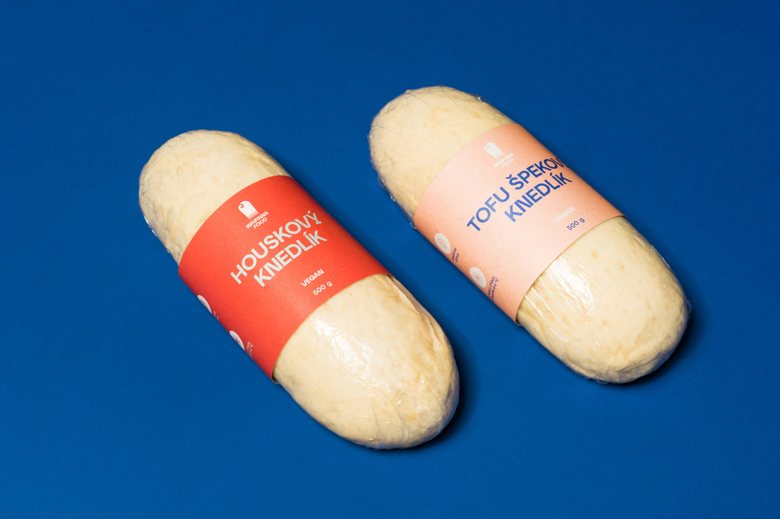
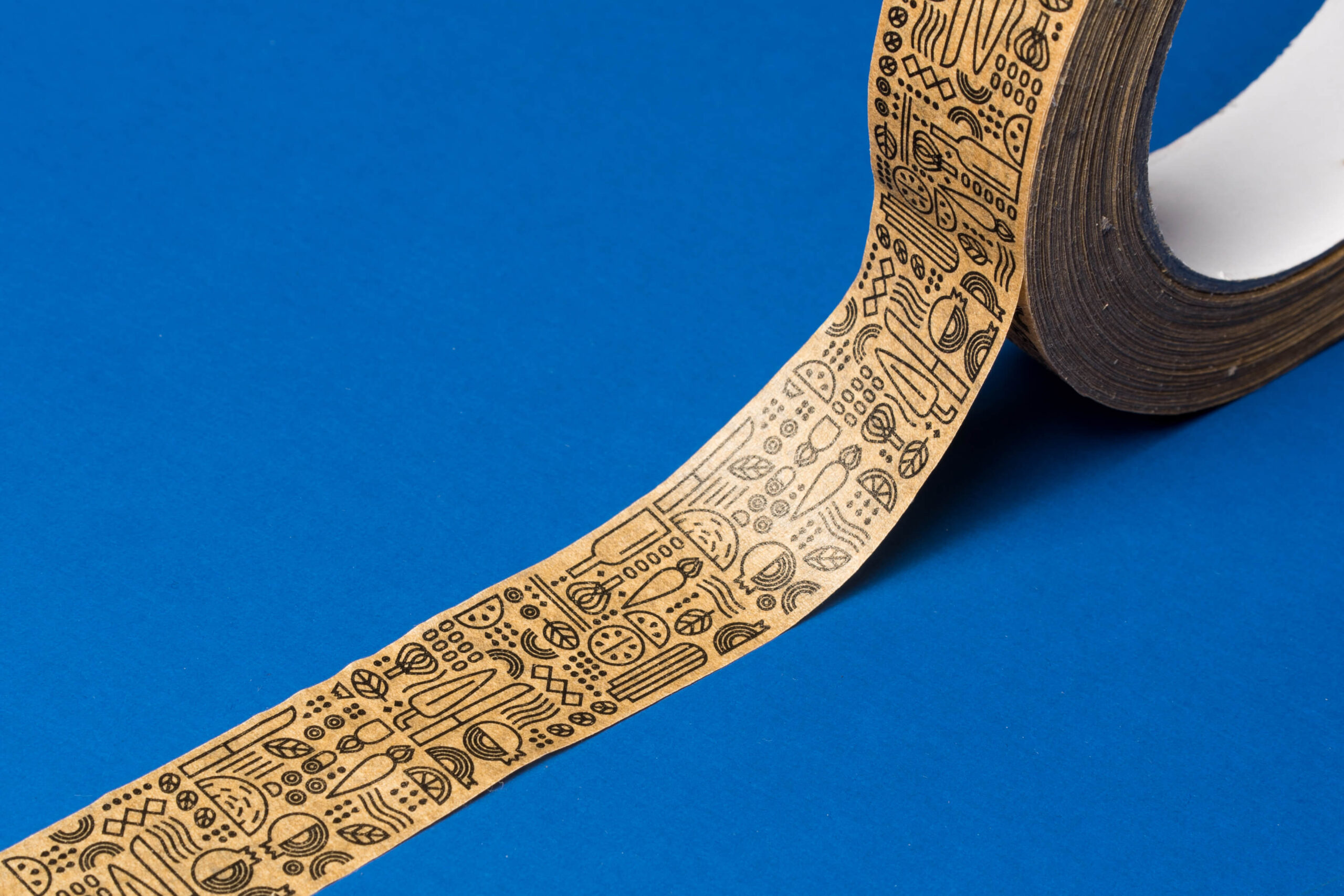
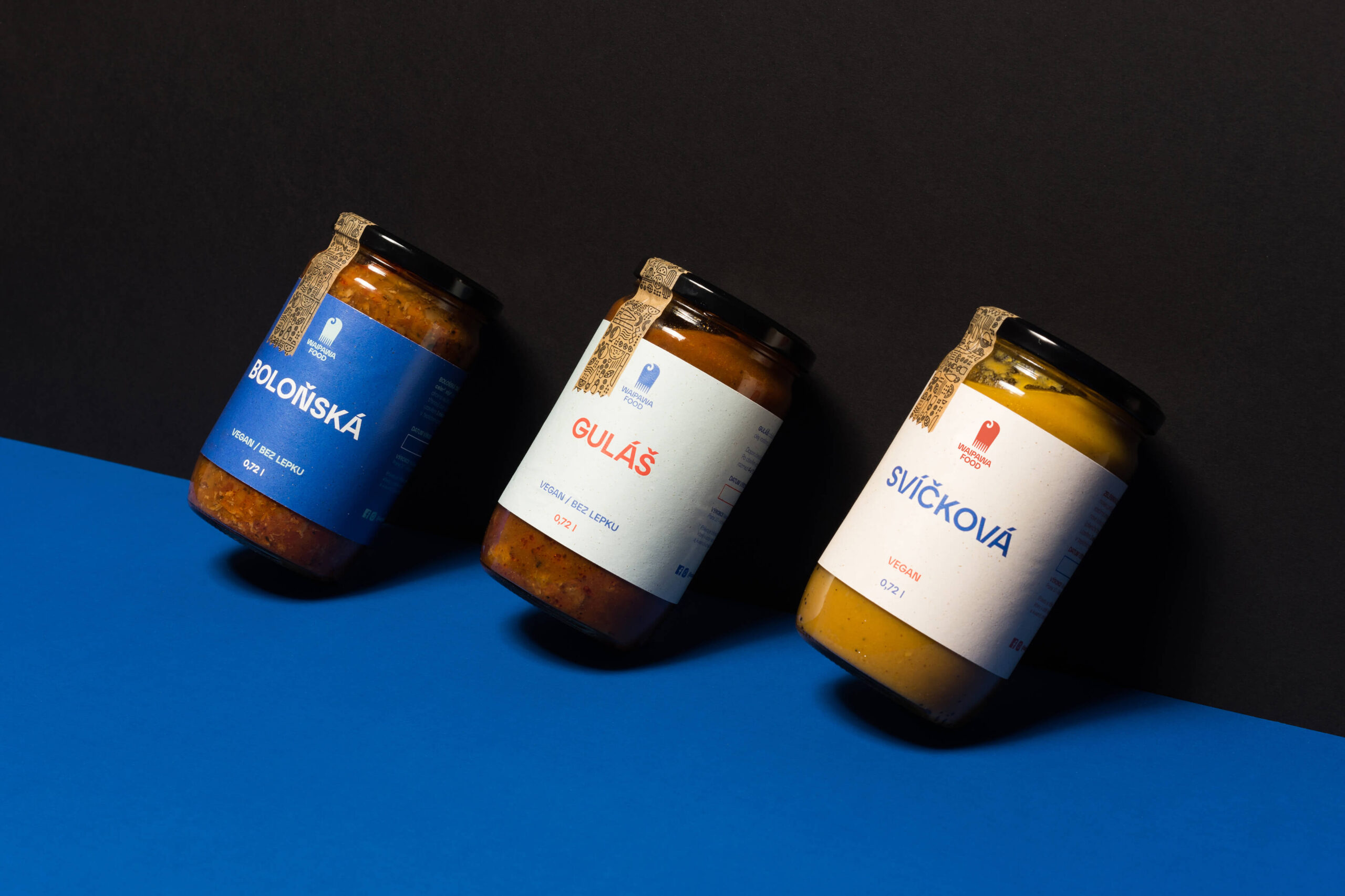
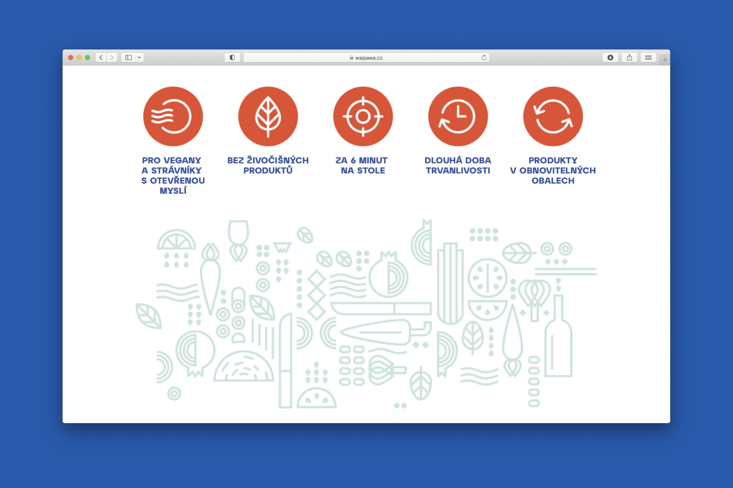
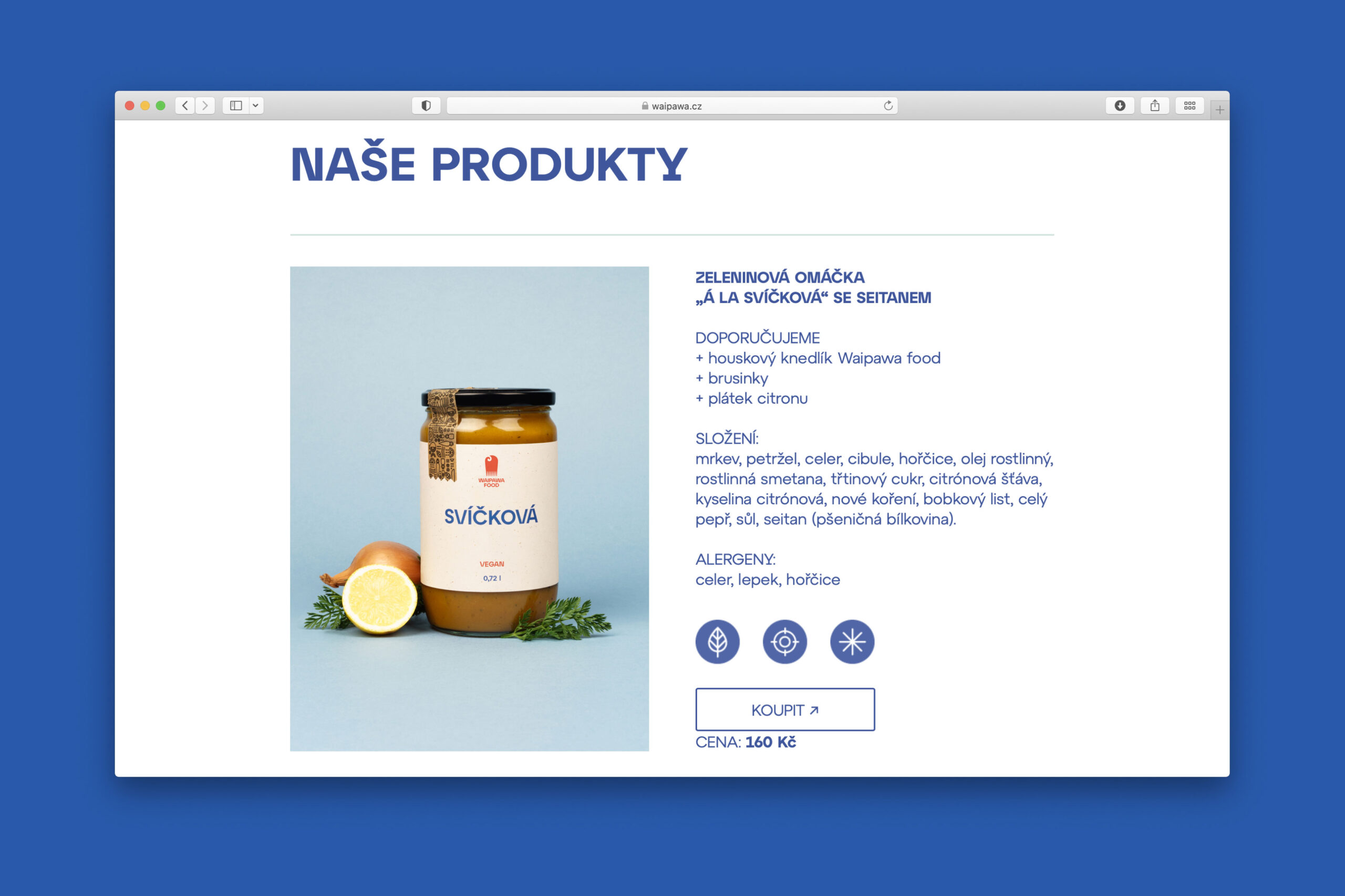
At the centre of their cuisine remains the true Czech classics – this has also become the inspiration for the visual style of the labels, which have become steeped in tradition. The name of the individual sauces has become the key visual element, with the distinctive Atyp font by Suitcase Type Foundry forming an integral part of the identity – the basic proportions of the capital letters refer to the elemental geometric structures of another tradition – Bauhaus. An equally important visual element is the small illustrations, inspired by Maori art (New Zealand), which reflect the composition of the individual products.
The packaging was developed with sustainability and the restaurant's vegan focus in mind, which is why, for example, the adhesive used to glue the labels is plant-based, the sauces are in reusable jars and the labels themselves are printed on eco-friendly Gmund Bier paper containing traces of real beer mill. Paper adhesive tape is a great eco-friendly alternative, it contains a natural rubber based adhesive without solvents.
Initiator/client:
Waipawa Food
Year:
2021
Design:
Tomáš Brychta
Sára Bergmannová
Karla Gondeková
Photography:
Zuzana Fedorová
Web developement:
punkmedia.cz
Print:
Indigoprint s.r.o.
