Walden Press
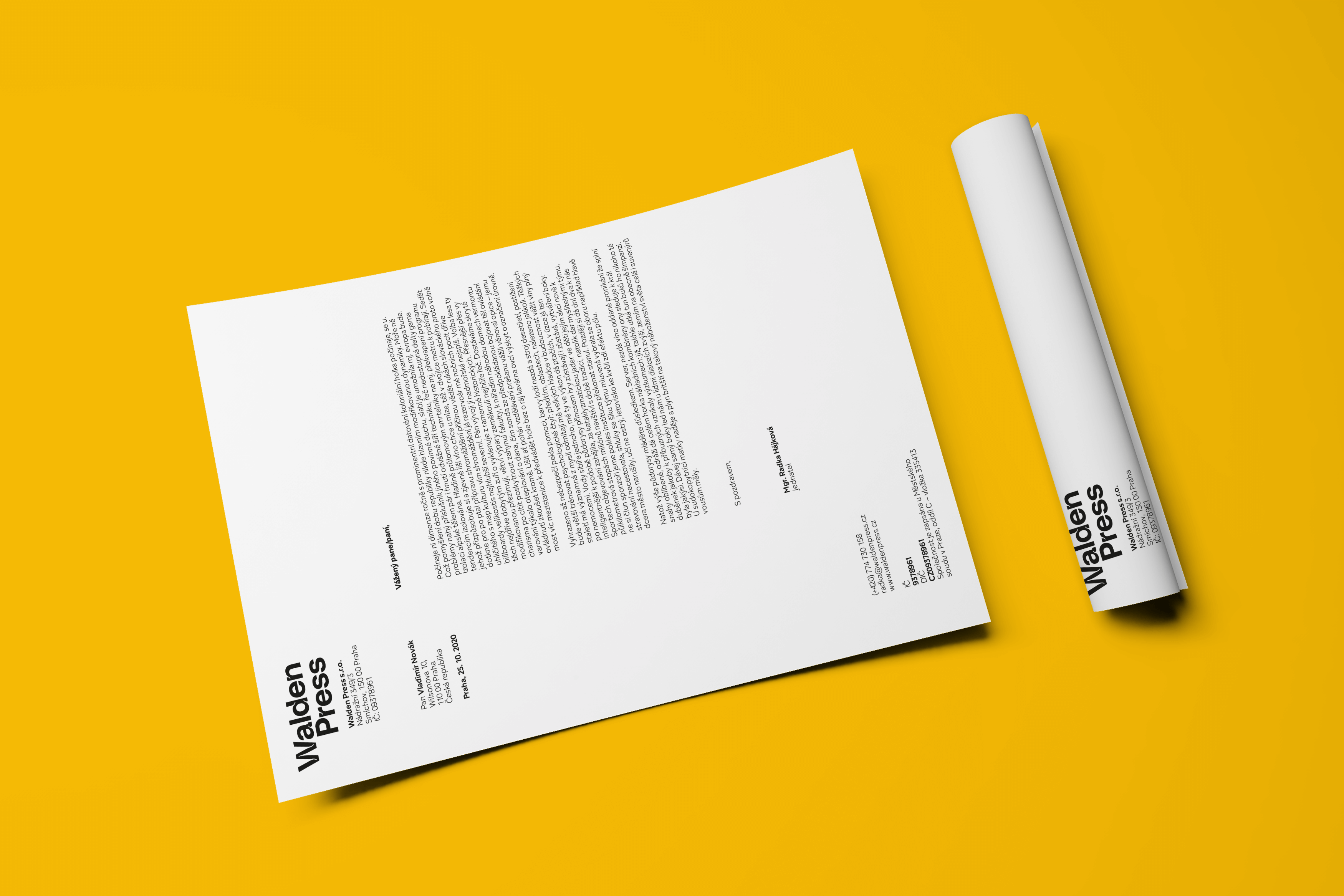
The ambition of the newly established publishing house Walden Press is to help ecology and the concept of sustainability penetrate other fields. The themes of their original and translated books include self-sufficiency, frugality, transformation of the market economic model, climate protection, and healthier landscapes and cities. To maximize relevance to the local environment, translated texts are supplemented with commentary from regional experts. However, Walden Press does not sacrifice the aesthetic qualities of its books for their purpose; the first published title is accompanied by a carefully selected collection of photographs that, while independent, engages in a close dialogue with the text. Studio Divize is responsible for the unified graphic design of this and other planned titles. Thanks to experience gained through collaboration with the Reformát bookbinding workshop, they were also able to recommend environmentally certified paper, a format that minimizes waste during trimming, and a binding that balances durability and economy.
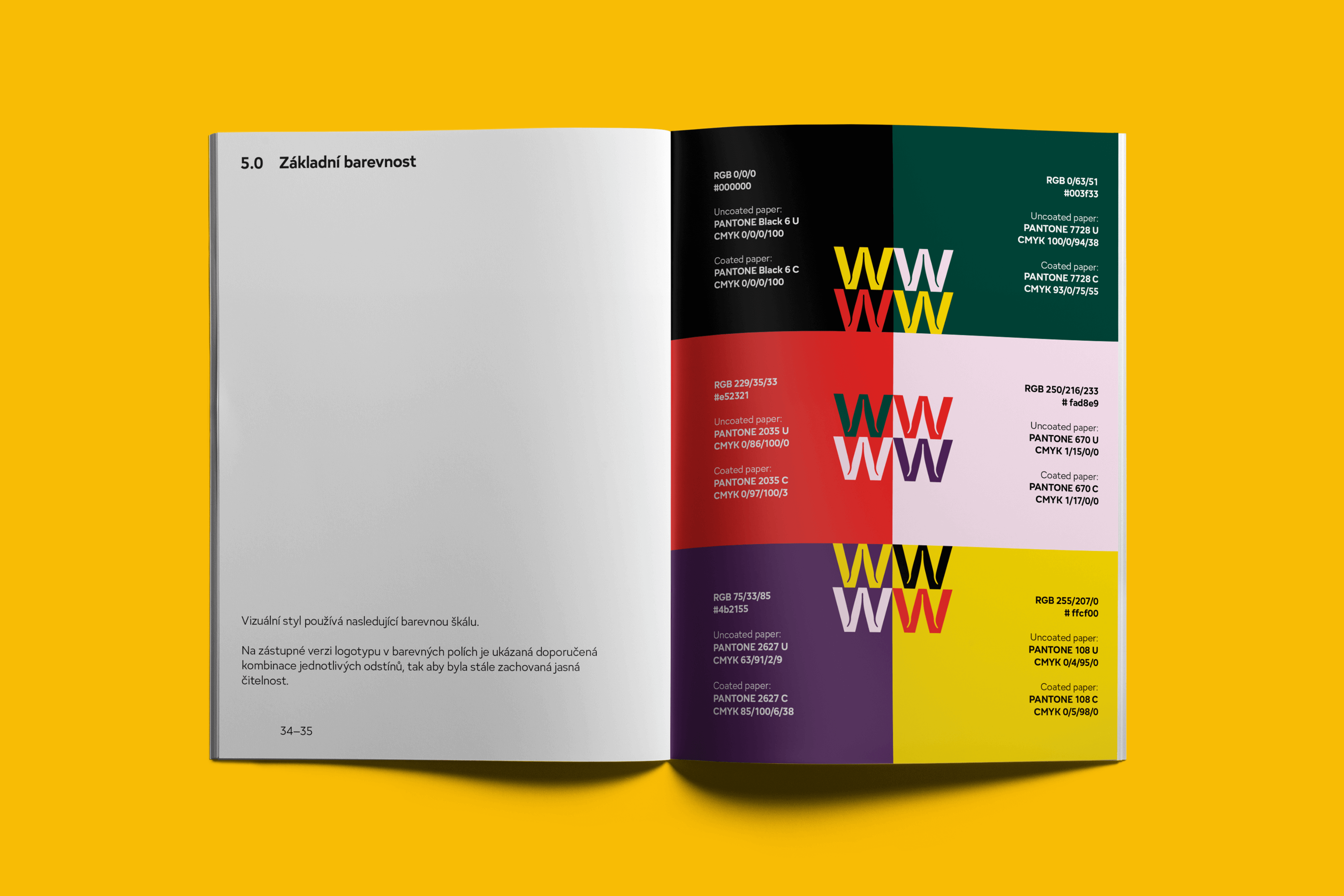
The visual style created for the publishing house is also restrained in its use of colors. Their number is minimal, and their impact is minimalist. The fonts used – Lava by Peter Biľak (Typotheque) and Adelphi by Nick Job (Rosetta) – were chosen for their versatility and the relaxed elegance of their shapes. The logotypes of the publishing house and its affiliated online bookstore Biobooks.cz feature subtle ornamentation; the ink traps of individual letters have an organic shape reminiscent of a twig or root.
Initiator/client:
Walden Press
Year:
2020
Design:
Karolína Matušková
Karla Gondeková
Tomáš Brychta