We're open
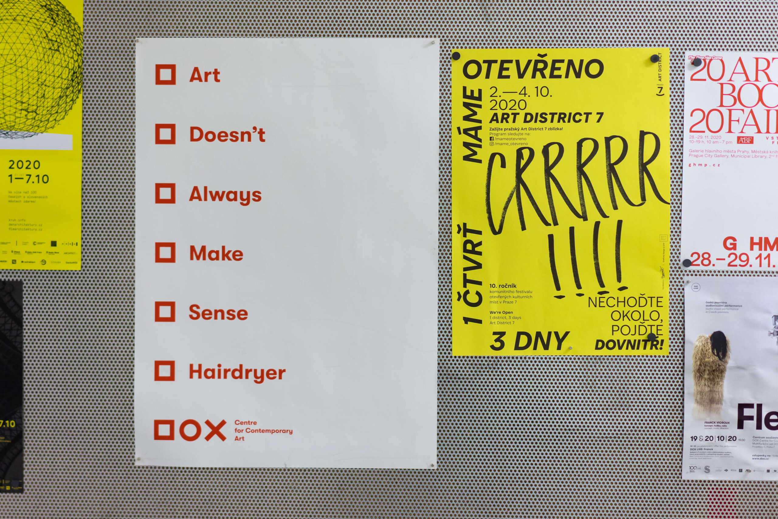
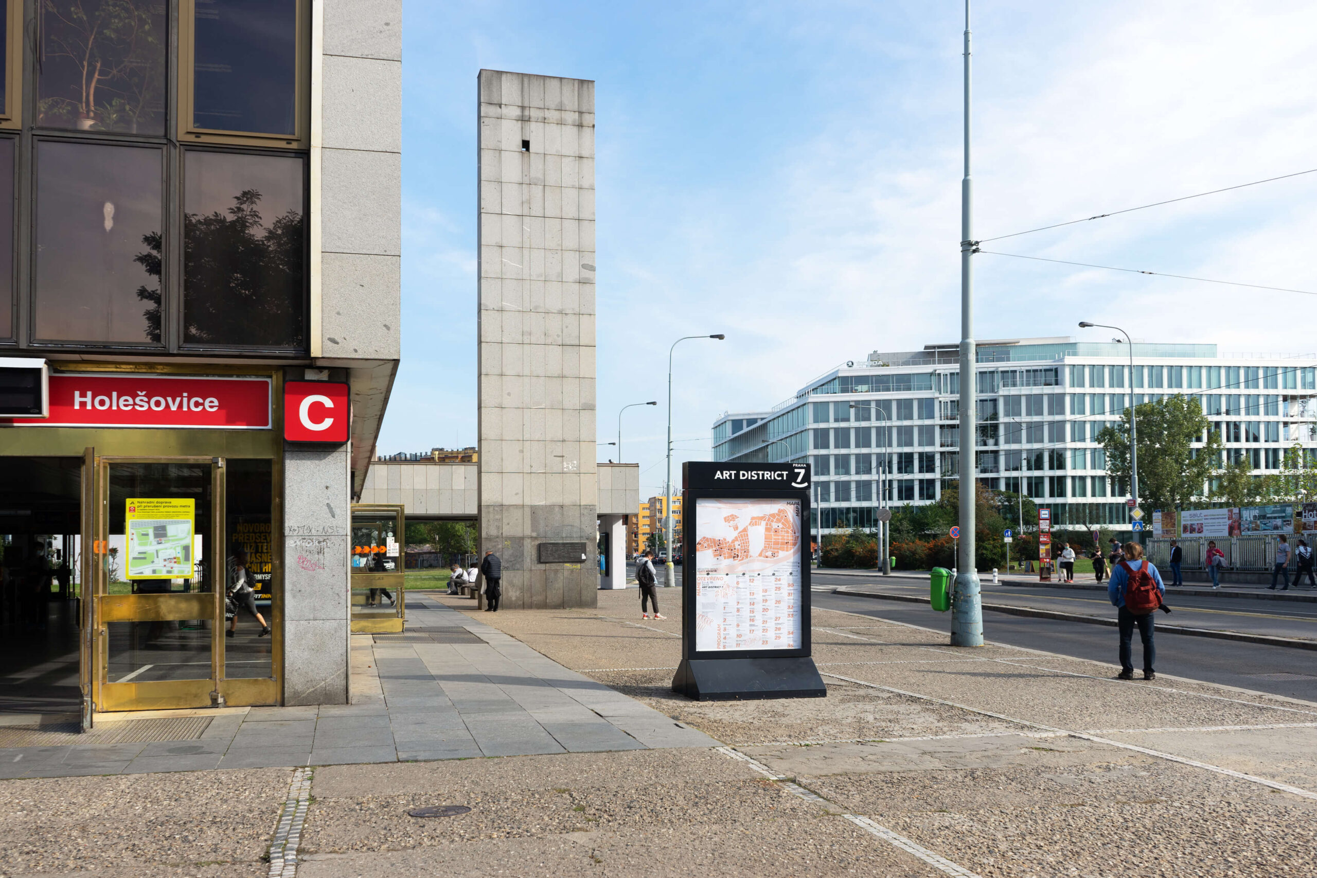
The tenth edition of the festival Máme otevřeno (We’re Open), which makes the cultural venues of Prague's Art District 7 accessible, has made its presence felt in a pervasive way. It put up simple posters with large signs in the city and virtual streets, straightforward and graphically raw, like posters highlighting sales or provincial entertainments. The neon yellow, orange and blue areas form the background for the handwritten font exclamations, which in itself can express and evoke emotions. These are emoticons imitating the sounds with which a visitor announces his arrival: Ding, ding, ding, crrr. The perception of the audience, invited to visit various cultural venues in Prague 7, is therefore not only visual but also acoustic; advertising is not only seen but also heard. The conspicuousness of the promotion is a bit of a virtue out of necessity; its austere graphic design in a single colour was chosen so that, given the non-profit nature of the festival, it would not be too expensive to produce. In the spirit of upcycling, a process that the studio develops primarily in projects in which it collaborates with the Reformat bookbinding company, the print was made using leftover paper. As part of the visual style of the festival, a map was created with an index of all those participating and symbols of the most important cultural places in Sedmička. The symbols were created by illustrator Karel Gondeková, a member of the studio. The map was designed with the intention of its continued use by the Art District 7 network, in the form of a poster for the citylight showcase and a freely distributed poster.
Initiator/client:
Art District 7
The Chemistry Gallery
MČ Praha 7
Year:
2020
Illustration:
Karla Gondeková
Design:
Sára Bergmannová
Tomáš Brychta
Jan Buchtela


